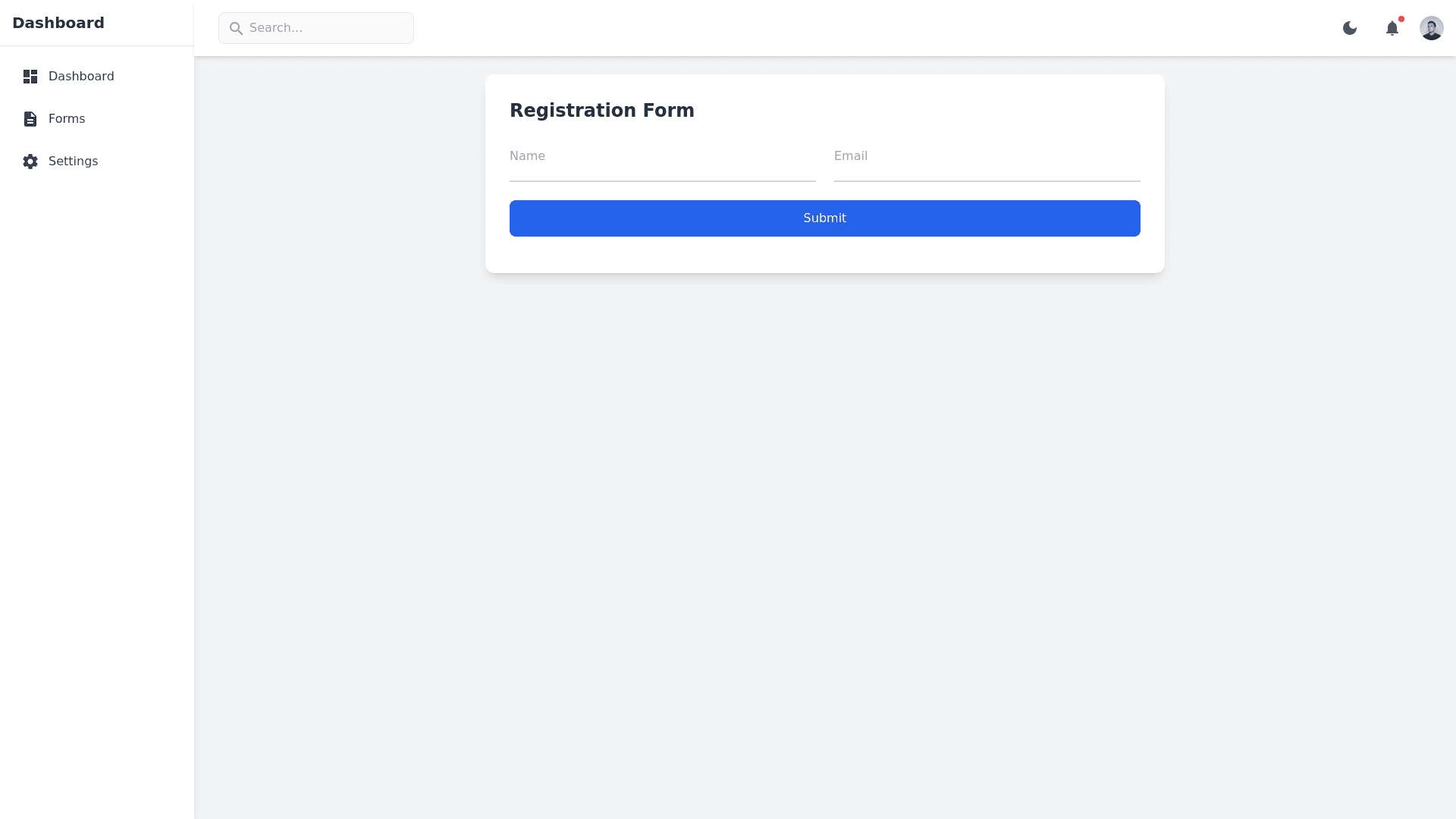
Material Design Form - Copy this Html, Tailwind Component to your project
Generate a premium-quality, mobile-responsive dashboard template for a form-based application with the following features: 1. Layout: A left-side collapsible menu with icons and labels for navigation, including sections like "Dashboard," "Forms," "Settings," "Reports," and "Profile." A top menu bar with a title, search bar, user avatar, and icons for notifications and settings. Include options to toggle between dark and light modes. A centered content area where the main form will be displayed, with proper spacing and margins to make the form look prominent and accessible. 2. Form Design (in Content Area): Add a complete Material Design form with floating labels that automatically float when a field is focused or filled. Form elements should include: Text fields (e.g., Full Name, Email, Address) Password field with a toggle for visibility Date picker for selecting "Date of Birth" Dropdown select for "Country" with a searchable dropdown Multi-select dropdown for "Skills" (e.g., HTML, CSS, JavaScript) Radio buttons for "Gender" (Male, Female, Other) Checkboxes for "Interests" (e.g., Coding, Music, Sports) File upload with drag-and-drop support and file preview Text area for "Additional Information" with a character counter Slider for "Experience Level" (1–10) Toggle switch for "Subscribe to newsletter" Each form element should include validation hints or error messages displayed beneath fields when incorrect data is entered. Ensure the form elements are styled with Material Design floating labels, hover effects, and validation feedback. 3. Additional Dashboard Features: Dark and Light Mode Toggle: Add an easily accessible switch in the top bar to toggle between dark and light themes. Ensure colors, icons, and form elements adjust accordingly for readability. Widgets in Side Panels: Include optional widgets for quick access to stats or actions, like "Form Submissions," "Profile Completion," and "Notifications." Quick Actions Panel: Include a quick actions panel on the dashboard that allows users to quickly add new entries, view recent submissions, and navigate to frequently used sections. 4. Responsiveness and Mobile Design: Ensure the dashboard layout is fully responsive and adapts seamlessly to mobile and tablet screens. The left-side menu should become a collapsible hamburger menu on smaller screens. Use a bottom navigation bar on mobile devices to improve accessibility for key actions like "Home," "Forms," and "Settings." The dark mode should look optimized and stylish on mobile, giving the dashboard an app-like appearance on both iOS and Android. 5. Animation and Interactions: Add smooth transitions and animations when switching between dark and light modes, expanding/collapsing the side menu, and navigating between sections. Use micro-interactions (e.g., button hover effects, form field focus effects) to enhance the premium feel of the dashboard. 6. User Account Menu and Profile Settings: Add a profile settings dropdown under the user avatar with options for "Profile," "Settings," and "Logout." Include a simple profile page where users can update their personal details, password, and notification preferences. Generate the entire dashboard layout and form in HTML, CSS, and JavaScript using Material Design principles, including code for responsive behavior, dark/light mode styling, and form validation.
