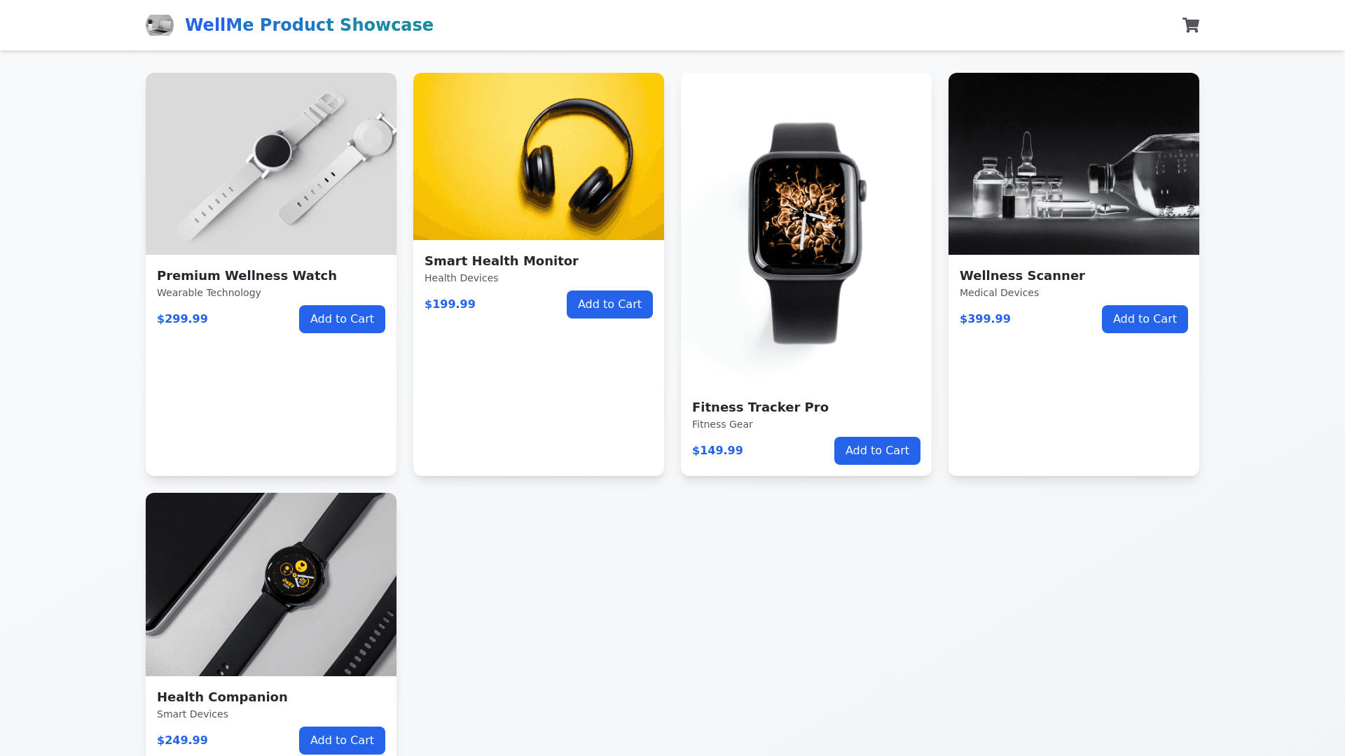
Product Showcase - Copy this React, Tailwind Component to your project
Create-a-visually-stunning-and-interactive-Product-Showcase-section-in-React,-using-advanced-design-techniques-and-Tailwind-CSS-to-provide-an-engaging-user-experience.-Begin-with-a-sleek,-sticky-header-displaying-the-logo-and-the-title-"WellMe-Product-Showcase".-Below-the-header,-dynamically-generate-product-cards-by-mapping-through-the-product-data,-each-card-featuring-an-image-with-fallback-text-and-a-hover-effect-that-scales-the-image-and-highlights-the-product-name-and-category-with-a-semi-transparent-overlay.-Make-the-layout-responsive-by-utilizing-flexbox-for-horizontal-alignment-and-horizontal-scrolling-if-the-number-of-products-exceeds-the-viewport.-Ensure-the-cards-adapt-to-different-screen-sizes,-scaling-down-on-smaller-devices-and-scaling-up-on-larger-ones,-using-Tailwind’s-responsive-breakpoints.-Enhance-the-interactivity-with-subtle-hover-effects-like-scaling-and-shadow-casting,-creating-a-polished-3D-effect-that-makes-the-cards-feel-dynamic.-The-product-data-should-include-an-ID,-name,-category,-and-an-array-of-image-URLs-for-each-product,-allowing-for-a-rich-visual-experience.-Incorporate-smooth-CSS-transitions-and-animations-to-make-the-hover-effects-feel-seamless,-and-utilize-CSS-grid-or-flexbox-to-optimize-the-layout-across-varying-screen-sizes.-By-blending-modern-design-and-interactive-features,-this-product-showcase-will-provide-an-immersive,-visually-appealing-user-experience-across-devices.
