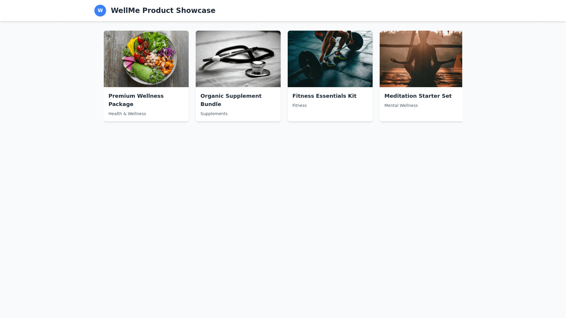
Product Showcase - Copy this React, Tailwind Component to your project
Create-a-visually-dynamic-and-responsive-Product-Showcase-section-in-React,-focusing-on-interactivity-and-sleek-design.-Begin-by-implementing-a-clean-header-that-features-your-logo-and-the-title-"WellMe-Product-Showcase"-at-the-top.-Below,-dynamically-render-a-list-of-products-by-mapping-over-your-product-data.-For-each-product,-display-an-image-with-fallback-text-if-the-image-is-missing,-and-on-hover,-implement-an-effect-where-the-image-enlarges-slightly,-and-the-product-name-and-category-are-highlighted-with-a-semi-transparent-background.-Each-card-should-also-feature-the-product-name-and-category-beneath-the-image,-which-become-more-prominent-when-hovered-over.-Organize-the-product-cards-in-a-horizontal-row-using-flexbox,-enabling-horizontal-scrolling-for-excess-products-that-don’t-fit-in-the-viewport.-Ensure-the-layout-is-fully-responsive,-where-the-product-cards-adjust-to-fit-smaller-screens-with-smaller-card-sizes-on-mobile-and-larger-ones-on-desktop.-Apply-subtle-hover-effects,-like-scaling-and-shadow-casting,-to-create-depth-and-interactivity,-making-the-cards-feel-alive-as-users-interact-with-them.-Tailwind-CSS-will-be-used-for-styling,-leveraging-its-utility-classes-to-ensure-the-layout-adapts-seamlessly-across-different-devices.-The-product-data-should-include-ID,-name,-category,-and-an-array-of-image-URLs,-ensuring-that-each-product-is-well-represented-visually,-and-the-cards-remain-interactive-and-engaging.-This-structure-will-create-a-user-friendly-and-aesthetically-pleasing-product-showcase-that-is-both-interactive-and-responsive.
