Products - Copy this React, Tailwind Component to your project
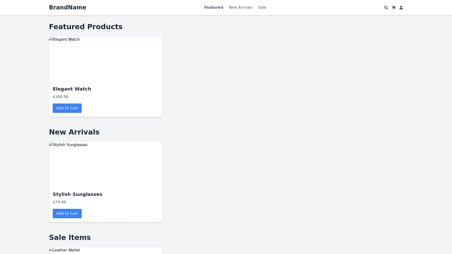
Design a modern and visually engaging "Products" page that showcases three distinct product offerings, each with a unique section that users can navigate to via internal links. The page should have a clean, minimalistic design with a cohesive color palette, such as soft grays, whites, and accent colors like muted blues or greens, to maintain a professional yet inviting aesthetic. Header Section: At the top of the page, include a prominent header with a title like "Our Products" in a large, bold font. Below the title, add a brief introductory paragraph that summarizes the company’s product offerings, highlighting their key benefits. Keep the text concise and easy to read, using a clean sans serif font. Navigation Links: Below the header, include navigation links or buttons that allow users to jump to each product’s section. These links could be styled as simple, modern buttons or as a horizontal menu bar. Use a hover effect, such as a slight color change or underline, to indicate interactivity. Each link should be labeled with the product name, such as "Product 1," "Product 2," and "Product 3," and should smoothly scroll to the corresponding section when clicked. Product Sections: For each product, create a distinct section on the page with a modern, card like design that separates it from the other sections. Each section should have a light background color, such as white or very light gray, with subtle shadows or borders to give it a floating effect. 1. Product Image: Start each section with a high quality, responsive image that represents the product. The image should be placed prominently at the top or to the left of the text content, depending on the layout. Ensure the image scales well across different devices and screen sizes. 2. Product Description: Below or next to the image, include a concise yet informative product description. This text should highlight the key features and benefits of the product, using bullet points or short paragraphs for clarity. Use a slightly larger font for headings or important points to make them stand out. 3. Detailed Explanation: Following the description, provide a more detailed explanation of the product’s functionality, use cases, or technology. This section could be formatted as a series of expandable/collapsible paragraphs or an accordion style layout to keep the content organized and easily digestible. Include icons or infographics to visually enhance the explanation and break up the text. 4. Video Tutorial: Towards the end of each product section, embed a YouTube video tutorial that demonstrates the product in action. The video should be responsive, maintaining its aspect ratio across different devices. Place a clear, easy to read heading above the video, such as "Watch the Product in Action," to draw attention. Ensure the video is embedded with modern controls, such as play, pause, and full screen options, and provide a brief description or key takeaways from the video directly below it. Call to Action: At the end of each product section, include a call to action button that encourages users to learn more, purchase, or sign up for a demo. Style these buttons with a consistent color that contrasts with the background, such as muted blue or green, with rounded corners and a hover effect like a color shift or shadow. Overall Page Layout: Ensure the page layout is fully responsive, with each product section stacking vertically on smaller screens. The navigation links should remain easily accessible and functional across all devices. Use smooth scrolling animations when navigating between sections to enhance the user experience. Apply subtle hover effects, animations, and transitions throughout the page, such as images slightly zooming in or buttons shifting colors, to keep the interface interactive and engaging without overwhelming the user. The design should be clean, professional, and easy to navigate, guiding users through the product offerings in a visually appealing manner.
