Learning Progress Bar - Copy this React, Tailwind Component to your project
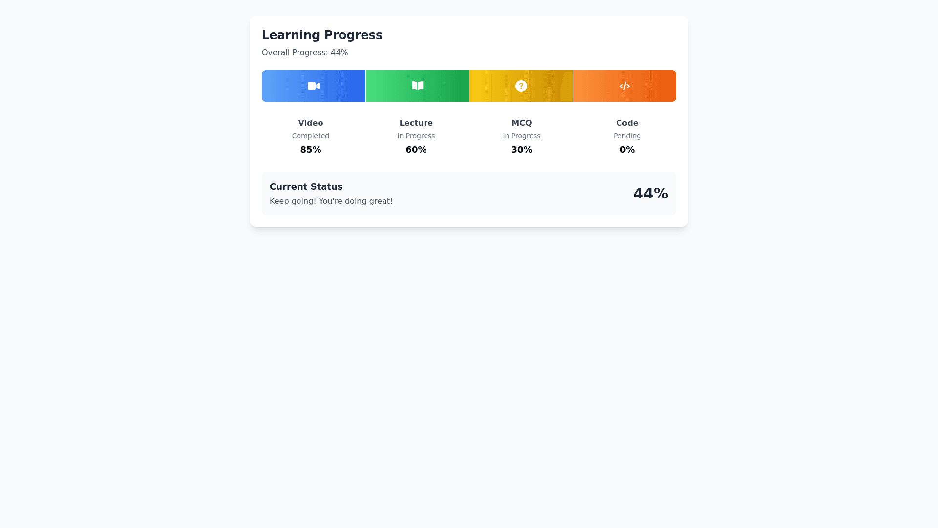
Certainly!-Below-is-a-detailed-prompt-you-can-provide-to-Napkin-to-create-visuals-for-the-progress-bars-in-your-project.-----**Prompt-for-Napkin:**-----**Design-a-horizontal-progress-bar-that-visually-represents-a-user's-progress-through-four-sequential-learning-activities:**-1.-**Video-Viewing**-2.-**Lecture-Study**-3.-**MCQ-Completion**-4.-**Code-Snippet-Execution**-----###-**Overall-Style:**---**Layout:**-A-sleek,-modern-horizontal-progress-bar-divided-into-four-equal-segments,-each-representing-one-of-the-activities-listed-above.---**Dimensions:**-Width-to-height-ratio-suitable-for-a-website-header-or-learning-module-interface.---**Style-Theme:**-Minimalistic-with-vibrant-colors-and-intuitive-icons.-----###-**Segment-Details:**-1.-**Segment-1:-Video-Viewing**---**Icon:**-A-play-button-icon-centered-within-the-segment.---**Color:**-Vibrant-blue-gradient.---**Progress:**-Show-this-segment-as-completed-(fully-filled).---**Label:**-"Video-Completed"-displayed-beneath-the-segment.-2.-**Segment-2:-Lecture-Study**---**Icon:**-An-open-book-icon-centered-within-the-segment.---**Color:**-Rich-green-gradient.---**Progress:**-Show-this-segment-as-in-progress-(half-filled).---**Label:**-"Lecture-In-Progress"-displayed-beneath-the-segment.-3.-**Segment-3:-MCQ-Completion**---**Icon:**-A-question-mark-or-quiz-icon-centered-within-the-segment.---**Color:**-Bright-yellow-gradient.---**Progress:**-Show-this-segment-as-not-started-(empty).---**Label:**-"MCQs-Pending"-displayed-beneath-the-segment.-4.-**Segment-4:-Code-Snippet-Execution**---**Icon:**-Curly-braces-`{}`-or-a-code-symbol-centered-within-the-segment.---**Color:**-Energetic-orange-gradient.---**Progress:**-Show-this-segment-as-not-started-(empty).---**Label:**-"Coding-Pending"-displayed-beneath-the-segment.-----###-**Additional-Visual-Elements:**---**Segment-Separation:**-Thin-white-lines-or-subtle-shadows-to-clearly-divide-the-segments.---**Hover-Effect:**-When-hovering-over-a-segment,-it-slightly-enlarges-or-glows,-displaying-more-details-like-"Click-to-continue."---**Percentage-Indicators:**-Above-each-segment,-display-individual-completion-percentages-(e.g.,-"100%",-"50%",-"0%",-"0%").---**Overall-Progress:**-At-the-top-or-bottom-of-the-progress-bar,-include-a-bold-text-stating-"Overall-Progress:-37.5%".---**Animations:**-Smooth-filling-animations-for-segments-that-are-in-progress-or-completed.-----###-**Typography:**---**Font:**-Clean,-modern-sans-serif-font-like-Helvetica-or-Open-Sans.---**Text-Color:**-White-or-high-contrast-color-that-stands-out-against-segment-backgrounds.---**Alignment:**-All-text-should-be-center-aligned-relative-to-each-segment.-----###-**Color-Palette-Suggestions:**---**Blue:**-`#4A90E2`---**Green:**-`#50E3C2`---**Yellow:**-`#F5A623`---**Orange:**-`#D0021B`---**Neutral-Background:**-Light-grey-`#F7F7F7`-to-make-the-progress-bar-pop.-----###-**Background-and-Surroundings:**---**Background:**-Simple-and-clean,-keeping-the-focus-on-the-progress-bar.---**Context-Elements:**-Optionally-include-subtle-graphics-related-to-learning-or-technology-in-the-background-(e.g.,-faint-mathematical-formulas-or-code-snippets).-----###-**Overall-Feel:**---**Mood:**-Encouraging-and-motivating,-aiming-to-inspire-users-to-continue-their-learning-journey.---**Style-Consistency:**-Ensure-that-all-icons-and-design-elements-share-a-consistent-style,-either-all-flat-design-or-all-skeuomorphic.-----**End-of-Prompt**-----Feel-free-to-adjust-any-part-of-this-prompt-to-better-fit-your-specific-needs-or-to-highlight-certain-aspects.-Providing-this-detailed-description-to-Napkin-should-help-generate-a-visual-that-effectively-represents-the-progress-bar-for-your-project