App Layout - Copy this React, Tailwind Component to your project
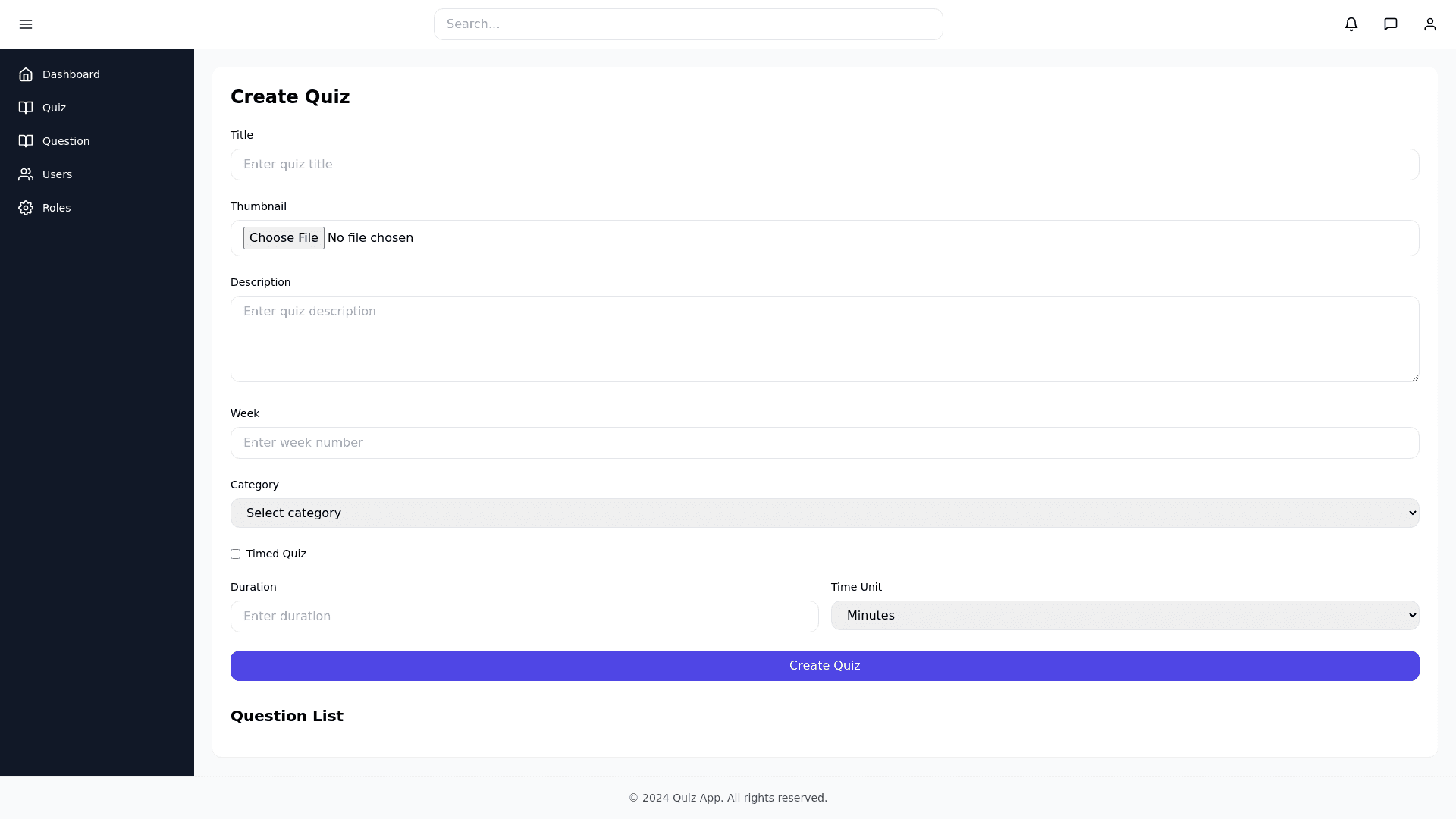
Generate a production ready React component with the following structure: Layout Navbar: fixed at the top, contains: Search bar in the center Notification dropdown (bell icon) Message dropdown (envelope icon) Profile dropdown (with avatar + logout option) Sidebar: collapsible with a toggle button (hamburger icon). Sidebar should include navigation items: Dashboard, Quiz, Question, Users, Roles. Expanded view → icons + labels Collapsed view → icons only Footer: fixed at the bottom, simple copyright text Main Content Area: displays a Quiz Form with fields: Title (input) Thumbnail Image (file upload) Description (textarea) Week (input) Category (select) Timed Quiz (checkbox) Duration (input) Time Unit (select) Submit button Below the form → section titled Question List Styling Requirements Use React + Tailwind CSS for styling Use shadcn/ui components where possible (button, input, select, card) Colors (modern dashboard theme): Primary: #4F46E5 (indigo 600) Secondary: #1F2937 (gray 800) Sidebar background: #111827 (gray 900) Navbar background: #FFFFFF (white with subtle shadow) Footer background: #F9FAFB (gray 50) Button primary: indigo 600 with hover indigo 700 Font: Use Inter, sans serif for all text Headings → font semibold, body text → font normal Inputs & selects → rounded xl with light gray border and focus ring in indigo Functionality Sidebar collapses to icons only when minimized Navbar, sidebar, and footer should remain consistent across pages (create AppLayout component) Main content should be scrollable while navbar/footer remain fixed Use React Icons or Lucide icons for bell, envelope, hamburger, user avatar, etc. Fully responsive: mobile → sidebar collapses by default State management for sidebar toggle and dropdowns Component Structure Navbar Sidebar Footer AppLayout QuizForm Write clean, reusable, production ready code.