Editor Container - Copy this React, Tailwind Component to your project
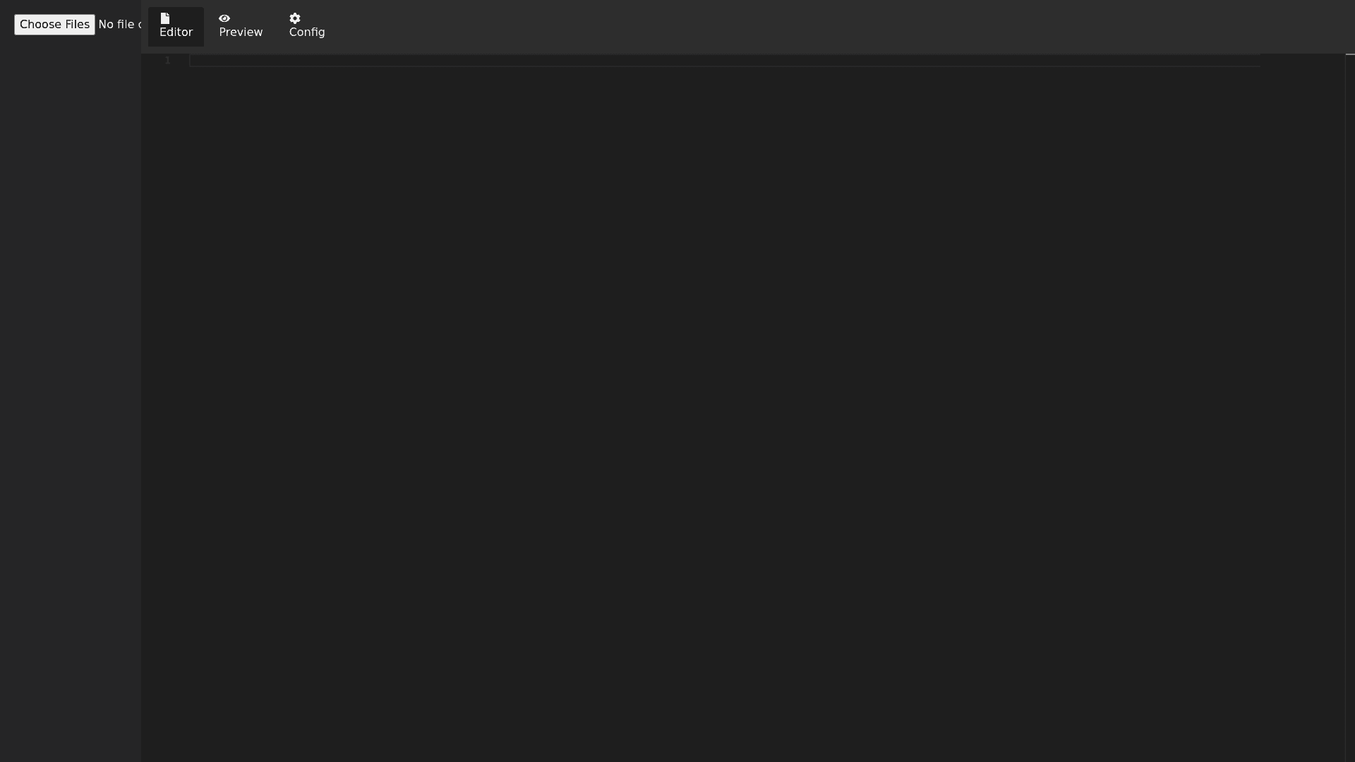
React Code Editor with Syntax Highlighting: The code editor should allow users to edit or write React code and support syntax highlighting, especially for JSX, JavaScript, and React specific syntax. Use a reliable editor library like Monaco Editor, CodeMirror, or a similar library that supports this level of syntax highlighting. Ensure that the syntax highlighting is dynamic and adjusts based on the type of code being written. 2. Live Preview: As the code is being written or updated in the editor, it should immediately reflect those changes in a live preview pane. The live preview should dynamically render the React components entered into the editor in real time. Ensure that any necessary isolation (like using an iframe) is implemented so that the editor and the preview do not interfere with each other. 3. File Navigation and Responsive UI: Include a simple file navigation or menu section with tabs for: Preview Configuration Ensure that the preview tab is visually emphasized when active, just like in the image. 4. Adjustable and Responsive Layout: The layout should consist of three primary columns: File Navigation (on the left), Code Editor (center), and Live Preview (right). Each column should be fully responsive and include a drag to adjust feature. Users should be able to drag the borders between the columns to dynamically adjust the width of the file nav, code editor, and live preview sections. Implement this feature to work smoothly across both desktop and mobile layouts, ensuring it remains responsive and intuitive. 5. File Uploader with Multi File Support: Add a file uploader component that supports multiple file types (e.g., .jsx, .js, .css, .html, .json). The file uploader should allow users to upload and view multiple files in the editor, switching between them as needed. Ensure that the uploaded files are properly categorized and can be previewed within the code editor. 6. React and UI Library Support (MUI, etc.): The code editor should provide full support for React, meaning it should be able to parse and highlight JSX code as well as standard React components, hooks, and syntax. The editor should also support UI libraries such as Material UI (MUI), meaning that users should be able to import MUI components like Button, TextField, etc., and see them rendered in the live preview. Ensure that the editor can handle typical UI library imports, such as import { Button } from '@mui/material'; and render them properly in the preview. 7. Style and Layout: The overall design should replicate the style of the image, with a dark themed editor and clean, minimal preview section. Use CSS to ensure that the code editor and live preview are displayed side by side in a responsive and clean layout. The React logo, the "Learn React" link, and the text in the live preview should match what is shown in the attached image.