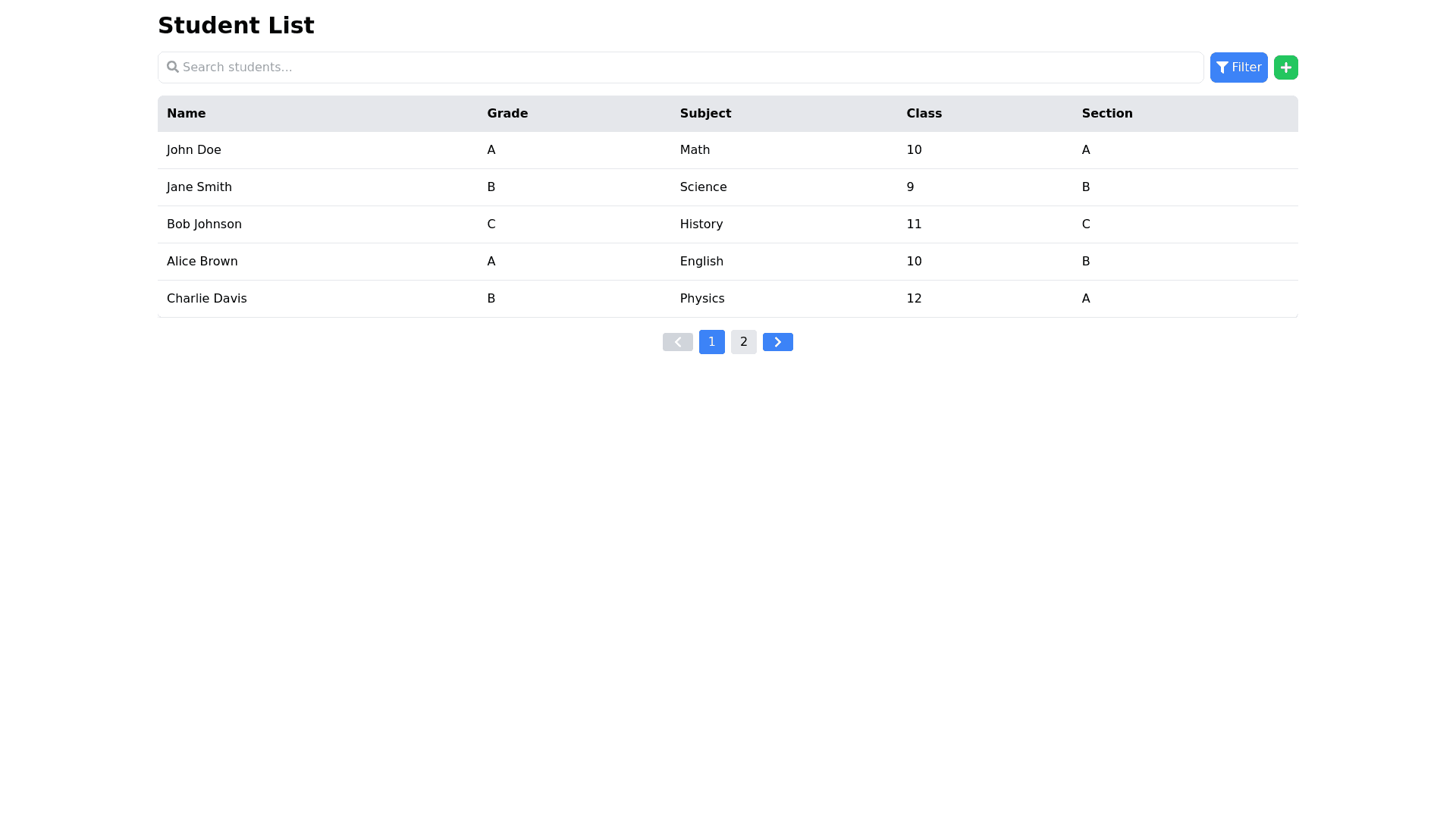
Student List - Copy this React, Tailwind Component to your project
open poup like this Breakdown of Props buttonText: The text of the button that opens the popup (in this case, "Filter"). icon: Icon to display next to the button (e.g., filter icon). popupTitle: The title shown at the top of the popup (e.g., "Filter Options"). fields: label: The label to be shown for each field. type: Specifies the type of input. In this case, "dropdown". placeholder: Placeholder text for dropdown fields (e.g., "Select a class"). options: List of options for the dropdown, which can be populated dynamically or statically. applyButtonText: The text for the "Apply" button at the bottom. onApply: The function to call when the "Apply" button is clicked. onClose: The function to close the popup when the user clicks outside or on a close button. Additional Considerations: Dynamic Dropdown: You may want to pass an event handler that dynamically updates the "Section" dropdown based on the "Class" selected. Responsiveness: Ensure the modal is responsive using Tailwind CSS utilities like w-full, max-w-sm, md:max-w-md for width, and flex or grid for layout inside the popup. Popup Trigger: Use a button to trigger the popup, and manage the visibility using state (useState).