Business Dashboard - Copy this React, Tailwind Component to your project
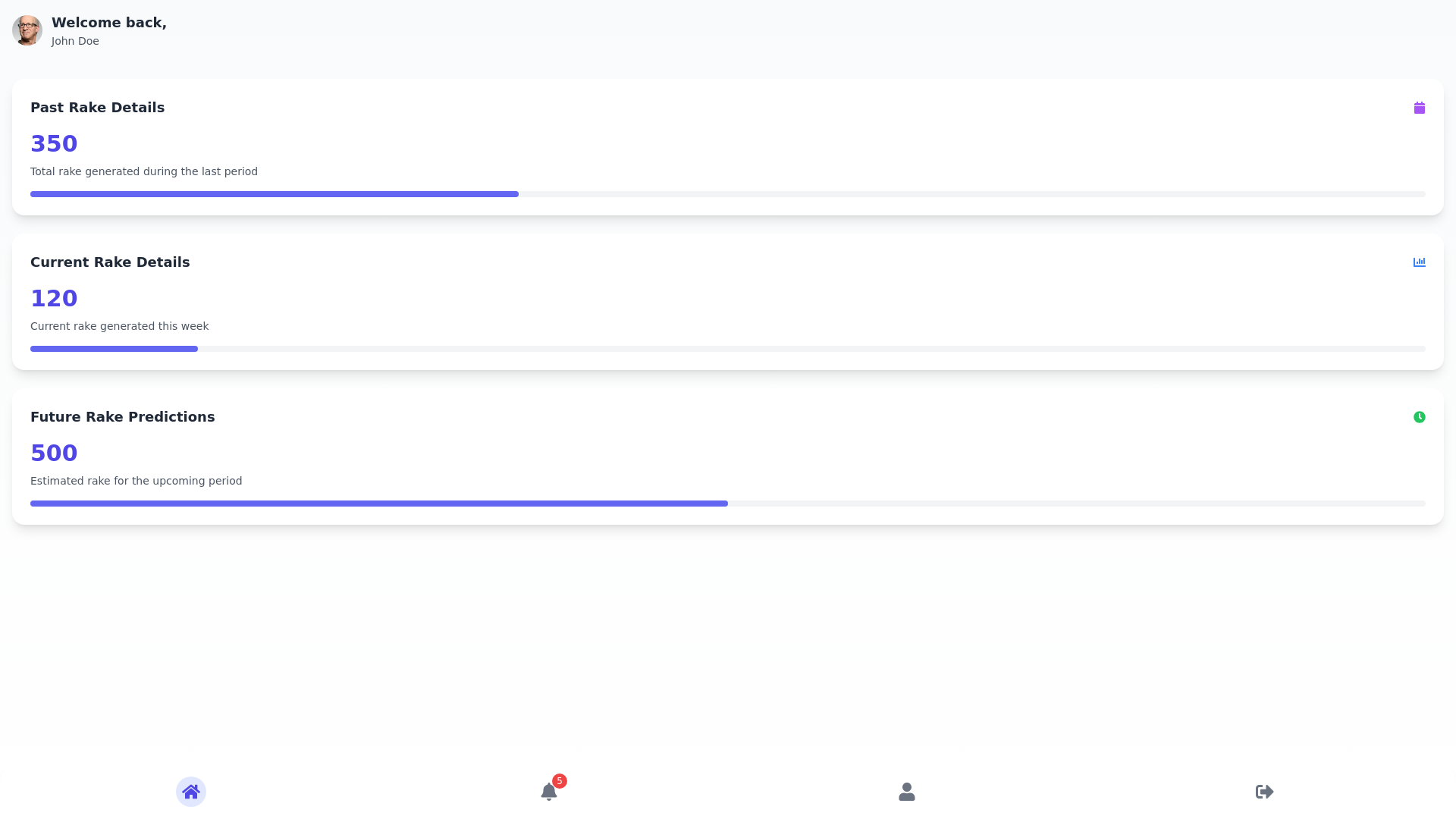
Overview:-Create-a-visually-striking-and-highly-professional-mobile-dashboard-for-a-business-application.-The-design-should-showcase-a-balance-of-modern,-clean-aesthetics-with-user-friendly-functionality.-The-dashboard-should-feature-colorful,-attractive-icons,-smooth-animations,-and-intuitive-navigation.-The-layout-will-consist-of-a-bottom-navigation-bar-with-four-key-options-and-a-main-dashboard-area-displaying-three-interactive-data-cards-with-detailed-information.-The-design-should-include-elements-such-as-subtle-gradients,-modern-typography,-and-thoughtful-iconography-to-provide-a-cutting-edge-experience.-Key-Design-Elements:-Bottom-Navigation-Bar:-Position:-The-bottom-navigation-bar-should-be-centered-horizontally-at-the-bottom-of-the-screen,-offering-four-primary-options:-Home,-Notifications,-Profile,-and-Logout.-Icons:-Home:-Use-a-colorful-and-modern-house-icon-with-a-light-gradient-effect.-The-icon-should-have-a-soft-glow-or-subtle-shadow-to-stand-out-when-selected.-Notifications:-A-vibrant-bell-icon-with-a-dynamic-notification-badge-(a-red-dot-or-small-number-on-the-bell)-to-indicate-unread-alerts.-Profile:-A-sleek,-colorful-user-icon-(silhouette-with-an-abstract-design,-incorporating-blue-and-green-tones)-with-a-subtle-hover-effect-when-tapped.-Logout:-A-clear-and-intuitive-exit-door-icon-in-a-professional-design-with-a-gradient-color-transition-(e.g.,-a-smooth-transition-from-grey-to-teal).-Design:-Icons-should-be-designed-in-a-flat,-2D-style-but-with-modern-gradients-and-a-touch-of-shadow-for-depth.-The-bottom-bar-background-should-be-in-a-rich-dark-color-(e.g.,-#2C3E50)-to-create-contrast,-with-the-icons-themselves-being-white-or-in-colorful-gradients-(vibrant-blues,-greens,-oranges,-and-reds).-Each-icon-should-glow-softly-when-active.-Dashboard-Section:-The-main-dashboard-area-will-contain-three-cards:-Past-Rake-Details,-Current-Rake-Details,-and-Future-Rake-Details.-Card-Layout:-Each-card-should-have-a-soft-rounded-corner-(15px-to-20px),-with-a-subtle-shadow-effect-(e.g.,-0px-4px-8px-rgba(0,-0,-0,-0.1))-to-give-it-a-3D,-elevated-look.-The-background-color-of-the-cards-should-be-a-soft,-neutral-tone-(e.g.,-white,-light-grey,-or-very-light-gradient-of-blue/green)-to-maintain-professionalism-while-ensuring-readability.-Card-Design-Details:-Each-card-should-feature:-Heading:-A-bold,-sans-serif-font-like-"Roboto"-or-"Poppins"-in-dark-gray-(#2F3A46)-for-the-card-title-(e.g.,-"Past-Rake-Details").-Rake-Count:-A-large,-bold,-attention-grabbing-number-in-a-bright-accent-color-(e.g.,-teal-or-dark-blue)-to-make-the-count-stand-out.-Use-typography-such-as-"Montserrat"-or-"Lato"-for-a-clean,-modern-feel.-One-Liner-Description:-A-smaller-text-in-a-lighter-gray-tone-(e.g.,-#B0B0B0),-explaining-the-data.-Ensure-that-the-description-text-is-concise-and-to-the-point.-Iconography:-Each-card-can-feature-an-icon-related-to-the-data-(e.g.,-a-small-upward-arrow-next-to-the-current-rake-count,-a-calendar-icon-for-past-data,-or-a-clock-icon-for-future-predictions).-The-three-cards-are:-Past-Rake-Details:-Heading:-"Past-Rake-Details"-Rake-Count:-Bold-numerical-value-(e.g.,-"350")-One-Liner:-"Total-rake-generated-during-the-last-period."-Card-Icon:-A-small,-colorful-calendar-icon-at-the-top-of-the-card-to-indicate-past-data.-Current-Rake-Details:-Heading:-"Current-Rake-Details"-Rake-Count:-Bold-numerical-value-(e.g.,-"120")-One-Liner:-"Current-rake-generated-this-week."-Card-Icon:-A-modern,-bright-bar-chart-or-line-graph-icon-to-symbolize-current-activity.-Future-Rake-Details:-Heading:-"Future-Rake-Predictions"-Rake-Count:-Bold-numerical-value-(e.g.,-"500")-One-Liner:-"Estimated-rake-for-the-upcoming-period."-Card-Icon:-A-sleek-clock-or-forecast-icon,-with-a-soft-glow-to-indicate-predictions-and-future-data.-Design-Aesthetic:-Color-Palette:-Background:-Use-a-gradient-color-background-for-the-entire-app-to-add-depth.-For-example,-a-subtle-gradient-from-light-grey-to-a-soft-white-(#F4F7F6-to-#FFFFFF).-Cards:-Light,-neutral-colors-such-as-off-white-or-soft-pastel-shades,-complemented-by-the-use-of-accent-colors-for-key-elements-(e.g.,-teal,-blue,-green,-coral)-to-bring-vibrancy-to-the-interface.-Icons:-Colorful,-flat-icons-with-slight-gradients-to-modernize-the-look-(e.g.,-using-shades-of-blue,-green,-yellow,-and-orange).-Typography:-Use-clean,-modern-sans-serif-fonts-like-Roboto-or-Montserrat.-Ensure-headings-and-counts-are-bold-and-prominent,-while-descriptions-and-other-text-are-lighter-but-still-legible.-The-font-color-should-contrast-well-with-the-background-(dark-gray-for-headings-and-light-gray-for-descriptions).-Use-larger-fonts-for-numerical-values-(e.g.,-28px-for-rake-count)-and-smaller-fonts-for-the-descriptions-(16px-or-14px).-Card-Shadow-and-Hover-Effects:-Cards-should-have-a-soft-drop-shadow-effect-(e.g.,-0px-6px-12px-rgba(0,-0,-0,-0.1))-to-give-them-a-floating,-modern-feel.-Hover-effect:-On-tap-or-hover,-the-cards-should-have-a-slight-lift-effect-(e.g.,-0px-10px-20px-rgba(0,-0,-0,-0.15))-with-a-smooth-transition.-Additional-Features:-Header-Section:-Display-a-welcome-message-at-the-top-of-the-dashboard,-such-as-"Welcome,-John!"-or-"Hello,-User!"-with-a-greeting-in-a-friendly,-larger-font-(e.g.,-"Roboto"-in-bold,-24px).-The-background-for-this-section-should-be-a-simple,-light-gradient-or-transparent-effect-with-a-shadow-under-the-header.-Optionally,-show-a-profile-picture-or-avatar-in-the-top-left-corner-that-can-be-tapped-to-view-the-user’s-profile.-Interactive-Data-Elements:-Consider-integrating-small-visual-analytics-for-each-card,-like-a-mini-progress-bar,-sparkline-graph,-or-radial-progress-indicator-showing-the-status-of-rake-performance-in-real-time.-These-could-be-aligned-next-to-the-count-or-in-the-card-footer-to-keep-the-layout-clean.-Progress-Bars:-Add-colorful-progress-bars-under-the-cards,-such-as-a-green-bar-for-current-rake-performance,-to-show-progress-toward-goals.-The-bar-could-be-animated-to-fill-when-the-card-loads.-Professional-and-Polished-Look:-Animation:-Add-smooth-animations-for-card-loading,-interactions,-and-transitions-(e.g.,-fade-in-effects,-sliding-transitions,-and-gentle-bounce-effects-when-switching-between-sections).-This-will-ensure-that-the-app-feels-modern-and-polished.-Notification-Indicator:-Use-a-dynamic-red-badge-or-dot-on-the-notification-icon-in-the-bottom-bar,-indicating-unread-notifications.-Profile-Preview:-When-tapping-on-the-profile-icon,-display-a-small-user-profile-card-with-the-user’s-picture,-name,-and-a-quick-link-to-settings-or-logout.-Overall-Feel:-The-layout-should-be-well-spaced,-with-plenty-of-white-space-around-each-section-and-card.-This-ensures-a-clean,-uncluttered-design-and-enhances-the-user-experience.-The-dashboard-should-be-fully-responsive,-ensuring-that-it-works-seamlessly-on-both-small-and-large-screens,-including-smartphones-and-tablets.-The-layout-should-adapt-accordingly,-maintaining-readability-and-usability.