A
Anonymous
Popover - Copy this React, Tailwind Component to your project
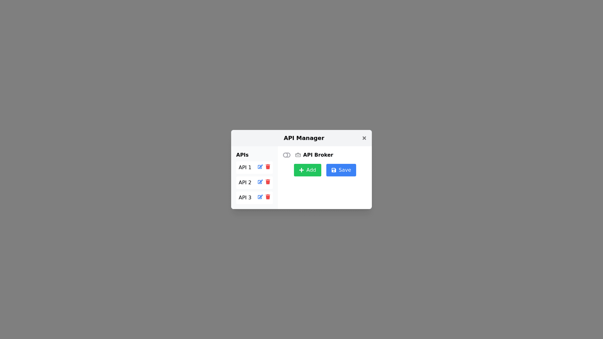
Create a popover inside it will have a title bar with a title and a button on the right to close the window, in its glass on the left side a sidebar, or menu called Apis, below the title an icon will appear that works as a button toggle to turn on and off socket icon, next to it the icon and name of the api broker, the apis are available in list format, at the bottom of this list there are the buttons add save edit and delete all in icons, next to this menu appears if you click on add or edit form hoods to add the api or edit an existing one
Prompt
