Drawer Width - Copy this React, Tailwind Component to your project
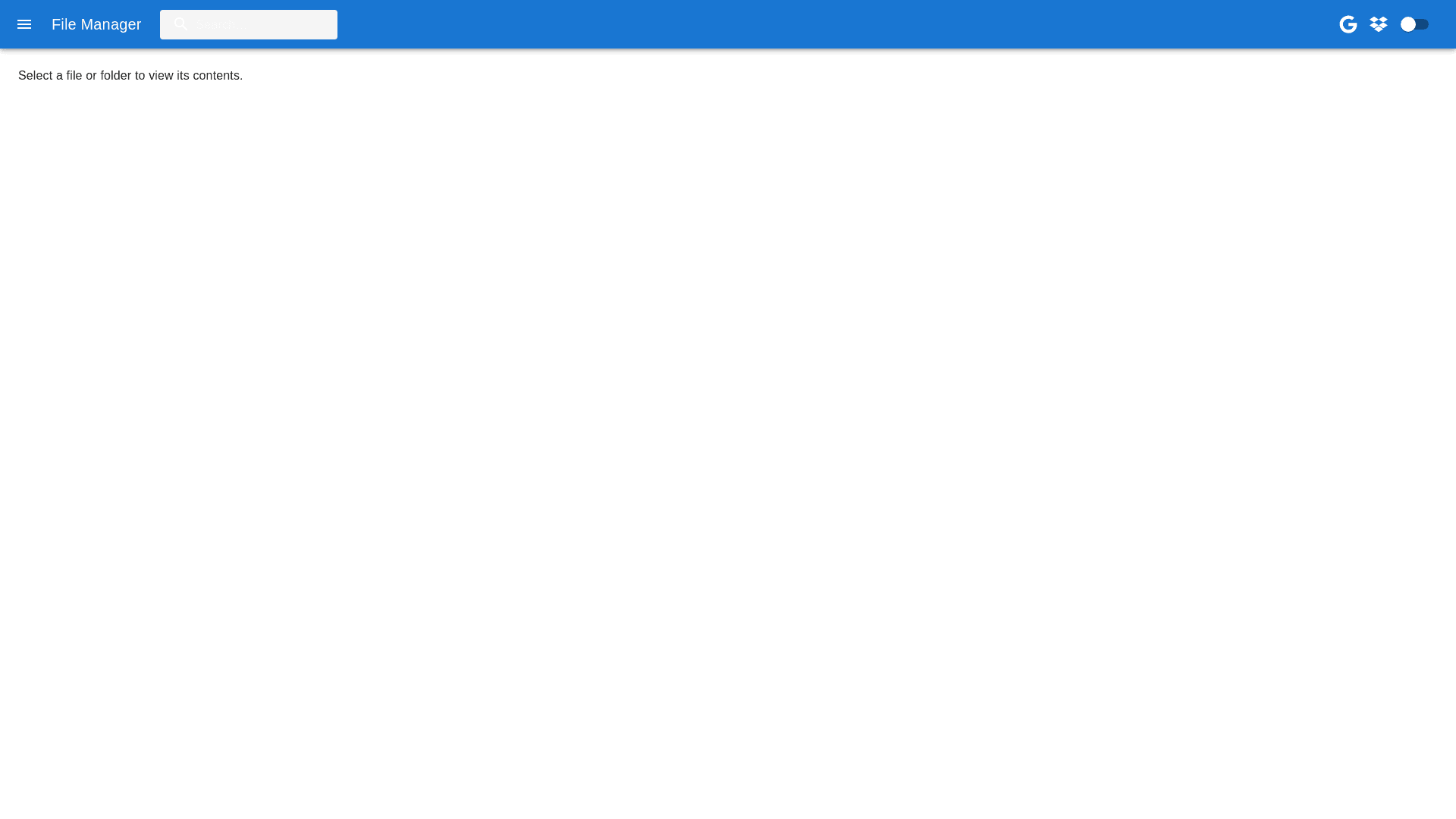
Prompt for Generating a Sidebar File and Folder Management Component: Component Overview: Create a React sidebar component using Material UI that replicates the provided UI image. The component includes a top bar with a "New File" button and a folder icon button, followed by a list of folders and files. Ensure the design closely matches the visual style in the image. Styles: Sidebar Container: Use a dark theme with a black background (#000000). Fixed width, with content structured vertically. Top Bar: "New File" Button: Displays a "+" icon and "New File". White background (#FFFFFF) with black text (#000000), rounded corners. Full width with flex grow to fill the remaining space. Folder Icon Button: Circular button, equal width/height, displaying a folder icon with a "+" symbol. White background, same styling as "New File" button, positioned next to it. Folder and File List: Folders: Expandable with chevron icons. White text, bold, reveals contents when expanded. Files: File icon with truncated names if needed. Clicking triggers file viewing or download. Functionalities: "New File" Button: Opens a modal for creating a new file via: File Upload: Supports file validation. Custom Text File: Users enter a filename and content. Adds to file list. Folder Icon Button: Opens a modal for creating a new folder. Adds the folder to the list after entering a name. Folder and File List: Folders: Expand/collapse to show/hide contents. Supports nested folders. Files: Click to open/download. Supports drag and drop for reordering. Data Structure: File Data: id, name, type, content, size, createdAt. Folder Data: id, name, items (array of file or subfolder IDs), createdAt. Additional Requirements: Responsiveness: Ensure the sidebar maintains layout across different screen sizes. Error Handling: Include user friendly error messages for upload failures, invalid file types, etc. Accessibility: Use ARIA labels, keyboard navigation support.