Chat Input Component - Copy this React, Tailwind Component to your project
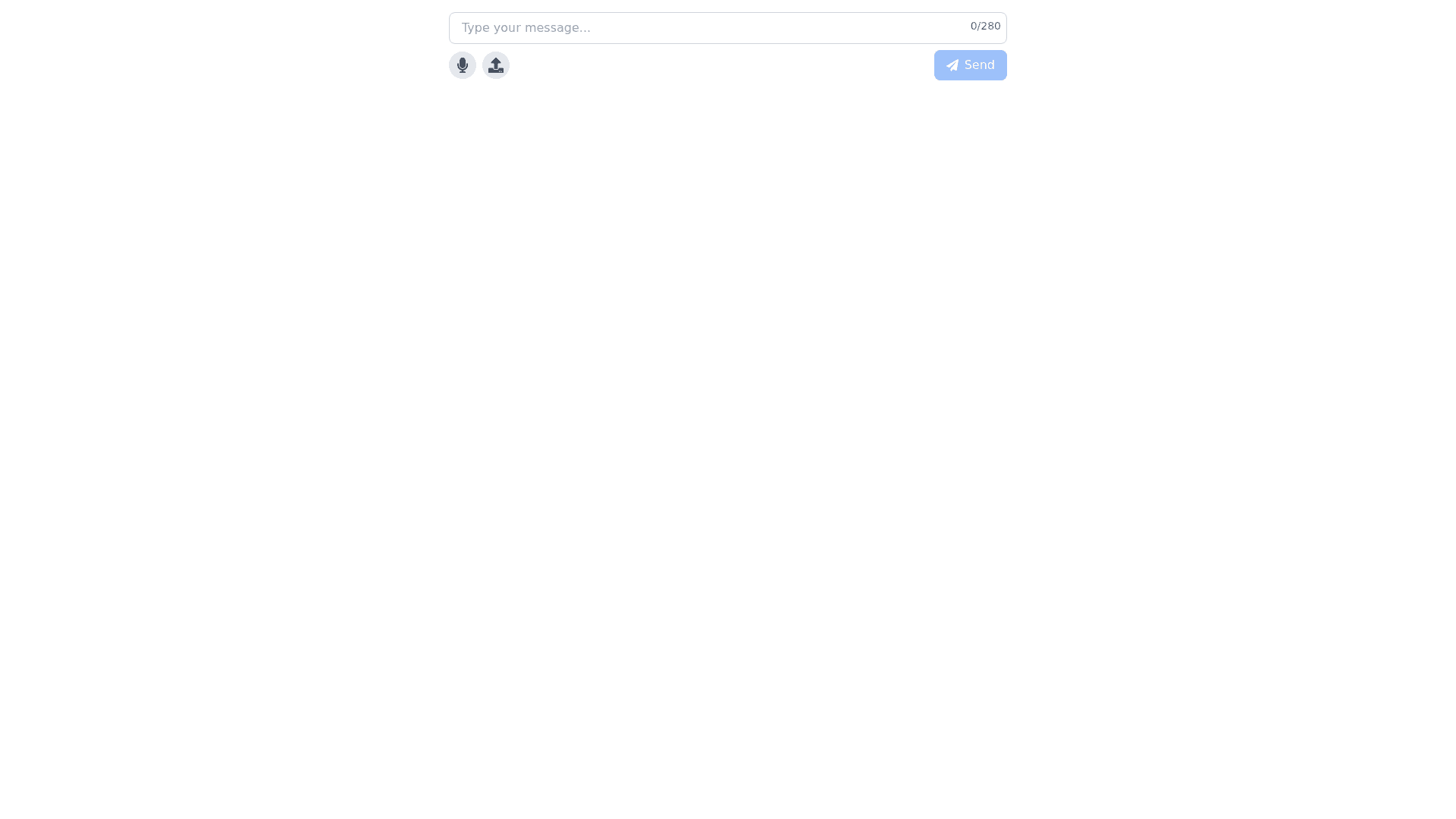
Text input field: Input Form: A text field that takes center stage at the bottom of the chat interface. The width of the field dynamically changes depending on the content to make it easier to enter long messages. The border of the field is silver gray (#A5A5A5A5) when inactive and changes to turquoise (#00B3B3) when the field is active. Placeholder: “Enter a message...” The placeholder text is in a neutral tone (dark charcoal, #333333) so as not to be distracting, but remain visible until the text is entered. The input font is Roboto Regular and the text color is dark charcoal (#333333) for excellent readability. Message length indication: When the message is too long, a prompt appears to indicate that the character limit has been exceeded. The warning text is displayed in red (#FF0000) to be prominent and alerting. Send Message Button: The main send button is located to the right of the input field and is in the form of an arrow icon. The icon is branded: the outline is in deep blue (#003366), and on hovering the cursor the color changes to turquoise (#00B3B3) for an activation effect. When sent, the message disappears from the input field and a micro animation runs to indicate the sending process. Voice input button: To the right of the send button is a button for voice input. The microphone icon is designed in the same style as the send button, supporting the corporate identity. When voice input is activated, the icon is highlighted in turquoise and a visual indication of recording (animated wave or dot) is launched, signaling the user that recording has started. Voice commands are processed and converted into text that appears in the input field before sending. The user can edit it before sending. Upload/Send Indicator: When the submit button is clicked or voice input is completed, a download process indicator appears, in the form of a circular turquoise colored animation (#00B3B3) that demonstrates that the request is being submitted. Adaptability and responsiveness: The component is adaptive for different devices: on mobile devices, elements of the component are enlarged to improve interaction (for example, buttons become larger for easy finger tapping). Responsive design: The input field and buttons are automatically rearranged based on the screen size. On mobile devices, the text field collapses when voice input is activated to save space. Interactive tooltips: When you hover over an input field or button, small tooltips are displayed, such as “Send Message” or “Enter by Voice”. This helps users learn the functionality faster and makes interaction easier. Styling of icons and visual elements: All icons, including the send arrow and microphone, are designed in a uniform flat and two dimensional style with clean lines and contrasting colors that support the technological and minimalist nature of the interface.