Dashboard - Copy this React, Tailwind Component to your project
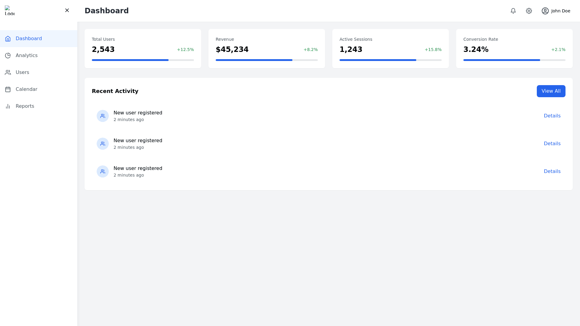
Layout and Components: Top Navigation Bar: The bar includes the system logo on the left, likely representing the brand or product. To the right, there's a user profile icon or a placeholder image, which may represent the logged in user. The navigation also features links or icons for accessing different sections of the platform, such as “Dashboard,” “Notifications,” and possibly settings or other utilities. Sidebar/Navigation Menu: The sidebar on the left side appears to list various menu items, with highlighted sections showing which part of the platform the user is currently on. Icons next to each menu item represent their function visually (e.g., a house for Dashboard, a document for "Reports," and a gear icon for settings). The active section is visually distinct with a color change or highlighted background. Main Content Area: The main content area features a large summary box or overview that could display metrics, charts, or important updates for the user. Below or beside this, there may be individual sections such as a list of items, a graph, or statistics, showing the user's data or activity. Status Indicators: There appear to be status indicators or progress bars on the screen, possibly showing system health or user activity. Some parts of the UI may show real time information updates or alerts. Interactive Elements: Several buttons or action links are visible throughout, possibly for user interactions, like “Add,” “Update,” or “View more.” Hover effects or dynamic changes when interacting with elements can be assumed based on modern UI practices. Color Scheme: The color scheme is clean and professional, utilizing shades of blue, white, and gray, providing a calm and organized feel to the interface. Overall Design: The layout is organized into clear sections to allow the user to easily navigate between them. The interface is designed to be intuitive, likely with a focus on functionality and ease of use. Icons and buttons are strategically placed for quick access to the most important areas of the platform.