Data Visualization G U I - Copy this React, Tailwind Component to your project
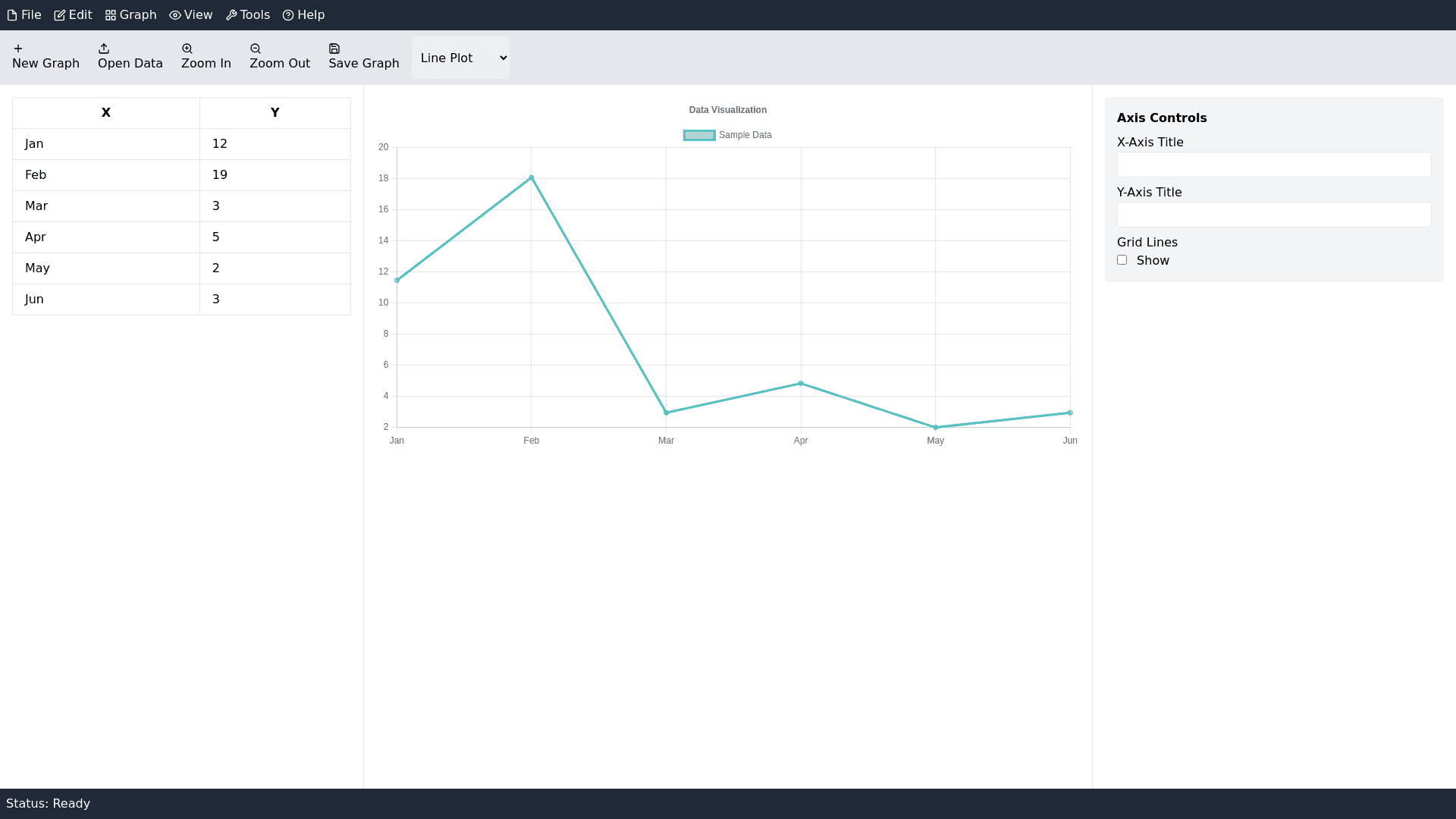
Create professional GUI with following features Main GUI Components: Menu Bar (Located at the top): The Menu Bar offers drop down menus for access to core functionalities. Key menus typically include: File: For actions like opening, saving, importing, and exporting data files. Edit: For modifying graphs, managing plot data, and other graph related tasks. Graph: To control aspects of the plots like axis settings, scales, and other customizations. View: Options to adjust the appearance of the workspace, such as zooming or changing the layout. Tools: Access to advanced settings or utilities for data analysis or graph styling. Help: Provides access to the user manual, tutorials, or troubleshooting information. Toolbar (Located directly under the Menu Bar): The Toolbar contains icons that provide shortcuts to frequently used commands. Common icons might include: New Graph: To create a new plot. Open Data: For importing datasets. Zoom In/Out: Allows users to zoom in or out on the graph. Save Graph: To save the current graph. Line Styles: For quick access to graph style adjustments, such as line thickness, markers, and colors. Plotting Area (Central Section of the Window): The Plotting Area is the main space where the graphs are displayed. It is dynamic and updates as you input or modify data and plot settings. You can interact with graphs directly, such as clicking on points, zooming in, or selecting specific data sets to analyze. Data Table / Spreadsheet (Located on the Left or Bottom): The Data Table is where users input or view data. It's typically organized in columns (for variables) and rows (for data points). You can copy paste data into the table or load external data from CSV, Excel, or text files. The data table is usually interactive, meaning updates made in the table can automatically reflect in the graph, and vice versa. Axis Control / Settings Panel (Located on the Right or Bottom): This panel allows you to configure the axes of the plot, including: X and Y axis settings: You can set the range, scale (linear, logarithmic), and labels. Gridlines: Controls for enabling/disabling gridlines. Axis Titles: Allows input for descriptive axis titles for clarity in scientific presentations. Graph Legend (Typically found in the Upper Right): The Legend shows the corresponding labels for different data series plotted on the graph. This helps identify which line or data point corresponds to which dataset. Status Bar (Located at the Bottom): The Status Bar provides information about the current operation. It may display: The current plot type (e.g., scatter plot, line graph). The dataset being used. Messages about ongoing operations or actions (e.g., "Data successfully imported"). Key Features: Graph Types: EasyPlot supports a variety of graph types, including: Line Plots: Ideal for showing trends over time or continuous data. Bar Charts: Used to compare quantities across different categories. Scatter Plots: Best for visualizing relationships between two variables. Histograms: For displaying the distribution of data. Pie Charts: For representing data as parts of a whole (though less common in scientific plotting). Data Handling and Import: Users can input data manually into the data table or import it from external files like CSV or Excel. Supports editing of datasets directly from the table, including sorting, deleting rows, or applying transformations. Customizable Axes: Users can adjust axis ranges, labels, and scales (linear or logarithmic). The Auto Scaling feature ensures that axes adjust dynamically based on the data. Plot Customization: You can change the appearance of your plots, such as: Line styles and markers: Solid, dashed, dotted lines, and various marker shapes. Colors: Set different colors for each data series. Gridlines: Control the visibility and frequency of gridlines for better readability. Data Fitting: EasyPlot provides options to apply mathematical fitting functions (like linear, polynomial, or exponential fits) to the data. Users can specify the type of fit, and the software will display the fitted curve alongside the original data. Export Options: Plots can be saved in a variety of image formats like PNG, JPG, and BMP for inclusion in reports or presentations. Data can also be exported back to CSV, Excel, or other file types. Interactive Features: Zooming: Zoom in/out to focus on specific parts of the plot. Point Identification: Users can click on specific points to get details about the data values at those coordinates. Graph Annotations: Users can add annotations such as text, arrows, or shapes to highlight certain aspects of the graph, making the presentation more informative. Multiple Graphs: Multiple graphs can be created and displayed simultaneously in different windows or tabs. You can compare several datasets side by side or combine them into one graph with different axes or plot types. Statistical Analysis: It often includes tools for performing basic statistical analysis on data, such as calculating averages, standard deviations, and more. These functions help in quickly interpreting the dataset's characteristics.