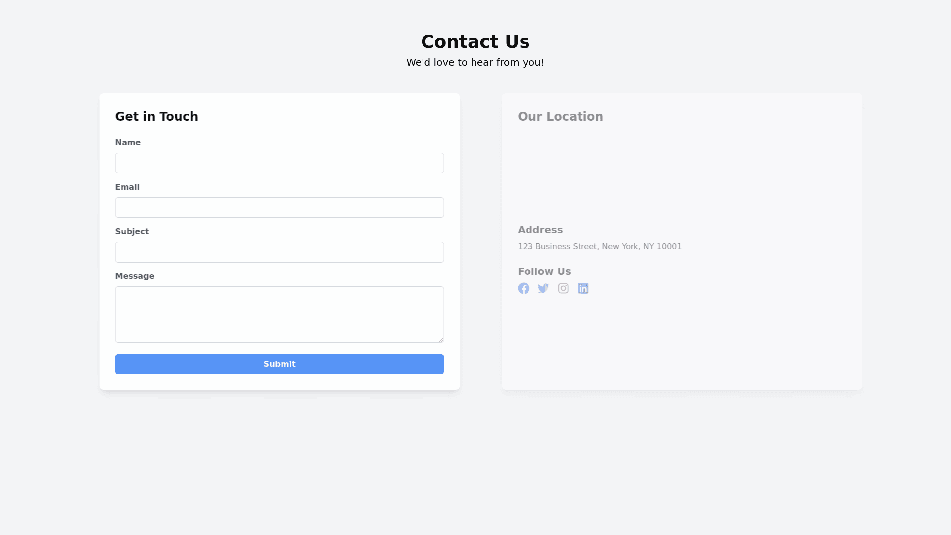
Contact Us - Copy this React, Tailwind Component to your project
You are an expert web designer your Objective: Design a visually stunning, fully responsive web portfolio for showcasing your work as a web designer. The portfolio should include modern animations, a user friendly interface, and be optimized for various screen sizes, from mobile devices to large desktop monitors. 1. Structure and Layout: Homepage: Hero section with a captivating background image or animation. Introduction with a professional profile picture and a brief bio. Navigation menu with smooth scroll functionality. Featured work section with a grid or carousel showcasing top projects. Call to action buttons for contacting or viewing the full portfolio. Portfolio Section: Categorized project galleries (e.g., Web Design, UX/UI, Branding). Each project should have a thumbnail, title, and brief description. Interactive elements such as hover effects and lightbox modals for project details. About Me Page: Detailed biography with a timeline or infographic about career milestones. Skills section with interactive graphs or progress bars. Testimonials or client feedback with a sliding carousel effect. Contact Page: Contact form with fields for name, email, subject, and message. Integration with Google Maps or a similar service for location. Social media links with animated icons. Blog Section (optional): List of recent posts with featured images and excerpts. Each post should have a dedicated page with a clean reading layout. 2. Design Elements: Typography: Use modern, legible fonts with a clear hierarchy (e.g., Google Fonts or Adobe Fonts). Ensure text is responsive and adjusts for different screen sizes. Color Scheme: Choose a cohesive color palette that reflects your brand identity. Incorporate contrasting colors for call to action buttons and interactive elements. Imagery and Media: High quality images and videos that showcase your projects. Use SVGs for icons and scalable graphics. 3. Animations and Interactivity: Page Load Animations: Smooth transitions for page loads, with a preloader animation if necessary. Scroll Animations: Parallax effects for background images. Fade in or slide in animations for content as the user scrolls. Hover Effects: Interactive hover effects for buttons and project thumbnails (e.g., zoom in, color change). Micro Interactions: Subtle animations for form fields, buttons, and other interactive elements to provide feedback. 4. Responsiveness: Mobile Optimization: Ensure all elements are touch friendly and accessible. Use a mobile first approach for designing and testing. Tablet and Desktop Optimization: Adjust layout and content presentation for larger screens while maintaining usability. Breakpoints: Design for common breakpoints: mobile (320px), tablet (768px), and desktop (1440px+). Test across various devices and screen sizes to ensure consistency. 5. Performance: Load Times: Optimize images and videos for faster load times. Implement lazy loading for off screen elements. SEO: Ensure SEO best practices are followed (e.g., proper meta tags, alt text for images). Use semantic HTML for better search engine indexing. 6. Accessibility: Compliance: Follow WCAG (Web Content Accessibility Guidelines) to ensure accessibility. Provide alternative text for images and ensure keyboard navigability. Contrast and Readability: Ensure sufficient color contrast for readability. Use legible font sizes and spacing. 7. Tools and Technologies: Frameworks and Libraries: Use modern frameworks and libraries like React, Vue.js, or Angular if needed. Utilize CSS preprocessors like SASS or LESS for efficient styling. Testing and Debugging: Test across different browsers and devices. Use developer tools to debug and optimize performance.
