Whiteboard - Copy this React, Tailwind Component to your project
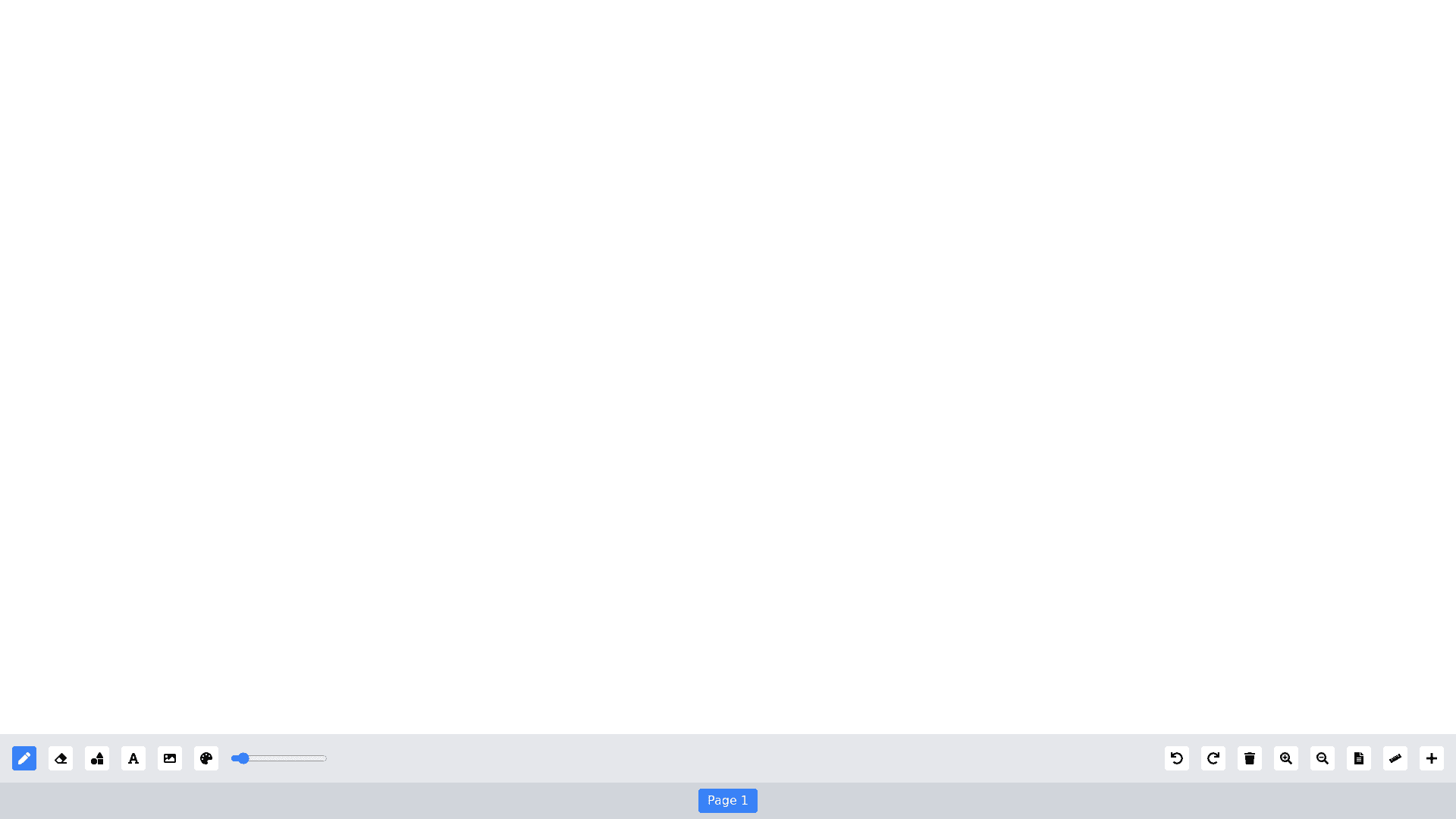
Build a fully functional whiteboard as a React component with the following features: Layout & Responsiveness: The whiteboard should occupy 100% of the width and be responsive, adjusting to different screen sizes. Below the whiteboard, include a toolbar for drawing and editing tools, ensuring an intuitive layout with icons/buttons for each function. Tools Panel: Move/Select Tool: An arrow icon that lets users select, resize, and move objects like text, shapes, images, and drawings. Include handles for resizing, and objects should deselect when clicking outside or pressing "Escape." Pen Tool: A round tipped pen with an adjustable size (via a slider and number input) for freehand drawing. Different pen types: Marker: 70% transparency. Ink pen: Square and tilted line pointers for unique strokes. Once selected, the pen will draw on the whiteboard in the specified style. Eraser Tool: Erase drawn elements with adjustable size (round or square shape). The eraser’s shape should visually match the selection. Color Picker: When clicked, a color panel opens to choose a color. The selected color applies to the active drawing tool, shape, or text and will persist across different tools. Shape Tool: A popup with various shape options: line, rectangle, oval, triangle, and star. Upon selection, the user can draw the shape on the whiteboard. Text Tool: Enables users to add text by double clicking the whiteboard to type, with the text being editable (color, font, size) after creation. Image Tool: Insert images from the user's computer, with options to resize and move the image once uploaded. Undo/Redo: Step back or forward through up to 10 actions, maintaining a history of changes. Clear Button: Clear the entire whiteboard content with one click. Zoom In/Zoom Out: Zoom in with a magnifying lens cursor displaying a "+" symbol; dragging to select a specific area zooms it to fit the screen. Zoom out with a magnifying lens cursor displaying a " " symbol; clicking or dragging adjusts the view accordingly. Background Tool (Paper Icon): Change the whiteboard background to graph paper, notebook lines, or other patterns. A popup menu offers background options, including colors and patterns. Paper Size Tool: Allows users to input custom height and width in pixels or select from predefined sizes (e.g., A4 Horizontal, A4 Vertical, A3 Horizontal, etc.). New Page Tool: Add a new page or canvas below the current whiteboard, with navigation buttons (previous/next arrows) to move between pages. Object Interaction: Allow selection of any drawn object (shape, text, image) using the arrow tool. Users can move, resize, or delete selected objects. Deletion should also be possible via the keyboard "Delete" key. Resizable handles should appear around selected objects for resizing and moving. Clicking outside an object or pressing "Escape" should deselect the current selection. Typed text should remain editable, and users should be able to change text or shape color via the color picker. General Functionality: The drawing mode should display immediately when the pen is selected. Objects like text, shapes, and drawings should respond to selection, allowing users to update properties like size, color, or position. The design must remain responsive, ensuring usability across all device sizes.
