Tab Content - Copy this React, Tailwind Component to your project
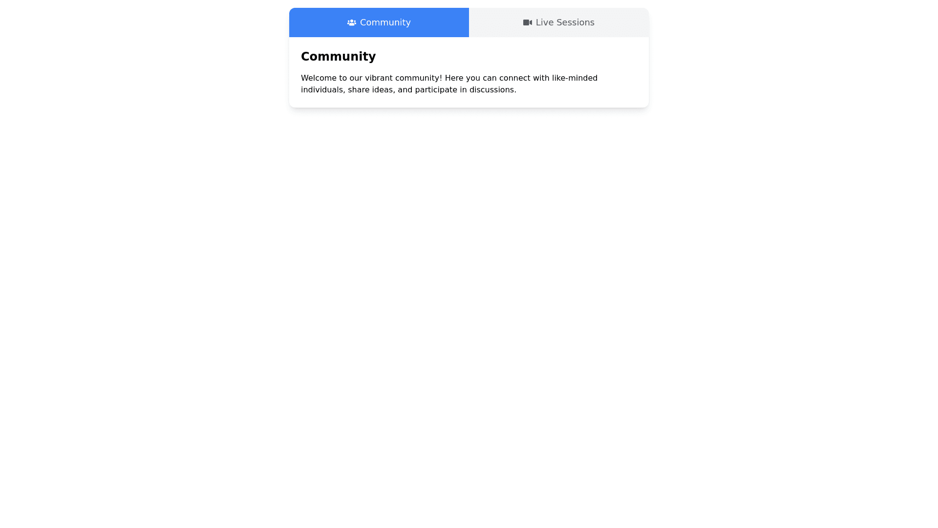
Create a responsive animated tabbed menu component that includes two items: Community and Live Sessions. The menu should follow these design principles: Layout & Style: Use a rounded rectangle container with two tabs side by side, each representing one menu item. The tabs should have soft rounded corners and a modern aesthetic. When clicked, the active tab should have an animation (e.g., slide in or fade effect) to indicate the active state, while the content area below should display the corresponding tab content. Animation & Transitions: Smooth transitions should occur when switching between tabs (e.g., slide or fade animations). When a tab is clicked, the active tab should change its background color and have a subtle animation to show it is active (e.g., a sliding underline or color gradient). Responsiveness: The layout must be fully responsive, adapting to mobile, tablet, and laptop screens. On smaller screens (mobile), the tabs should stack vertically or shrink in size, while on larger screens (tablet/laptop), they should remain side by side. Use media queries to adjust layout and font sizes based on screen size. Component Breakdown: Each tab should display a title (e.g., “Community” and “Live Sessions”). Upon clicking a tab, the corresponding content should be displayed, and the previously active content should be hidden with smooth animation. Ensure that the component has good spacing and padding for comfortable interaction on touch devices (e.g., tablets and mobile). Styling & Design: Use a minimalistic and clean design with light background colors for the tabs. Utilize modern fonts (e.g., Google Fonts like Inter or Roboto) for a clean look. Add hover effects for desktop interactions (e.g., subtle shadow or color change when hovering over tabs). Tab Content: For the Community tab, include a placeholder for a community section (e.g., text or image). For the Live Sessions tab, include a placeholder for live sessions information (e.g., schedule or description). Code requirements: Use React and CSS in JS or any preferred CSS framework like TailwindCSS for styling. Optionally, include animation libraries like Framer Motion for the tab transitions. The component should be easily customizable, allowing changes to tab titles, content, and colors.
