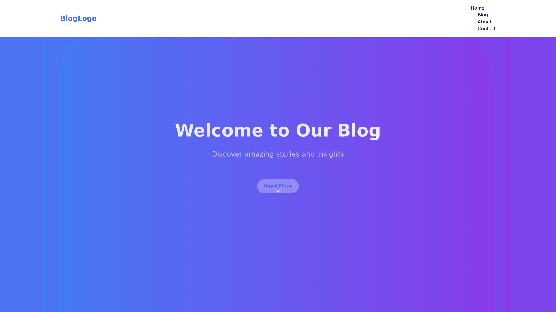
Blog Website - Copy this React, Tailwind Component to your project
Create a single page blog website using HTML, CSS, and JavaScript. The website should be responsive and work perfectly on desktop, tablet, and mobile devices. Include a header section with a top navigation bar featuring a logo on the left and a hamburger menu on the right for smaller screens (tablet and mobile) that expands into a vertical menu when clicked. Implement smooth animations for the hamburger menu opening and closing. Include a full width hero section with a background image or gradient, a title and subtitle, and a call to action button (e.g., "Read More" or "Subscribe"). Add a scroll down animation indicator. Create a blog section displaying blog posts in a card layout. Each card should contain a featured image, title, short description, and a "Read More" link/button. On smaller screens, arrange the cards in a single column; for larger screens, use a grid with 2 3 columns. Add an about section that includes a short bio or introduction about the blog or author, with an image and animated text effects (e.g., fade in or slide in). Include a contact section with a simple contact form that has fields for name, email, and message, with form validation using JavaScript. Provide a submit button with a hover effect. Create a footer with social media icons and copyright information, using smooth hover animations for the icons. Use CSS animations for smooth transitions and hover effects. Add a scroll reveal effect for different sections to appear as you scroll down. Ensure the website is responsive using media queries, so the layout adjusts properly on desktop, tablet, and mobile. The hamburger menu should only appear on tablets and mobiles and be hidden on desktop screens.
