Header - Copy this React, Tailwind Component to your project
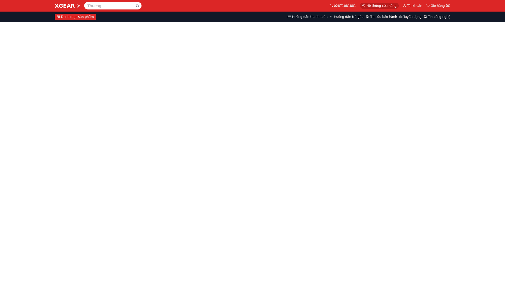
Responsive Header Design: Logo: The "XGEAR" logo remains in the top left corner but appears scaled down to fit the narrower screen size. Search Bar: The search bar is still prominently placed, occupying a large portion of the top section. The placeholder text ("Thương hi...") is truncated due to the limited space, and the search icon (magnifying glass) remains on the right, resized to fit appropriately. Hotline: The hotline number "02871081881" is still displayed with a phone icon before it. However, the elements are scaled down and aligned to accommodate the smaller screen. Store Locator & Cart: The store locator button (with a location pin icon) and the cart button (with a shopping cart icon and item count) are still present but resized and placed closer together to conserve space. The login and register section (user icon) is also scaled down but maintains its functionality. Responsive Sub-Header Design: Product Categories & Guides: The second navigation bar still displays categories such as "Danh mục sản phẩm" (Product Categories) with a grid icon, along with payment guides, installment guides, warranty lookup, and careers. However, the spacing between these items has been reduced, and the icons have been resized to appear more compact on smaller screens. Key Features of the Responsive Design: Element Size Reduction: All elements in both the header and sub-header are scaled down but retain their full functionality. Compact Layout: Items are placed closer together, but the design still avoids a cluttered look. Prioritization of Key Elements: Important components such as the logo, search bar, hotline, cart, and product categories are given prominence, ensuring a functional experience even with limited screen space. This responsive design is optimized for mobile devices and tablets, maintaining a clean and functional layout for users on smaller screens.