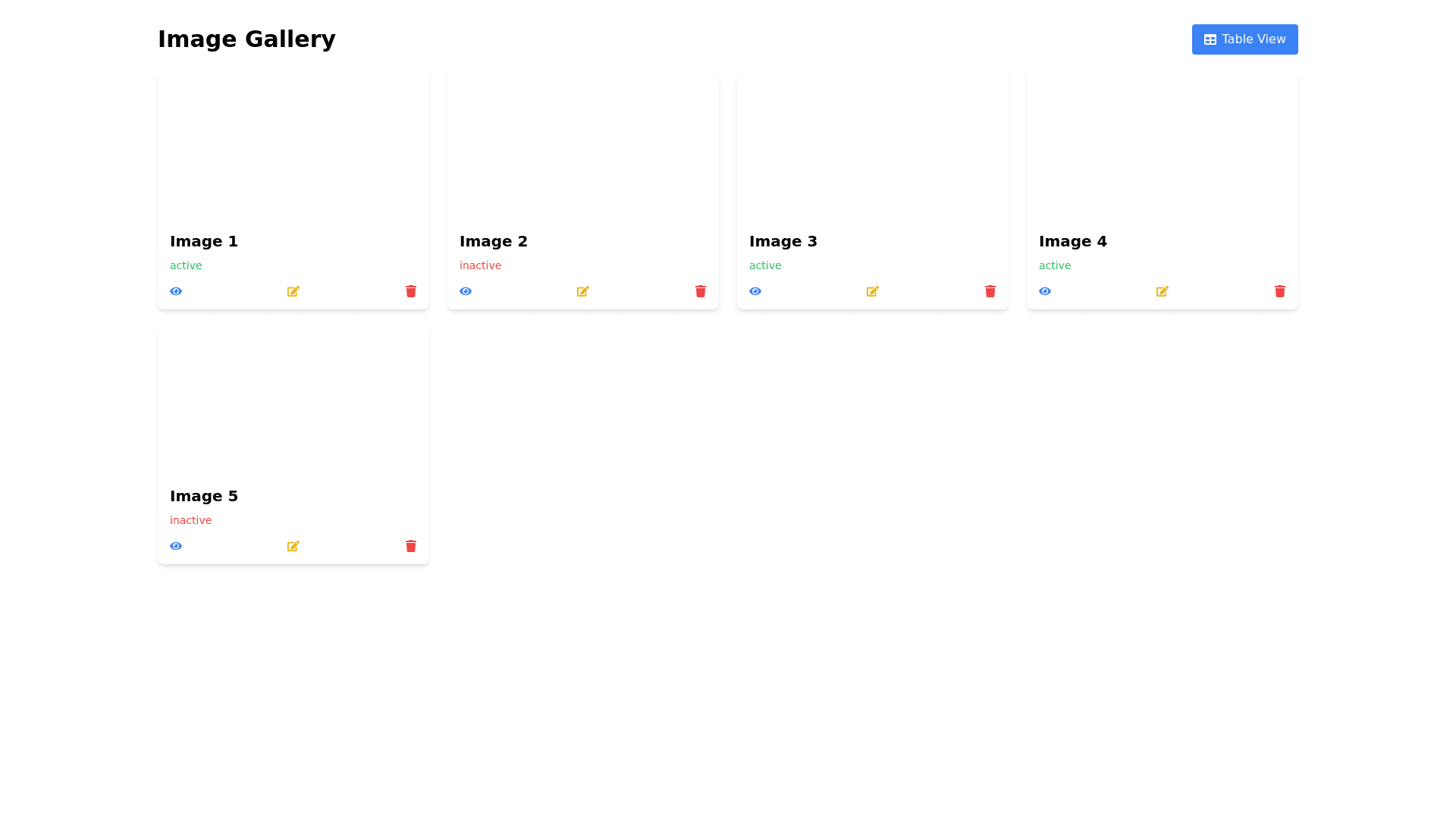
Image View Page - Copy this React, Tailwind Component to your project
Design a responsive image view page with two toggleable views: a table view and a card view. Each item in the dataset includes an image URL, ID, status, and description. Table View: Display the data in a table format with columns for the image (as a thumbnail), ID, status, and description. The image column should show a small preview of the image URL. The status should be color coded (e.g., green for active, red for inactive). Each row should allow actions like view details, edit, or delete. Card View: Each card should display a larger image at the top (using the image URL). Below the image, show the ID, status (color coded), and description. Cards should be responsive and adjust based on the screen size, forming a grid layout. The user should be able to switch between the table and card views via a toggle button at the top of the page.
