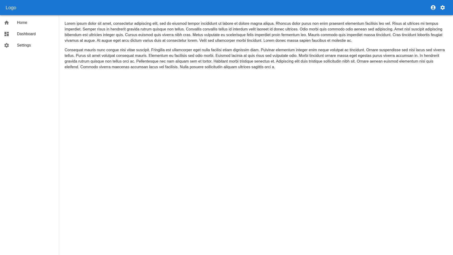
Drawer Width - Copy this React, Mui Component to your project
Generate a responsive layout code for a React component that includes the following: Sidebar: A fixed, vertical sidebar on the left hand side of the screen. The sidebar should occupy a fixed width (e.g., 250px on desktop) and collapse into a narrow version with just icons (e.g., 80px) on smaller screens or when toggled. The sidebar should be hidden behind a hamburger menu on mobile screens, sliding in and out when the hamburger is clicked. Topbar: A horizontal topbar at the top of the screen, spanning the full width. The topbar should remain fixed while scrolling and should include space for a logo, page title, and user controls (like profile and settings). It should adjust its height depending on the screen size, with a compact version for mobile devices. Content Area: The main content area should take up the remaining space to the right of the sidebar and below the topbar. The content should be responsive, filling all available space dynamically. Ensure proper padding for content, and maintain good readability on all devices. Responsive Design: The layout should be fully responsive, adjusting for all device sizes (mobile, tablet, desktop). On smaller screens, the sidebar collapses or becomes hidden, the topbar becomes more compact, and the content area fills the remaining screen space. For mobile, ensure touch friendly design (e.g., larger clickable areas and icons).
