Responsive Layout - Copy this React, Tailwind Component to your project
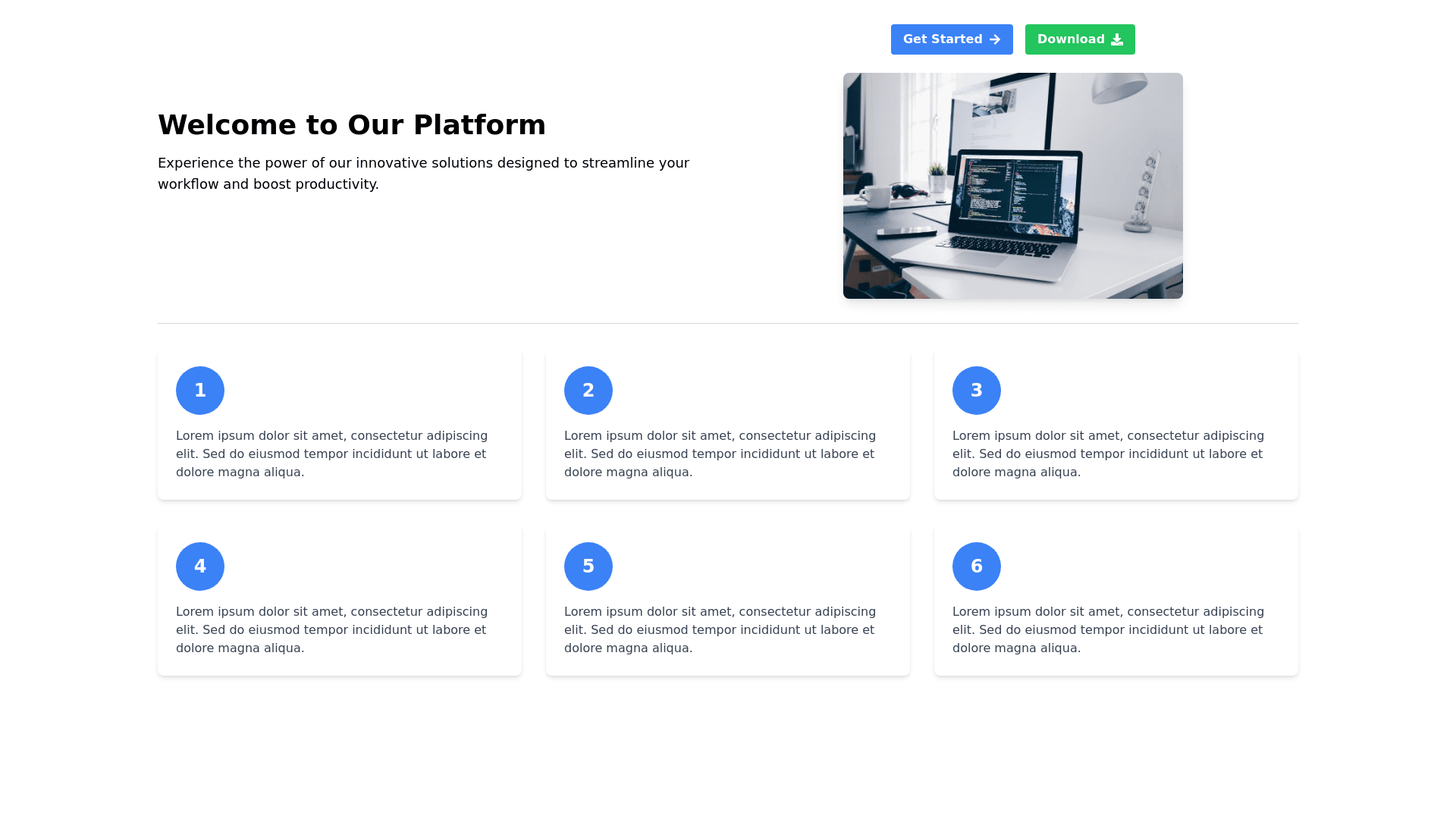
Create an layout with the following structure: Title: Positioned at the top. Description: A paragraph following the title. Buttons: Two buttons next to each other. Image: Inside a div following the buttons. Separator: An <hr> tag below the image. Responsive Layout: Mobile View: The title, description, buttons, and image should stack vertically. The buttons should be horizontal next to each other, and the image should be below the buttons. Large Screens: The title and description should appear in a vertical column on the left. The buttons and image should be displayed in a horizontal row on the right, with the image in a div and text aligned. Following the separator, add a section with six responsive div elements. Each div contains a nested div and a paragraph. Ensure these div elements stack vertically on mobile and align horizontally in a grid on larger screens.
