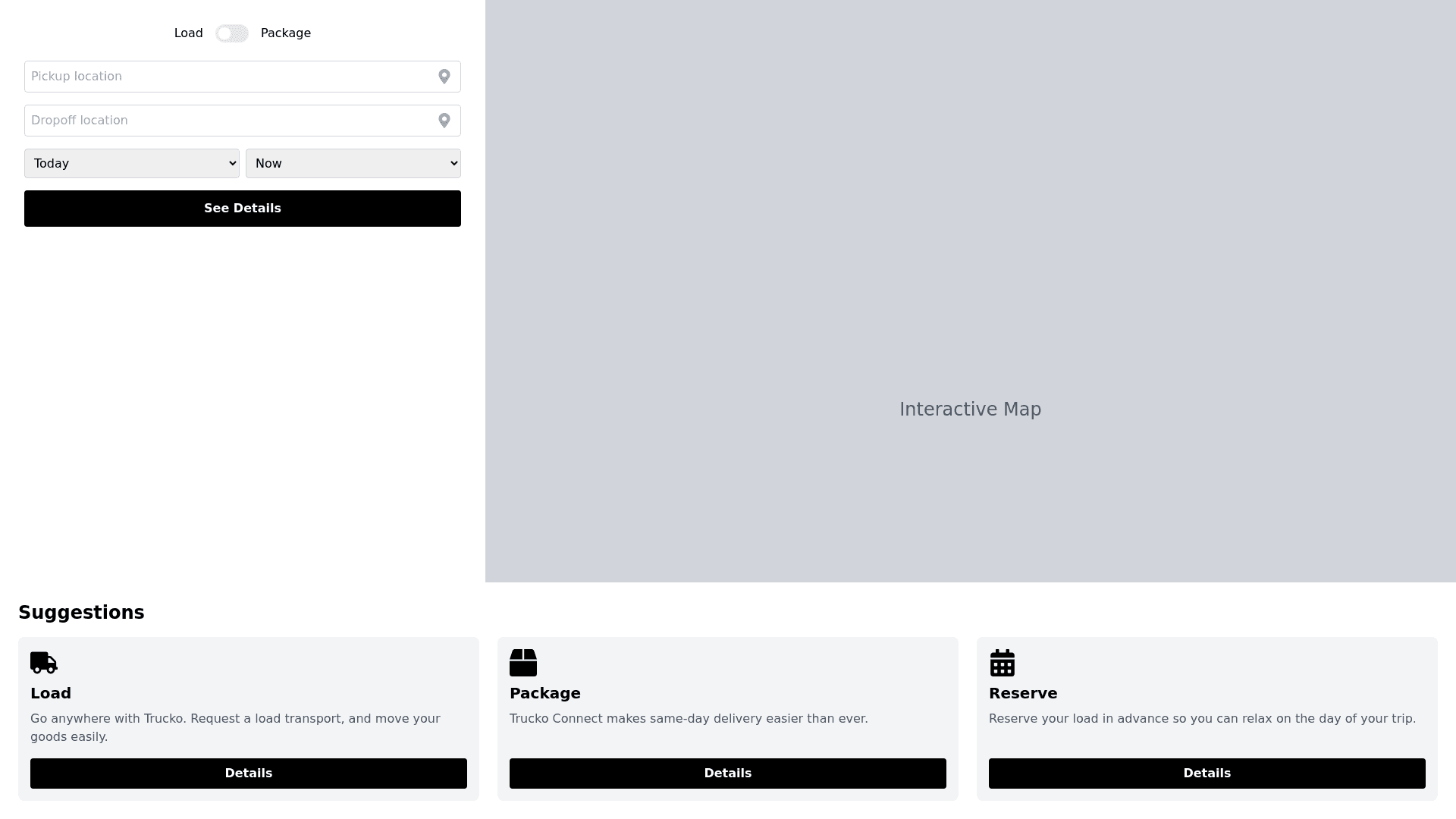
Trucko Booking - Copy this React, Tailwind Component to your project
Implement a fully responsive layout for the 'Trucko' load booking interface. Ensure the following elements adjust dynamically across all device types and screen sizes, including desktop, tablet, and mobile: Left Panel: Ensure that the toggle for 'Load' and 'Package' options, the input fields for 'Pickup location' and 'Dropoff location,' and the dropdown menus for date and time are flexible and responsive. On smaller screens, stack these elements vertically, ensuring no overlap. The location icon should adjust in size and positioning relative to the input fields for seamless user interaction. The 'See prices' button should resize proportionally and maintain adequate spacing between other elements, ensuring it remains prominent and touch-friendly on mobile devices. Map Section: The interactive map should automatically resize according to the available screen space. On smaller devices, collapse the map into a smaller view or hide it under a collapsible button, allowing users to toggle its visibility while maintaining performance. Suggestions Section: Each card ('Load,' 'Package,' and 'Reserve') should shrink or stack vertically when viewed on smaller devices. The icons, text, and 'Details' button should resize accordingly without sacrificing clarity or readability. Ensure proper padding and spacing between cards to maintain a clean, uncluttered layout. General Responsiveness: Use flexible grid layouts (such as CSS Grid or Flexbox) to ensure the interface adjusts smoothly across different breakpoints (desktop, tablet, mobile). Maintain appropriate text scaling for headers, labels, and button text so that all information remains readable without causing overflow or truncation issues on smaller screens. Ensure all touch elements (buttons, dropdowns) are optimized for both touch and mouse interactions, with proper hitboxes and padding. Incorporate fluid, percentage-based widths, media queries, and scalable typography to create a seamless experience across all devices. Ensure the design maintains visual consistency and usability across various resolutions, orientations (portrait/landscape), and screen sizes.
