IC
Iain Craig
Responsive Layout - Copy this React, Tailwind Component to your project
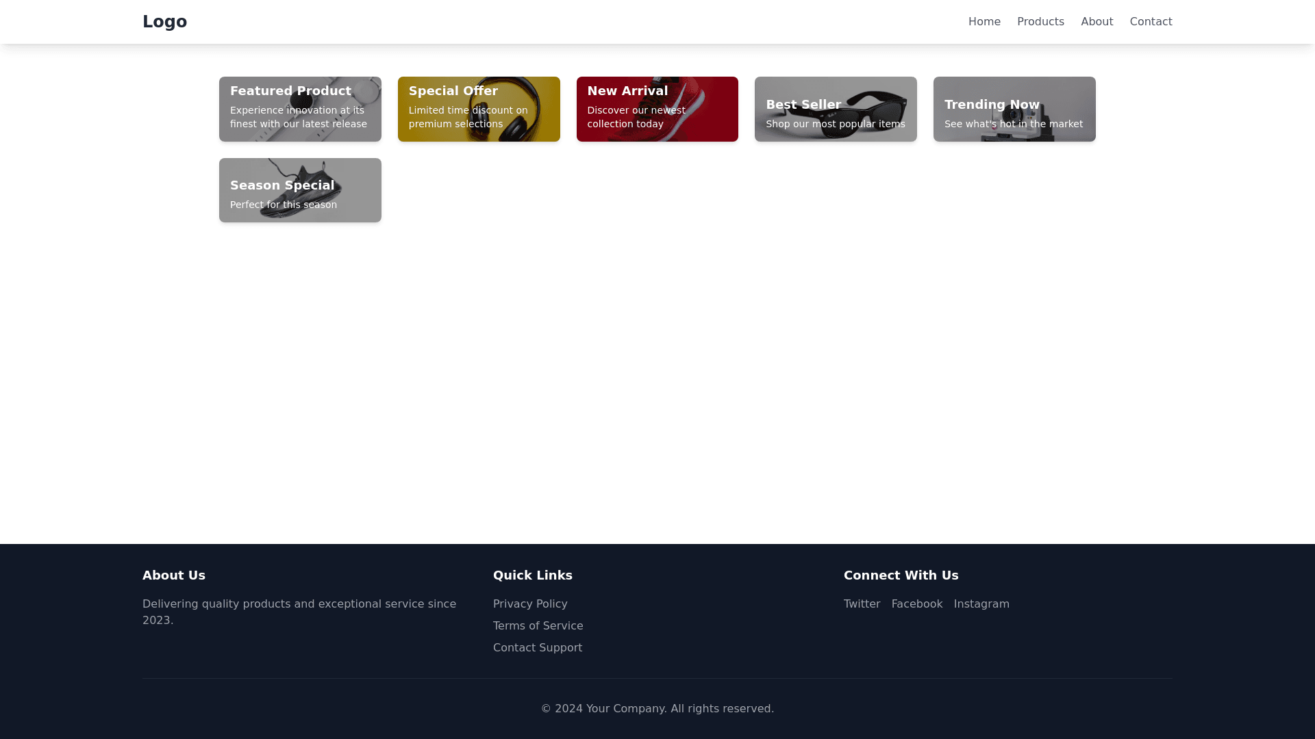
Generate-a-mobile-first-page-framework-with-3-main-areas:-Header,-main-area,-and-footer.-On-mobile,-header-should-scroll-out-of-view-when-the-page-scrolls,-while-on-desktop-it-should-stay-fixed-and-blur-content-underneath-it.-Main-area-is-a-grid-of-rectangular-cards-of-aspect-ratio-5:2;-these-should-collapse-to-1-card-wide-on-mobile,-while-on-desktop-they-should-go-to-a-max-of-5-per-row.-Above-a-certain-width-threshold,-center-the-main-area-content-and-limit-its-width.
Prompt
