Navbar - Copy this React, Tailwind Component to your project
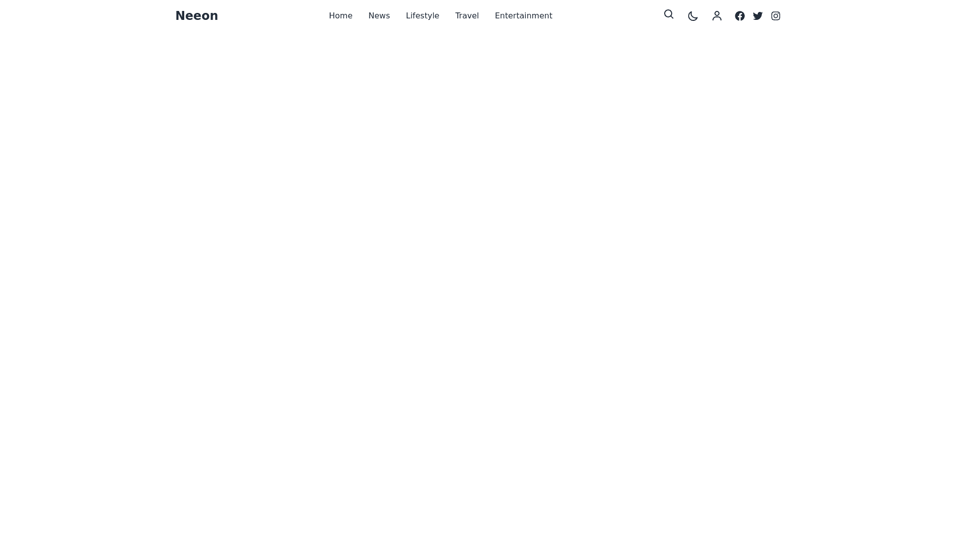
Create-a-responsive-and-modern-navigation-bar-similar-to-the-Neeon-WordPress-News-Magazine-Theme.-The-navbar-should-include-the-following-elements-and-features:-Structure:-A-full-width-navbar-that-adapts-to-desktop-and-mobile-screen-sizes.-Left-Section:-A-placeholder-for-the-logo-(e.g.,-"Neeon")-that-is-aligned-to-the-left.-Center-Section:-A-horizontal-menu-with-multiple-items-such-as-Home,-News,-Lifestyle,-Travel,-and-other-placeholders.-Right-Section:-Functional-icons-or-buttons,-including:-A-search-bar-icon-or-expandable-search-field.-A-dark-mode-toggle-switch-icon.-A-user-profile/login-button-(optional).-Social-media-icons-(e.g.,-Facebook,-Twitter,-Instagram)-for-quick-access.-Design:-Use-a-clean,-flat,-and-modern-design-with-minimal-borders-and-shadows.-Dropdown-menus-for-some-categories-(e.g.,-News-or-Lifestyle)-with-a-hover-or-click-effect.-Add-a-hover-animation-for-menu-items-(e.g.,-underline-slide-in-or-color-change).-Ensure-a-sticky-header-effect-so-the-navbar-remains-visible-during-scrolling.-Responsive-Design:-On-desktop:-Display-the-full-menu-in-a-horizontal-layout-with-dropdowns.-On-mobile/tablets:-Replace-the-horizontal-menu-with-a-hamburger-menu-on-the-right.-Expand-the-menu-to-a-full-screen-overlay-or-a-side-drawer-when-clicked.-Colors-and-Styling:-Background-color:-White-or-light-gray-for-desktop;-adjustable-for-dark-mode.-Font-style:-Use-a-modern,-readable-sans-serif-font-(e.g.,-Roboto-or-Open-Sans).-Font-size:-Slightly-larger-for-primary-menu-items-(e.g.,-16px),-smaller-for-dropdown-items.-Highlight-the-active-menu-item-with-a-distinct-color-or-underline.-Additional-Features:-Dropdown-menus-should-support-multiple-sublevels-for-categories-(e.g.,-News->-Local->-Politics).-Smooth-transitions-for-hover,-focus,-or-click-effects.-Sticky-navbar-functionality-for-better-usability-on-longer-pages.-Include-an-option-to-toggle-between-light-and-dark-modes.
