Responsive Page Framework - Copy this React, Tailwind Component to your project
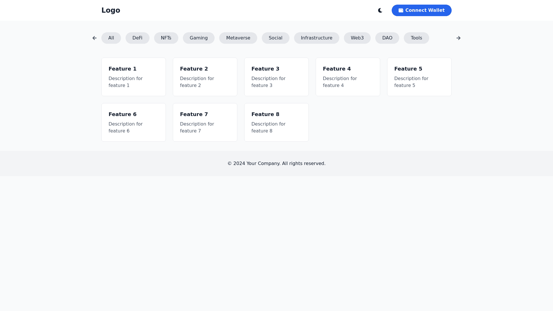
Generate a responsive page framework with 3 main areas: Header, main area, and footer. On mobile, header should scroll out of view when the page scrolls, while on desktop it should stay fixed whatever the scroll position, and blur content underneath it. Main area is a grid of rectangular cards of aspect ratio 5:2; these should collapse to 1 card wide on mobile and 2 cards wide on tablet, while on desktop they should go to a max of 5 per row. On desktop, center the main area content and limit its width. Include a dark mode / light mode toggle. Dark mode palette should use #1D052D for background, #4F0C67 / #A40879 for foreground elements, #FCEDF4 for text, and #FEEA13 / #FEC311 for contrast/flashes. Include gradient effect elements in the design. Include a hamburger menu for mobile. On mobile, the dark/light toggle should be in the hamburger menu. Include a horizontally scrolling bar of buttons beneath the header. On mobile, the user will drag to scroll them; on desktop, have two arrow buttons to smoothscroll them, at either end of the bar. Don't show a horizontal scroll bar. Add a bold Connect Wallet button in the header.
