Portfolio - Copy this React, Tailwind Component to your project
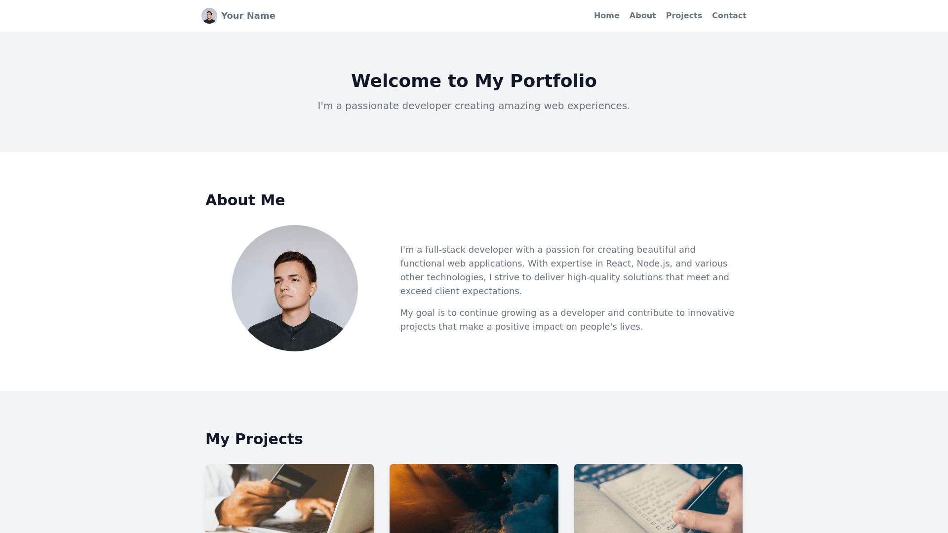
Create a responsive personal portfolio website that seamlessly adapts to various screen sizes, including Android, iOS, and larger displays. Key Features: Navigation Bar: Implement a top navigation bar with the following sections: Home, About, Projects, Contact. Each section should link to the corresponding content. Circular Profile Image: Place a circular profile image in the top left corner. Responsive Design: Ensure the layout and content adjust appropriately on different screen sizes and orientations. Smooth Transitions: Use smooth animations or transitions to enhance user experience. Clean and Modern Aesthetic: Maintain a clean, minimalist design with a modern aesthetic. Additional Considerations: Project Showcase: Highlight your projects with relevant information, such as descriptions, images, and links to live demos or repositories. Contact Information: Provide clear and accessible contact details, such as email, phone number, and social media links. About Section: Share a brief introduction about yourself, your skills, and your career goals. Customization: Feel free to add any additional elements or features that align with your personal brand and preferences. Example Technologies: HTML: Structure the website's content. CSS: Style the layout and elements. JavaScript: Enhance interactivity and functionality. Responsive Frameworks: Consider using frameworks like Bootstrap or Foundation for efficient responsive design.