User Profile Card - Copy this React, Tailwind Component to your project
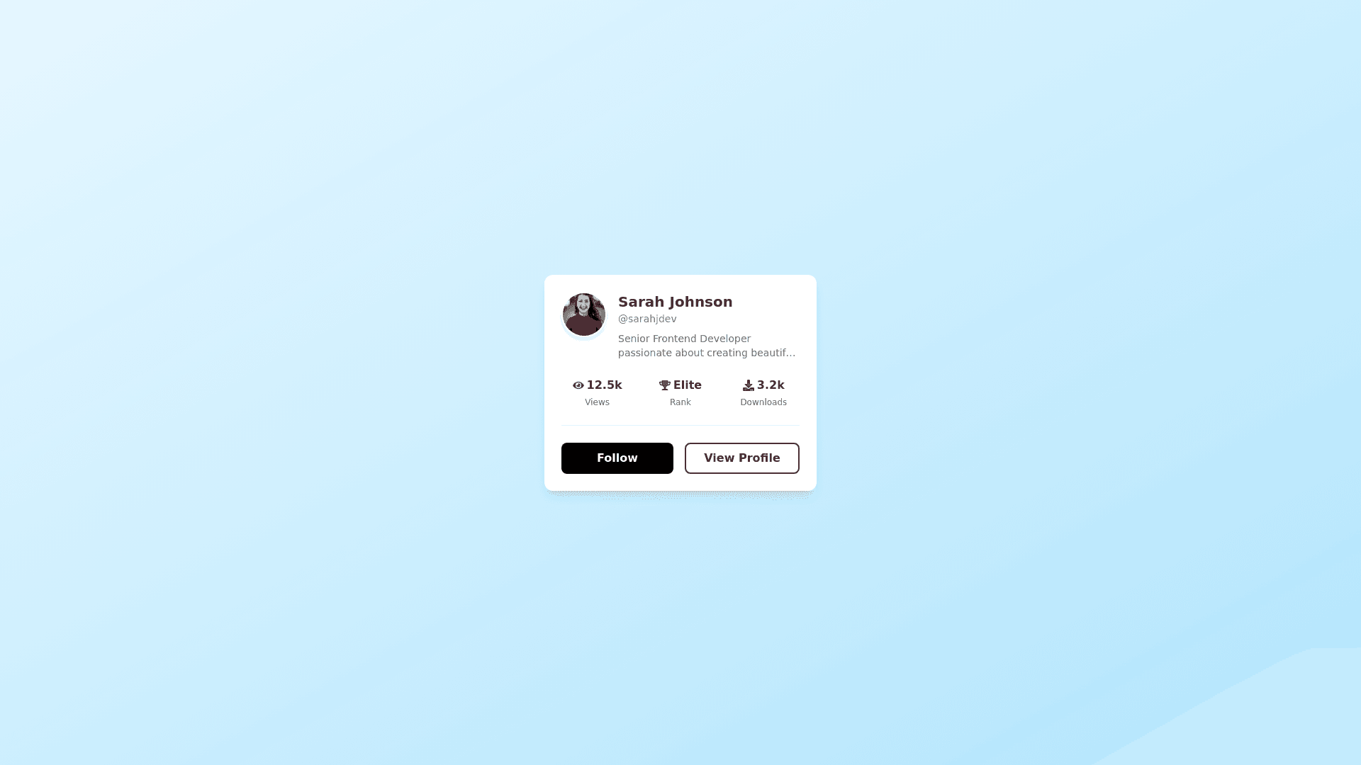
Create-a-responsive-React-component-styled-with-Tailwind-CSS-and-react-icons,-using-an-Ant-Design-Modal-for-extended-functionality,-replicating-the-provided-design-with-precise-color-schemes.-The-card-should-have-a-soft-blue-gradient-background-(#e6f7ff-to-#b3e5fc)-with-rounded-corners-and-a-subtle-shadow-for-depth.-Place-a-circular-avatar-with-a-white-border-and-shadow-at-the-top-left.-Below,-display-the-name-in-bold-black-(#333333),-the-username-in-lighter-gray-(#808080),-and-a-two-line-description-in-medium-gray-(#666666).-Add-three-stats—"Views,"-"Rank,"-and-"Downloads"—aligned-horizontally-with-dark-gray-text-for-the-label-and-black-for-the-values.-Include-two-buttons-at-the-bottom:-"Follow"-with-a-bold-black-background-(#000000)-and-white-text,-and-"View-Profile"-with-a-transparent-background,-black-border-(#333333),-and-black-text,-both-styled-with-hover-effects-for-slight-scale-and-color-change.-Ensure-the-design-remains-responsive,-with-smooth-ease-in-out-animations-for-hover-interactions-and-consistent-spacing-across-devices.