Slider Container - Copy this React, Mui Component to your project
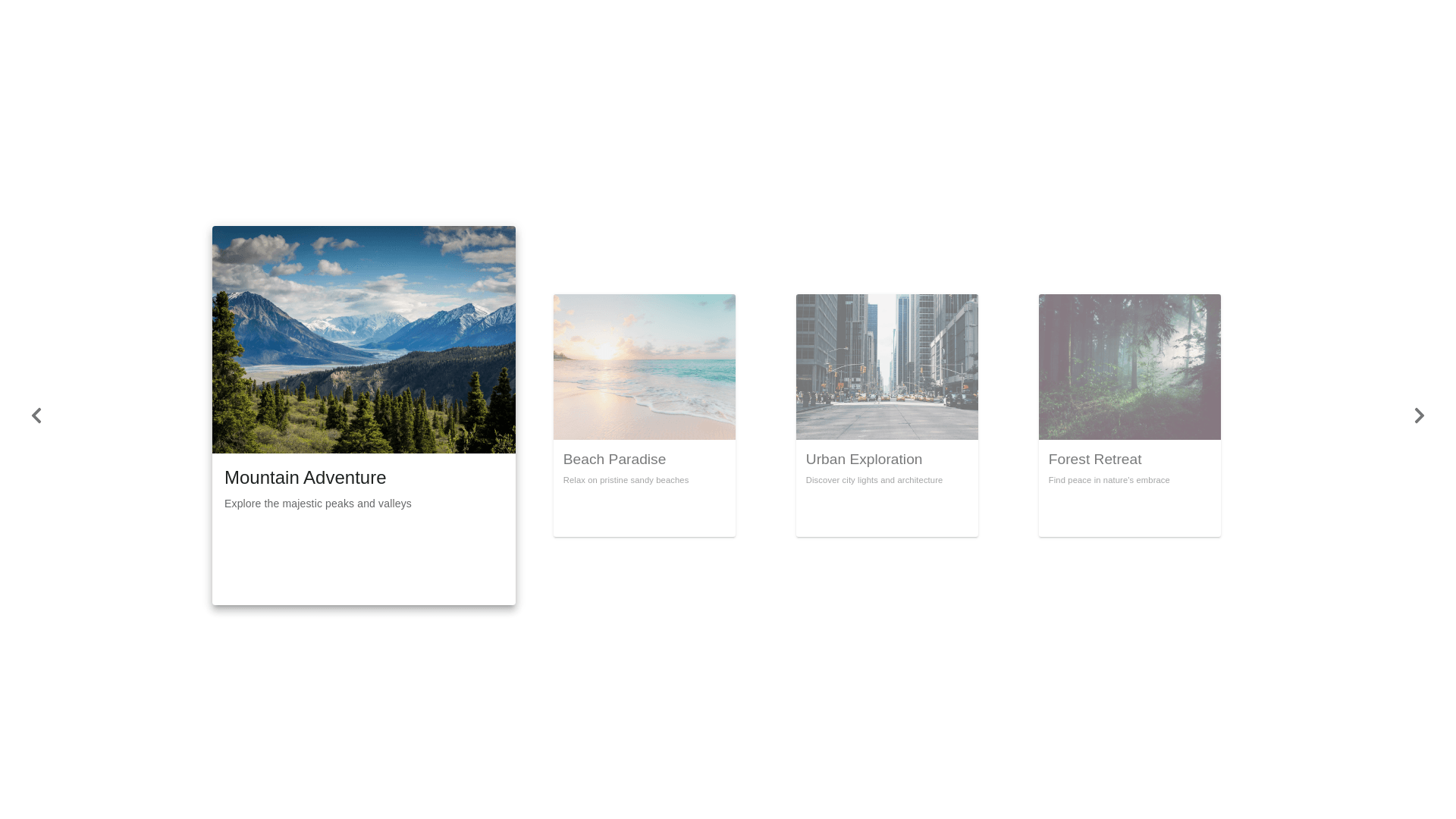
Hola por favor modifica este componente para que puedan verse las tarjetas del slider mejor con la de presentacion en el centro porque salen desproporcionadas y muy importante que todo sea responsive . este es mi componente import Link from "next/link"; import { Box, Typography, Button } from "@mui/material"; import { useState } from "react"; import icons from "../../utils/icons"; const Slider = ({ items = [], buttonStyles, containerStyles, boxStyles }) => { const [currentIndex, setCurrentIndex] = useState(0); const handleNext = () => { setCurrentIndex((prevIndex) => (prevIndex + 1) % items.length); }; const handlePrev = () => { setCurrentIndex((prevIndex) => prevIndex 1 < 0 ? items.length 1 : prevIndex 1 ); }; if (!Array.isArray(items) || items.length === 0) { return <p>No items available</p>; } return ( <Box sx={{ display: "flex", flexDirection: "column", alignItems: "center", width: "100%", maxWidth: "800px", margin: "0 auto", position: "relative", ...containerStyles, }} > {/* Botón Anterior */} <Button variant="contained" onClick={handlePrev} sx={{ minWidth: "40px", height: "40px", borderRadius: "50%", backgroundColor: "#e0e0e0", color: "#555", "&:hover": { backgroundColor: "#d6d6d6", }, position: "absolute", left: "10px", top: "50%", transform: "translateY( 50%)", zIndex: 2, display: { xs: "none", sm: "block" }, ...buttonStyles, }} > {"<"} </Button> {/* Contenedor de tarjetas */} <Box sx={{ display: "flex", justifyContent: "center", alignItems: "center", position: "relative", width: "100%", height: "300px", overflow: "hidden", }} > {items.map((item, index) => { const Icon = icons[item.icon]; const isCurrent = index === currentIndex; const isPrev = index === (currentIndex 1 + items.length) % items.length; const isNext = index === (currentIndex + 1) % items.length; return ( <Link key={index} href={item.route} passHref> <Box component="a" sx={{ position: "absolute", display: "flex", flexDirection: "column", justifyContent: "center", alignItems: "center", width: "60%", height: "80%", transform: isCurrent ? "translateX(0) scale(1)" : isPrev ? "translateX( 120%) scale(0.8)" : isNext ? "translateX(120%) scale(0.8)" : "translateX(200%) scale(0.5)", opacity: isCurrent || isPrev || isNext ? 1 : 0, transition: "all 0.5s ease", zIndex: isCurrent ? 3 : isPrev || isNext ? 2 : 1, backgroundColor: "#f5f5f5", boxShadow: "0px 4px 10px rgba(0, 0, 0, 0.1)", borderRadius: "8px", padding: "20px", textAlign: "center", textDecoration: "none", color: "#333", ...boxStyles, }} > {/* Ícono */} <Box sx={{ backgroundColor: item.iconColor || "#007bff", borderRadius: "50%", padding: 1, display: "flex", alignItems: "center", justifyContent: "center", width: 50, height: 50, marginBottom: 1, }} > {Icon ? <Icon sx={{ color: "#fff" }} /> : null} </Box> {/* Texto */} <Typography variant="subtitle1" sx={{ fontWeight: 600 }}> {item.text} </Typography> </Box> </Link> ); })} </Box> {/* Botón Siguiente */} <Button variant="contained" onClick={handleNext} sx={{ minWidth: "40px", height: "40px", borderRadius: "50%", backgroundColor: "#e0e0e0", color: "#555", "&:hover": { backgroundColor: "#d6d6d6", }, position: "absolute", right: "10px", top: "50%", transform: "translateY( 50%)", zIndex: 2, display: { xs: "none", sm: "block" }, ...buttonStyles, }} > {">"} </Button> {/* Botones en pantallas pequeñas */} <Box sx={{ display: { xs: "flex", sm: "none" }, justifyContent: "space between", width: "100%", mt: 2, }} > <Button variant="contained" onClick={handlePrev} sx={{ backgroundColor: "#e0e0e0", color: "#555", "&:hover": { backgroundColor: "#d6d6d6", }, }} > Prev </Button> <Button variant="contained" onClick={handleNext} sx={{ backgroundColor: "#e0e0e0", color: "#555", "&:hover": { backgroundColor: "#d6d6d6", }, }} > Next </Button> </Box> </Box> ); }; export default Slider;