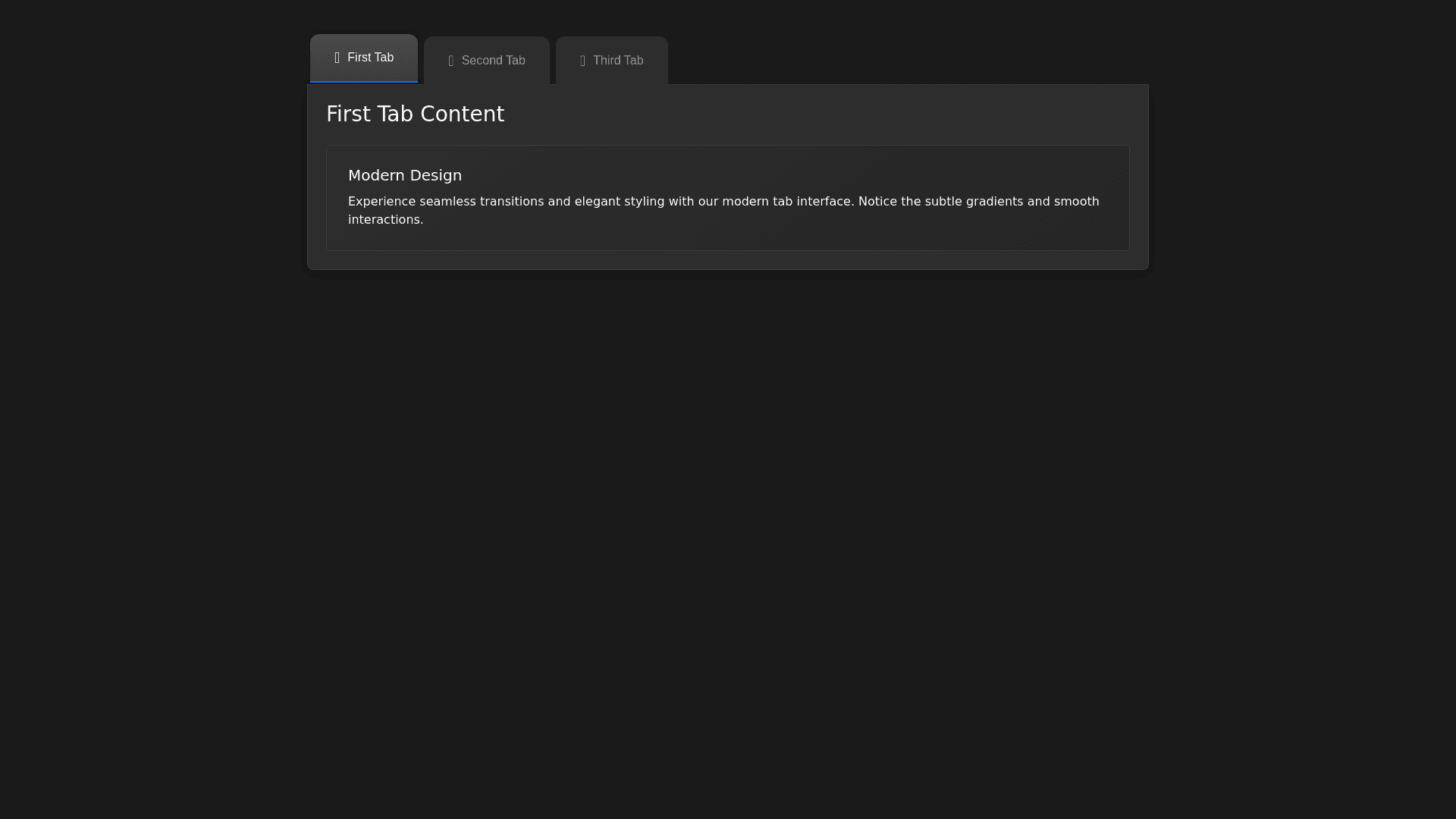
Dark Tabbed Navigation - Copy this Html, Bootstrap Component to your project
"Generate HTML and CSS code for a responsive, tabbed navigation interface using Bootstrap. Style the tabs to match the following requirements: Tabs Layout and Shape: Use three tabs with the labels 'First Tab', 'Second Tab', and 'Third Tab'. The tabs should have a dark background and be horizontally aligned with a slight space (gap) between each tab. Each tab should have rounded corners on the top with a border-radius of approximately 12px on the top left and right corners, similar to classic file tabs. Only the top corners should be rounded; the bottom should be straight to align smoothly with the content area. Active Tab Style: The first tab should be active by default, with a gradient background to indicate it’s selected. The active tab should also have a 2px solid border at the bottom, matching the primary accent color (e.g., blue). Non-active tabs should have a flat dark background, but on hover, they should slightly brighten. Tab Content Area: The content area below the tabs should have a border-radius at the bottom of 8px to give a rounded finish. Use a subtle shadow effect on the content box to make it appear slightly raised above the background. Responsive Design: On smaller screens, stack the tabs vertically. Adjust the border-radius for the stacked tabs so that each tab appears with rounded corners on all sides. Additional Details: Use a thin separator line below the tabs. Include smooth transition effects for the hover and active states. Use the latest version of Bootstrap for the tab structure and custom CSS to handle the rounded corners and styling. Make the design visually close to the provided image with clean, modern aesthetics."
