Team Members - Copy this React, Tailwind Component to your project
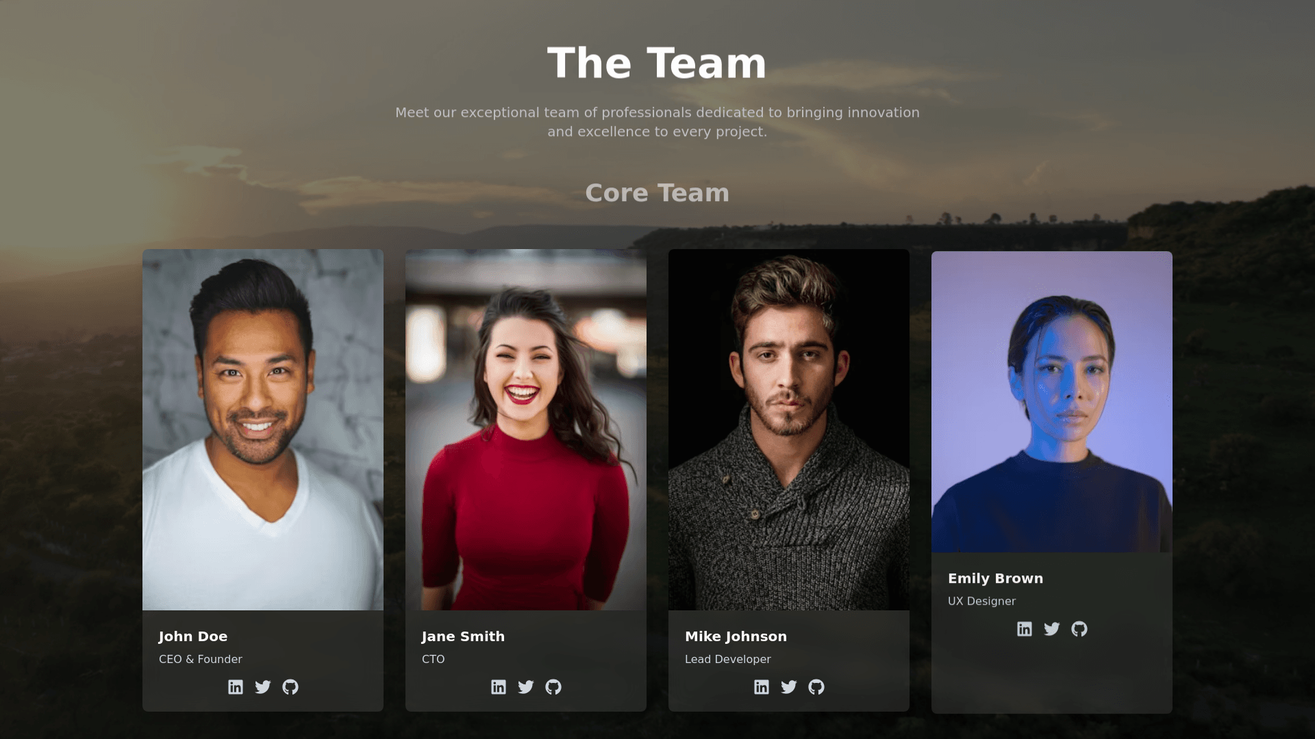
Create a responsive team page with the following specifications: Theme Colors: Primary Color: Red (#FF0000) Secondary Color: Black (#000000) Accent Color: Light Gray (#B0B0B0) for text details. Background: Use a fixed video background that covers the entire viewport. Add a subtle black overlay with transparency to enhance text visibility. Typography: Headings: Bold, large font for headings like "The Team" and "Core Team". Body Text: Clear, readable font for descriptions, such as a light sans serif font like "Lato". Card Layout: Grid based design for team members, responsive across different screen sizes. Include profile image, name, and designation for each member. Use Framer Motion for animations: On Hover: Zoom in effect on the profile picture, with a shadow on hover. Card Animations: Cards should fade in and slide up sequentially as the page loads. Framer Motion Animations: Fade and Slide: When each card loads, it should fade in and slide up with a slight delay. Hover Effects: On hover, zoom in on profile images, and change shadow intensity. Ensure animations are smooth and responsive on mobile, tablet, and desktop screens. Section Layout: Header Section: A centered heading "The Team" with a brief introduction. Core Team Section: A grid layout of team members below the heading, responsive with 2 4 columns based on screen size. Responsive Design: Desktop: Four column layout for team cards. Tablet: Two or three columns depending on screen width. Mobile: Single column layout with larger cards for readability.