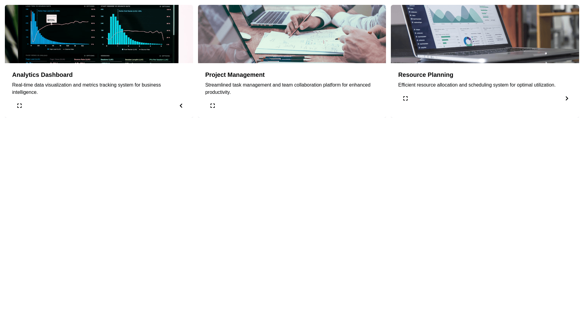
Card Layout - Copy this React, Tailwind Component to your project
We need a responsive 3-panel layout with the following behavior and styling: 1. General Layout: • Three equally-sized cards stretch horizontally across the viewport with a small margin between them. • The layout should be responsive, meaning it adjusts to different screen sizes. 2. Accordion-like Behavior: • Each panel (card) should have a chevron button that toggles its visibility or expansion. • When a card is expanded, it should double in size while the other two adjust their widths accordingly to fit the available space. 3. Toggle Logic: • The leftmost and rightmost panels should have retractable behavior (collapse completely) via their chevron buttons. • If one card retracts (collapses), the remaining two panels take up the available space, with the middle card optionally doubling in size. 4. Customizable Behavior: • When both the left and right panels are retracted, there should be an option to specify which card (left or right) doubles in size while the other remains standard. 5. Interaction & Animation: • Smooth animations are required for the panel resizing and toggling transitions. • Chevron buttons should visually rotate to indicate the toggle state (collapsed or expanded). 6. State Management: • Track the state of each panel (expanded, collapsed, or normal). • Adjust the layout dynamically based on the state of the panels. 7. CSS Styling: • Use Tailwind CSS for the styling, ensuring the layout looks clean and modern. • Add responsive utilities to handle mobile and desktop views.
