Styled App Bar - Copy this React, Mui Component to your project
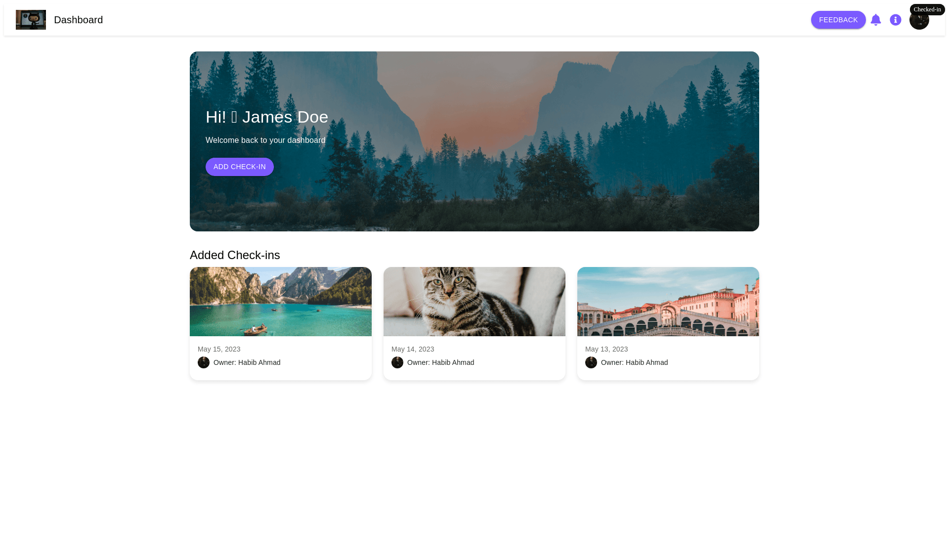
Design a modern, responsive web interface using Material Design principles. The top navbar should have a white background, with a logo on the left, and on the right, include a feedback button, a bell icon for notifications, and a rounded information ("i") icon with the same color as the button (#7b5aff). The information icon should have a rounded design with an "i" inside. Additionally, include a user avatar with dropdown on image. All buttons, including the feedback button, should be rounded and use the color #7b5aff, and the icons should match this color as well. Below the navbar, create a large, rounded banner with left and right margins, featuring a beautiful scenery image as the background. On the left side of the banner, overlay the text "Hi! 👋 James Doe" with a smaller line below saying "Lorem ipsum dolor sit amen, something important to say here". Add a subtle transparent black overlay behind the text to ensure it's readable against the image. Below this text, add a prominent rounded button labeled "Add Check in", with a color of #7b5aff. After the banner, include a heading titled "Added Check ins", followed by multiple rounded cards arranged vertically. Each card should have an image at the top with a "Checked in" overlay on the top right corner of the image. Below the image, display the date, and within the card, include a rounded user avatar with the label "Owner: Habib Ahmad". The cards should have a slightly elevated shadow effect to make them stand out. Ensure the entire design is clean, with smooth spacing, and fully responsive for various screen sizes, while maintaining the use of #7b5aff for all buttons and icons.