Tourism Explorer - Copy this Angular, Css Component to your project
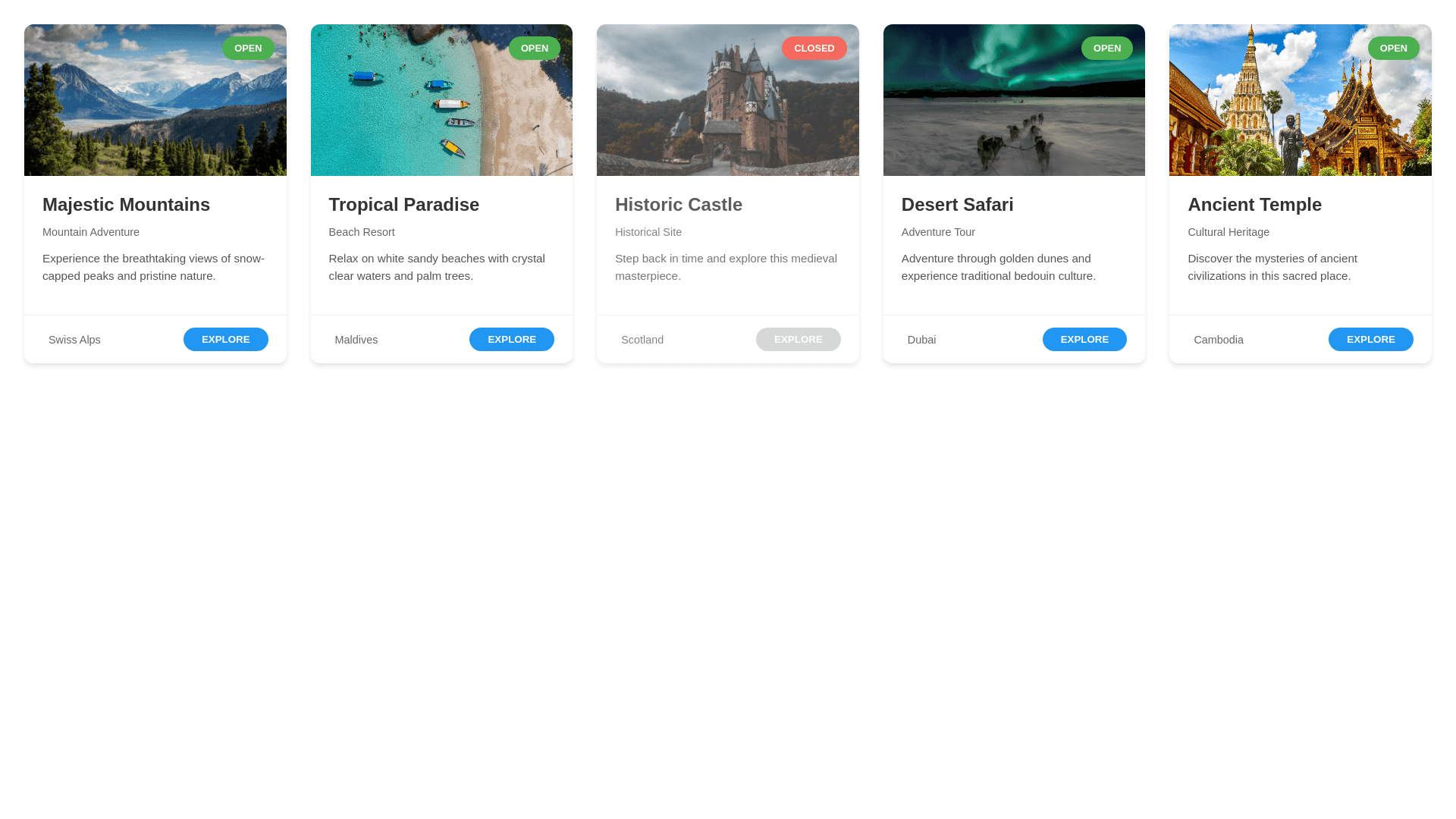
<app-navbar></app-navbar> <div class="heading"> <h1>SALON</h1> </div> <div class="tourism-container"> <div class="salon-grid"> <div *ngFor="let salon of salons" class="tourism-card"> <div class="status-badge" [ngClass]="{'open': salon.isOpen}"> {{ salon.isOpen ? 'OPEN' : 'CLOSED' }} </div> <div class="card-content"> <div class="salon-image"> <img [src]="salon.imageUrl" [alt]="salon.name"> </div> <div class="salon-details"> <div class="salon-header"> <h2> SALON </h2> <p>{{ salon.description }}</p> </div> <div class="salon-type">{{ salon.type }}</div> </div> <div class="salon-footer"> <div class="user-info"> <span class="user-icon">👤</span> <span class="salon-name">{{ salon.name }}</span> </div> <button class="show-package-btn">SHOW PACKAGE</button> </div> </div> </div> </div> </div> <app-footer></app-footer> .heading { text-align: center; padding: 20px 0; font-family: 'Poppins', sans-serif; } .heading h2 { font-size: 24px; font-weight: 600; color: #333; } .salon-container { padding: 20px; max-width: 1600px; margin: 0 auto; } .salon-grid { display: grid; grid-template-columns: repeat(5, 1fr); gap: 15px; padding: 10px; } .salon-card { background: white; border-radius: 20px; position: relative; box-shadow: 0 2px 8px rgba(0,0,0,0.1); overflow: hidden; transition: transform 0.3s ease; } .salon-card:hover { transform: translateY(-5px); } .status-badge { position: absolute; top: 10px; right: 10px; background: #ff4444; color: white; padding: 4px 12px; border-radius: 20px; font-size: 12px; font-weight: 600; z-index: 1; } .status-badge.open { background: #4CAF50; } .card-content { display: flex; flex-direction: column; height: 100%; } .salon-image { height: 160px; width: 100%; overflow: hidden; } .salon-image img { width: 100%; height: 100%; object-fit: cover; } .salon-details { padding: 12px; flex-grow: 1; } .salon-header h2 { font-size: 15px; font-weight: bold; margin-bottom: 8px; color: #333; } .salon-header p { font-size: 12px; color: #666; margin-bottom: 8px; line-height: 1.4; } .salon-type { font-size: 13px; color: #555; margin-top: 6px; } .salon-footer { padding: 12px; border-top: 1px solid #eee; } .user-info { display: flex; align-items: center; gap: 8px; margin-bottom: 10px; } .user-icon { font-size: 16px; } .salon-name { font-weight: 600; font-size: 14px; color: #333; } .show-package-btn { width: 100%; background: #000; color: white; border: none; padding: 8px 0; border-radius: 5px; font-size: 12px; font-weight: 600; cursor: pointer; margin-bottom: 8px; transition: background 0.3s; } .show-package-btn:hover { background: #333; } .rating { display: flex; justify-content: center; gap: 2px; font-size: 13px; color: #FFD700; } /* Responsive breakpoints */ @media (max-width: 1400px) { .salon-grid { grid-template-columns: repeat(4, 1fr); } } @media (max-width: 1200px) { .salon-grid { grid-template-columns: repeat(3, 1fr); } } @media (max-width: 900px) { .salon-grid { grid-template-columns: repeat(2, 1fr); } } @media (max-width: 600px) { .salon-grid { grid-template-columns: 1fr; } } THIS COMPONENT cards STYLE CONVERT TO THE TURISM STYKE CARDS