Styled Card - Copy this React, Mui Component to your project
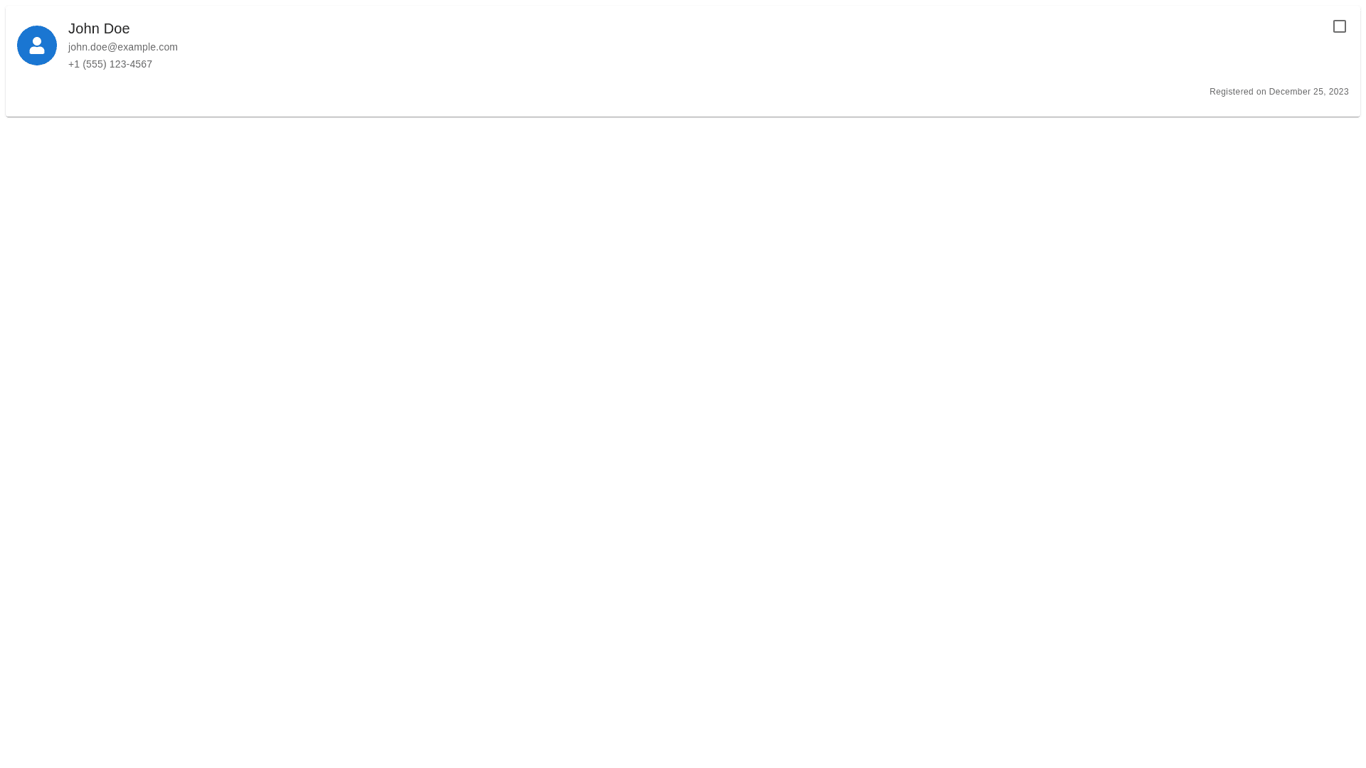
2. Service Provider Card (components_vetting_service provider card.jsx) Purpose: Display a summary of a service provider's information in a card format. Components: Checkbox: Allows the user to select the service provider for bulk actions. Profile Icon: A placeholder icon representing the service provider. Details: Name Email Phone Number (if available) Registration Date UI Details: The card should have a white background with rounded corners and a shadow. The checkbox should be positioned at the top right corner. The profile icon should be a small circle with a user icon inside. The details should be displayed in a vertical list with a small gap between each item.import { User } from 'lucide react'; import { Checkbox } from "@/components/ui/checkbox"; export function ServiceProviderCard({ provider, isSelected, onSelect }) { return ( <div className="relative p 4 bg white rounded lg shadow"> <Checkbox checked={isSelected} onCheckedChange={() => onSelect(provider.id)} className="absolute top 2 right 2" /> <div className="flex items start gap 3"> <div className="h 10 w 10 rounded full bg gray 100 flex items center justify center"> <User className="h 6 w 6 text gray 500" /> </div> <div className="space y 1"> <p className="font medium text sm">{provider.name}</p> <p className="text sm text gray 500">{provider.email}</p> {provider.phoneNumber && ( <p className="text sm text gray 500">{provider.phoneNumber}</p> )} <p className="text sm text gray 500"> Registered on {provider.registrationDate} </p> </div> </div> </div> ); }