Services Interface - Copy this React, Tailwind Component to your project
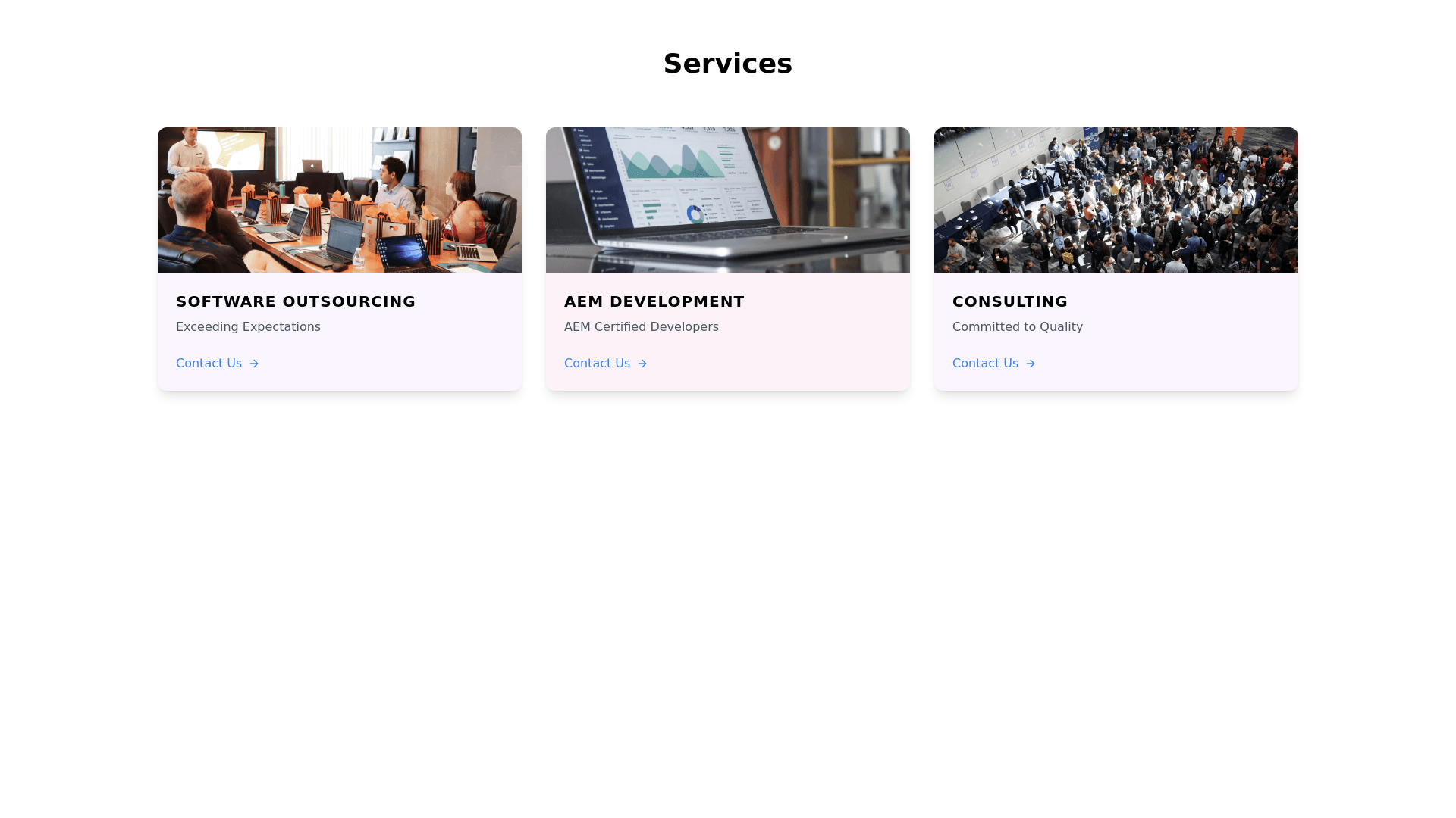
I see a beautifully organized web interface with three main sections titled "Services." The background is a subtle light purple, providing a soothing contrast to the elements in each section. ### First Section: **SOFTWARE OUTSOURCING** **Image**: It showcases a modern office setting with individuals focused on their computer screens. The office is well lit, featuring glass partitions and multiple computer monitors, giving a professional vibe. **Title**: "SOFTWARE OUTSOURCING" is prominently displayed in bold, uppercase black text, emphasizing the importance of the service. **Subtitle**: Below the title, the text "Exceeding Expectations" is written in regular black text, smaller in size, suggesting a commitment to high standards. **Button**: There's an inviting "Contact Us" button in light blue text, accompanied by a small arrow icon, encouraging user interaction. ### Second Section: **AEM DEVELOPMENT** **Image**: This section features the Adobe Experience Manager (AEM) logo, a distinct red square with a stylized white "A" in the center. **Title**: "AEM DEVELOPMENT" is written in bold, uppercase black text, making it clear and easy to read. **Subtitle**: "AEM Certified Developers" is displayed in smaller, regular black text, indicating the expertise of the developers. **Button**: The "Contact Us" button in light blue text with an arrow icon remains consistent with the first section. **Background**: A light pink hue forms the background for this section, subtly differentiating it from the others. ### Third Section: **CONSULTING** **Image**: This section includes a photo of a conference or presentation setup, featuring a large screen displaying a presentation. The room's arched ceilings and red lighting accents create an ambiance of sophistication. **Title**: "CONSULTING" is prominently displayed in bold, uppercase black text. **Subtitle**: The phrase "Committed to Quality" appears in smaller, regular black text, emphasizing the dedication to high quality service. **Button**: Like the other sections, the "Contact Us" button in light blue text with an arrow icon remains consistent. The overall design uses a consistent style with bold titles, descriptive subtitles, and interactive buttons in light blue, making it easy for users to navigate and understand the services offered. The images and graphics are carefully chosen to provide relevant visual context for each service, enhancing the user experience.