Shipments Dashboard - Copy this React, Tailwind Component to your project
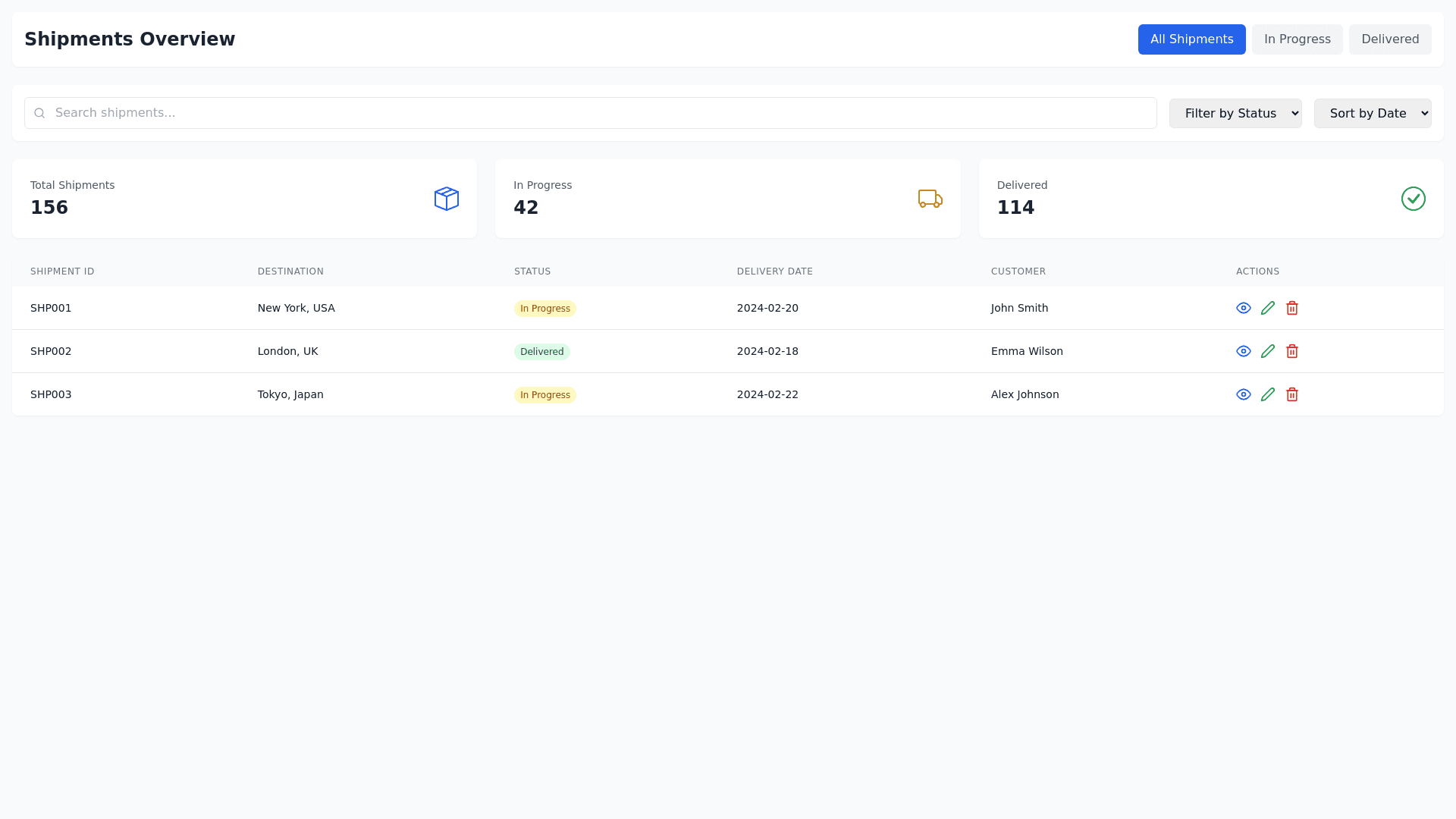
To elevate the functionality and user experience of the "Shipments Overview" dashboard, a comprehensive redesign has been undertaken. This redesign emphasizes clarity, usability, and visual cohesion while incorporating advanced UI/UX principles to ensure a responsive and accessible interface. Enhanced Shipments Overview Dashboard Design Header and Navigation: Main Title: "Shipments Overview" is prominently positioned at the top to anchor user orientation and reinforce brand identity. Navigation Tabs: These are elegantly streamlined to facilitate seamless user navigation, with each tab tailored to display specific datasets: Overview: Provides a holistic view of all shipment modes. LTL: Focuses on metrics specific to Less Than Truckload shipments. Truckload: Dedicated to the detailed tracking and analysis of full truckload shipments. Intermodal: Offers insights into shipments that utilize multiple forms of transportation. Ocean: Delivers focused insights into ocean freight operations. Search and Filtering Capability: Dynamic Search Bar: Centrally positioned, this feature empowers users to efficiently search by BOL, PRO number, origin, destination, or status. It includes predictive text functionality to streamline interactions. Filters Feature: Prominently displayed, this button is designed for sophisticated querying, enabling rapid access to specific shipment details or historical data. Metrics and Data Visualization: Data Cards: Total Shipments Card: Shows "1,234" total shipments over the last 30 days with an interactive line graph for trend analysis. LTL Shipments Card: Displays "456" active shipments with an area graph that illustrates LTL shipment dynamics. Truckload Shipments Card: Indicates "789" shipments currently in transit, depicted with a soft colored area graph. Intermodal Shipments Card: Lists "123" scheduled shipments with a line graph that provides scheduling insights. Ocean Shipments Card: Shows "67" active shipments, tracked using a simplified line graph. Detailed Shipments Table: Layout: Organized to include essential details like BOL #, PRO #, PO #, Date Created, Pickup Date, Origin, Destination, Carrier, and Status. This setup provides a complete snapshot of each shipment. Status Indicators: Utilizes intuitive color coding to quickly convey shipment statuses such as 'In Transit', 'Delivered', and 'Scheduled'. Action Dropdown: Integrates a refined three dot menu in each row, offering actionable options like 'View Details', 'Edit', and 'Delete'. Design and Usability Enhancements: Color Palette: Uses a harmonious scheme that effectively differentiates data types while maintaining visual harmony. Interactive Elements: All graphical elements are interactive, providing expanded views on interaction to deepen user engagement. Responsive Design: Adapts seamlessly across various devices and screen sizes, ensuring optimal functionality whether accessed on mobile, tablet, or desktop. Accessibility Features: Includes high contrast modes, keyboard navigable interfaces, and screen reader compatibility. Action Button Integration: Enhanced Action Menu: Features a three dot action button for each shipment entry, enhancing user control: View Details: Opens a detailed overlay or modal with extensive shipment information for thorough tracking. Edit: Allows for real time, inline modifications directly from the dashboard. Delete: Secured with a confirmation prompt to prevent accidental deletions. This revitalized "Shipments Overview" dashboard is designed not only to track and analyze logistics data but also to provide an intuitive, user friendly interface that meets the diverse operational needs of logistics management professionals. It simplifies the complexities of logistics data management through a visually appealing, functionally rich, and accessible environment, enhancing overall operational efficiency and user satisfaction. To optimize the "Shipments Overview" dashboard for better functionality and responsiveness across all devices—desktop, mobile, and tablet—here is a tailored approach that focuses on enhancing user interaction, visual appeal, and overall efficiency: Enhanced Design for "Shipments Overview" Dashboard 1. Responsive Layout Adjustments: Flexibility: Implement a fluid grid layout that adapts to different screen sizes. This ensures that all dashboard elements resize and rearrange themselves appropriately based on the device. Navigation: Convert tabbed navigation into a collapsible menu or a slider on smaller screens to maximize space and maintain accessibility. Cards: Each metric card (Total Shipments, LTL, Truckload, etc.) should stack vertically on smaller screens while displayed side by side on larger screens, with touch friendly elements for ease of use on mobile devices. 2. Interactive Data Visualization: Graphs: Utilize scalable vector graphics (SVG) for graphs to ensure they render sharply at any resolution. Graphs should be touch responsive, allowing users to swipe through data points on mobile devices. Progress Indicators: Adapt progress bars to be visually prominent on smaller screens. Include percentage labels inside progress bars for clarity at a glance. 3. Table Enhancements: Scrollable Tables: Introduce horizontal scrolling for tables on mobile devices to maintain readability without compromising the display of data. Ensure table headers remain fixed during scrolling. Action Buttons: Redesign action buttons (View Details, Edit, Delete) to be accessible via expandable sections or pop up menus on smaller screens to avoid accidental taps and enhance usability. 4. Search and Filters: Dynamic Positioning: Position the search bar and filters prominently at the top, with the option to expand or collapse on mobile devices. This makes them accessible without taking up too much screen real estate. Auto complete and Suggestions: Enhance the search function with auto complete and predictive text features, which are especially useful on mobile devices to minimize typing. 5. Aesthetic and Color Palette: Cohesive Color Scheme: Employ a consistent, calm color palette that aids in distinguishing different sections and metrics visually but remains subtle enough not to overwhelm on smaller screens. Contrast and Typography: Use high contrast text and scalable typography to improve readability on various devices and support users with visual impairments. 6. Accessibility and Usability: Touch Targets: Ensure all interactive elements are of adequate size and spaced to prevent mis taps, crucial for tablet and mobile users. Accessibility Features: Implement features like screen reader support, keyboard navigation, and ARIA (Accessible Rich Internet Applications) attributes to make the dashboard usable for everyone. 7. Performance Optimization: Fast Loading Times: Optimize images and assets for quick loading times, essential for a smooth user experience, especially on mobile networks. Lazy Loading: Incorporate lazy loading techniques for data heavy elements like graphs and tables, so they load as the user scrolls, reducing initial page load time. This redesigned "Shipments Overview" dashboard will not only cater to the functional needs across various devices but will also provide an engaging and efficient user experience, ensuring that users can manage and analyze shipment data effortlessly, irrespective of the device they use.