Default Component - Copy this React, Tailwind Component to your project
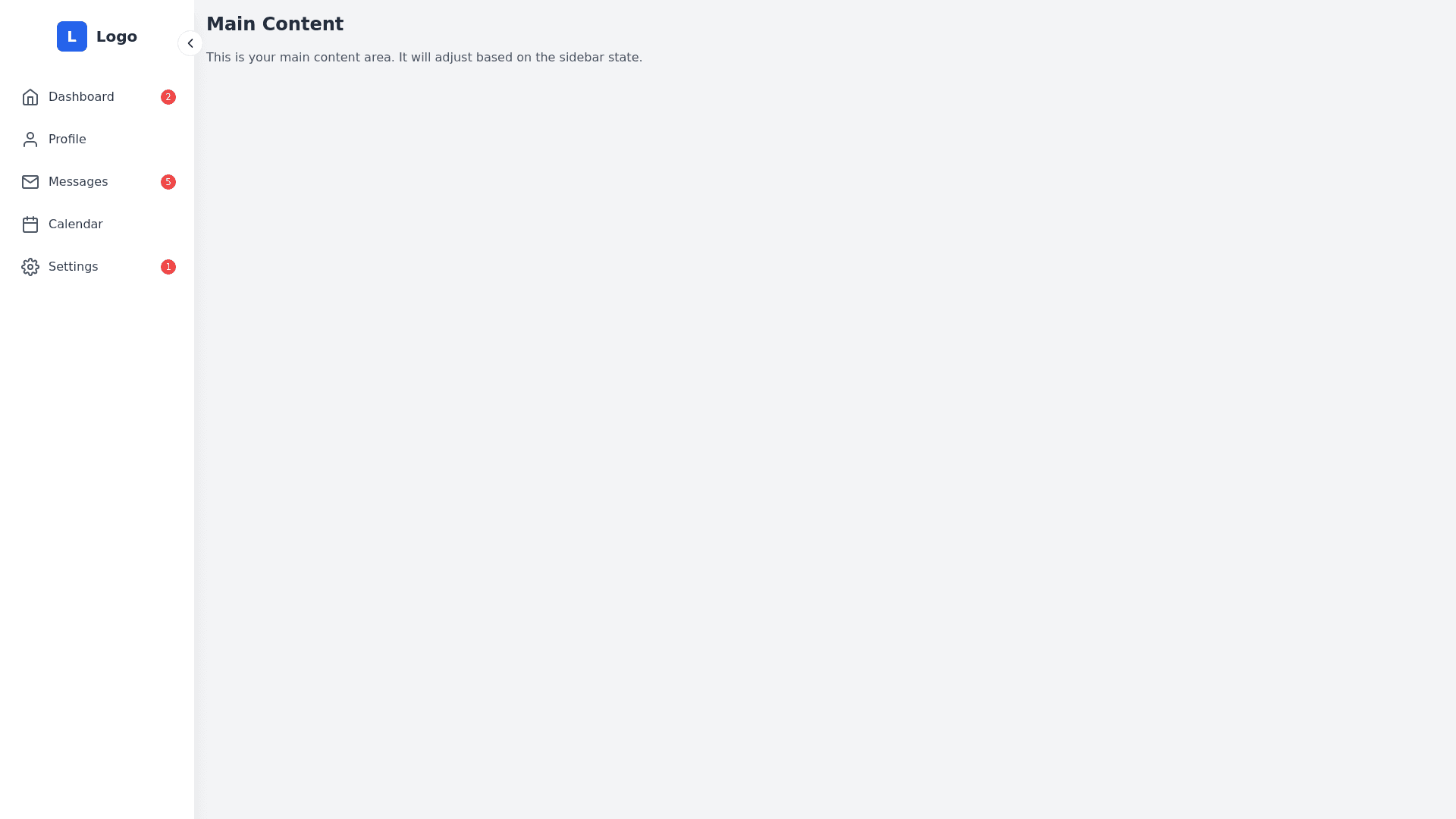
<!---Sidebar-Toggle--->-<input-type="checkbox"-id="sidebarToggle"-class="hidden-peer"-/>-<aside-class="bg-gray-900-text-white-h-screen-py-6-px-2-transition-all-duration-300-w-56-peer-checked:w-20-flex-flex-col">-<!---Sidebar-Toggle-Button--->-<label-for="sidebarToggle"-class="cursor-pointer-flex-items-center-space-x-3-mb-6-px-3">-<i-class="fa-solid-fa-bars-text-xl"></i>-<span-class="text-lg-font-semibold-peer-checked:hidden">Menu</span>-<!---Text-will-be-hidden-when-sidebar-is-collapsed--->-</label>-<!---Sidebar-Navigation--->-<nav-class="flex-flex-col-space-y-2-flex-grow">-<!---Dashboard-Link--->-<a-href="#"-class="flex-items-center-space-x-3-px-3-py-2-rounded-lg-hover:bg-gray-700">-<i-class="fa-solid-fa-gauge-text-lg"></i>-<span-class="peer-checked:hidden">Dashboard</span>-<!---Text-will-be-hidden-when-sidebar-is-collapsed--->-</a>-<!---Officers-Link--->-<a-href="#"-class="flex-items-center-space-x-3-px-3-py-2-rounded-lg-hover:bg-gray-700">-<i-class="fa-solid-fa-user-shield-text-lg"></i>-<span-class="peer-checked:hidden">Officers</span>-</a>-<!---Logos-Link--->-<a-href="#"-class="flex-items-center-space-x-3-px-3-py-2-rounded-lg-hover:bg-gray-700">-<i-class="fa-solid-fa-image-text-lg"></i>-<span-class="peer-checked:hidden">Logos</span>-</a>-<!---Ambulances-Link--->-<a-href="#"-class="flex-items-center-space-x-3-px-3-py-2-rounded-lg-hover:bg-gray-700">-<i-class="fa-solid-fa-ambulance-text-lg"></i>-<span-class="peer-checked:hidden">Ambulances</span>-</a>-<!---Location-History-Link--->-<a-href="#"-class="flex-items-center-space-x-3-px-3-py-2-rounded-lg-hover:bg-gray-700">-<i-class="fa-solid-fa-map-text-lg"></i>-<span-class="peer-checked:hidden">Location-History</span>-</a>-<!---Statistics-Link--->-<a-href="#"-class="flex-items-center-space-x-3-px-3-py-2-rounded-lg-hover:bg-gray-700">-<i-class="fa-solid-fa-chart-bar-text-lg"></i>-<span-class="peer-checked:hidden">Statistics</span>-</a>-<!---Reports-Link--->-<a-href="#"-class="flex-items-center-space-x-3-px-3-py-2-rounded-lg-hover:bg-gray-700">-<i-class="fa-solid-fa-file-alt-text-lg"></i>-<span-class="peer-checked:hidden">Reports</span>-</a>-<!---Login-Logs-Link--->-<a-href="#"-class="flex-items-center-space-x-3-px-3-py-2-rounded-lg-hover:bg-gray-700">-<i-class="fa-solid-fa-sign-in-alt-text-lg"></i>-<span-class="peer-checked:hidden">Login-Logs</span>-</a>-<!---Logout-Link--->-<a-href="#"-class="flex-items-center-space-x-3-px-3-py-2-rounded-lg-hover:bg-gray-700">-<i-class="fa-solid-fa-sign-out-alt-text-lg"></i>-<span-class="peer-checked:hidden">Logout</span>-</a>-</nav>-</aside>-correct-this-code-as-it-is-not-hiding-text-on-collapsing