Smart Transit Dashboard - Copy this React, Tailwind Component to your project
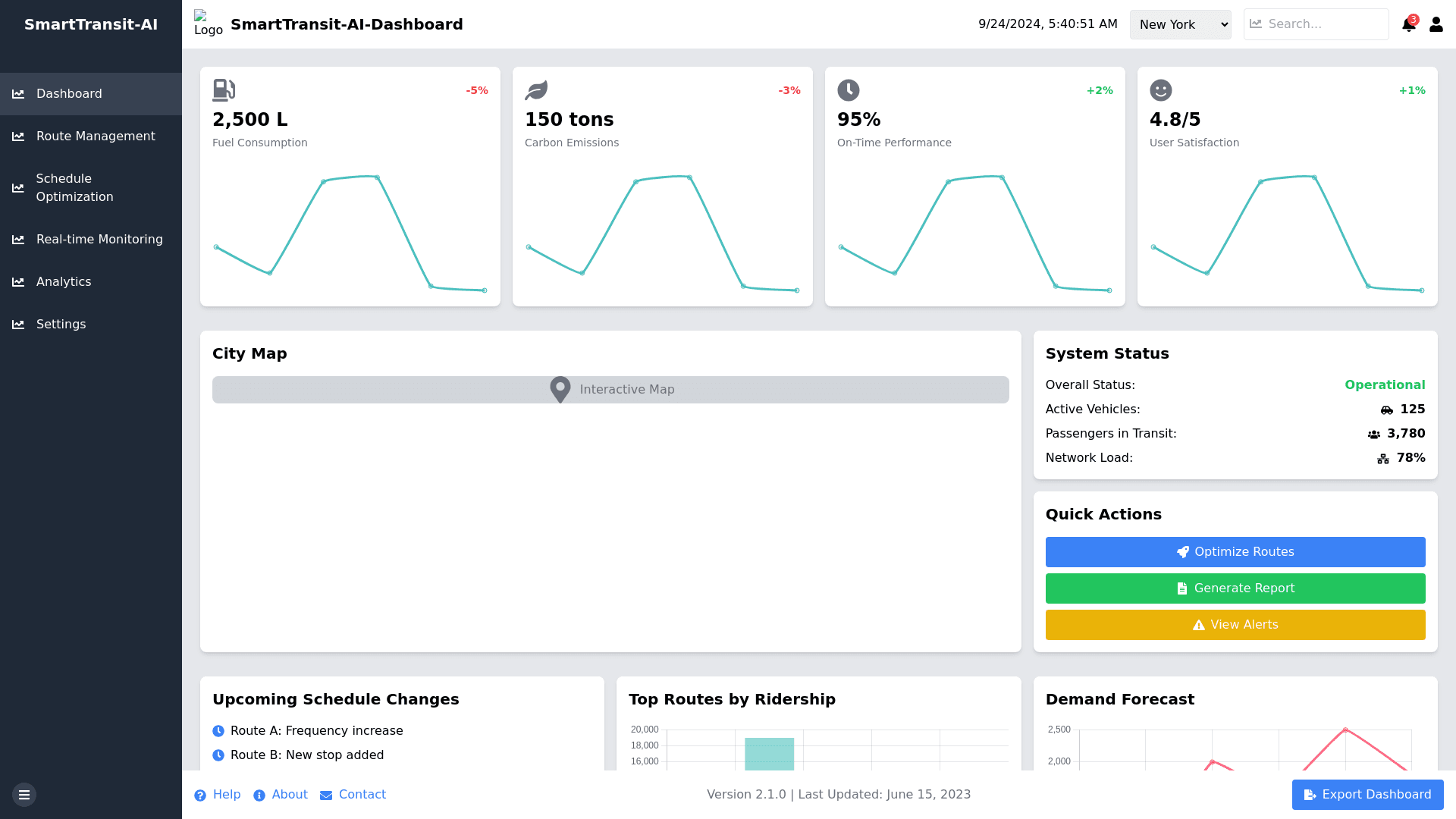
# Detailed Dashboard Wireframe Description ## Overall Layout Full screen responsive design Top header (height: 60px) Left sidebar for navigation (width: 240px when expanded, 60px when collapsed) Main content area (remaining space) ## Header (60px height, full width) Left section: System logo (40x40px) System name: "SmartTransit AI Dashboard" Sidebar toggle button (hamburger icon) Center section: Current date and time (updates in real time) City name dropdown (for systems managing multiple cities) Right section: Search bar (width: 200px, expands on focus) Notifications bell icon (with badge for unread notifications) User profile icon/button (opens dropdown for account management, settings, logout) ## Left Sidebar (240px width when expanded) Navigation menu items (60px height each): 1. Dashboard (current page) 2. Route Management 3. Schedule Optimization 4. Real time Monitoring 5. Analytics 6. Settings Each item has an icon (left aligned) and text label Currently active item is highlighted Collapse/Expand button at the bottom ## Main Dashboard Content Layout: Grid system with 12 columns, responsive breakpoints ### Top Row (Full width) Key Performance Indicators (KPIs) 4 cards, each spanning 3 columns: 1. Fuel Consumption 2. Carbon Emissions 3. On Time Performance 4. User Satisfaction Each KPI card (height: 120px) contains: Icon representing the metric (top left) Metric name Current value (large font) Percentage change from previous period (with up/down arrow icon) Small sparkline graph showing trend (bottom of card) ### Middle Row (Full width) Split into two sections: Left Section (8 columns): Large interactive map of the city (height: 400px) Shows current vehicle locations as moving icons Major routes highlighted Heatmap overlay toggle for showing high demand areas Zoom and pan controls Right Section (4 columns): System Status panel (height: 190px) * Overall system status indicator (Normal/Warning/Critical) * Total active vehicles * Total passengers in transit * Current network load percentage Quick Actions panel (height: 190px) * "Optimize Routes" button * "Generate Report" button * "View Alerts" button (shows number of active alerts) ### Bottom Row Split into three sections: Left Section (4 columns): Upcoming Schedule Changes (height: 300px) * Scrollable list of pending schedule optimizations * Each item shows route, change summary, and scheduled implementation date * "Review All" button at the bottom Middle Section (4 columns): Top Routes by Ridership (height: 300px) * Bar chart showing top 5 routes * X axis: Route numbers * Y axis: Average daily ridership * Each bar color coded based on efficiency score Right Section (4 columns): Demand Forecast (height: 300px) * Line graph showing predicted demand for next 24 hours * X axis: Time in 3 hour intervals * Y axis: Predicted number of passengers * Dotted line showing capacity based on current schedule * Shaded areas indicating potential under/over capacity ### Footer (Full width) Left: Links to Help, About, Contact Center: Current system version and last update date Right: "Export Dashboard" button (allows exporting current view as PDF/CSV) Interactivity Notes: All charts and graphs are interactive with hover tooltips showing detailed data KPI cards are clickable and lead to detailed views of each metric Map allows clicking on vehicles for quick info popups Responsive design adjusts layout for smaller screens: * KPI cards stack into 2x2 grid on medium screens * Bottom row sections stack vertically on small screens