Social Network Component - Copy this Html, Bootstrap Component to your project
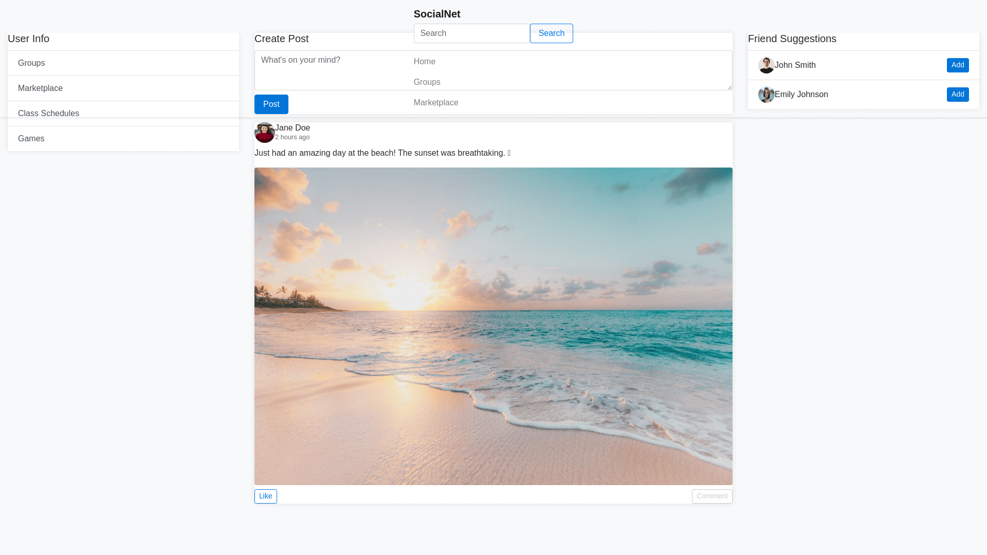
Design a responsive social networking webpage with a focus on clean and modern aesthetics. The layout should consist of a sticky navbar that remains fixed at the top of the page, even as the user scrolls. Below the navbar, the page should be divided into three sections, with clear but subtle separations between them. Key Features: Navbar: The navbar should always remain visible (sticky) when scrolling. It should include a brand name or logo on the left, a search bar in the middle, and navigation buttons/icons (e.g., home, groups, marketplace) on the right. The navbar should have a shadow or subtle separator to distinguish it from the rest of the content. Page Layout: Below the navbar, the page should be divided into three main columns: Left Sidebar: Contains user information (profile picture, name), navigation to groups, marketplace, class schedules, and games. Middle Section: A dynamic content area for user posts (including text, images, and comments), which should not scroll with the page. Users can create posts with a simple form. Right Sidebar: A list of friends or users to connect with, following the user as they scroll. The separation between columns should be clear but not overwhelming (e.g., light borders or soft shadows). Scrolling Behavior: Both the left and right sidebars should stay fixed as the user scrolls, while only the middle post section scrolls. Ensure that this behavior works smoothly without feeling intrusive. Post Section (Middle Column): Users can create posts that include text (up to 300 characters) and images. Each post should have a profile picture, user name, post time, post content, and the option to like or comment. Comments should appear beneath each post, with the ability to add new ones. Friend List (Right Column): Display a list of suggested friends or connected users. This section should remain visible as the user scrolls through the page. General Styling: Use Bootstrap for responsiveness. Use light colors for the background (e.g., light gray or off white) and a clean, readable font. Subtle shadows, borders, or spacing should provide clear separation between different content blocks without feeling too harsh. Ensure the design is responsive and works well on both desktop and mobile devices.