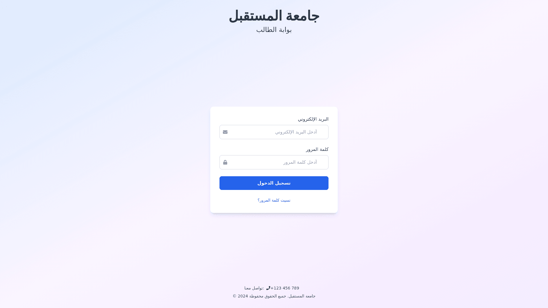
Student Portal Login - Copy this React, Tailwind Component to your project
Step-1:-Background-Design-Create-a-clean,-modern-background-with-a-gradient-transitioning-from-light-blue-at-the-top-to-soft-lavender-or-pastel-purple-at-the-bottom.-The-gradient-should-feel-fresh-and-welcoming.-Add-abstract,-minimalistic-patterns-(e.g.,-icons-related-to-education-like-books,-lightbulbs,-graduation-caps)-subtly-blended-into-the-background-for-a-professional,-academic-look-without-cluttering-the-interface.-The-patterns-should-be-light-and-non-distracting,-ensuring-that-the-focus-remains-on-the-form-and-navigation.-Step-2:-Header-Design-At-the-top-of-the-page,-place-the-university’s-name-and-the-student-portal-section-title-in-Arabic:-"كلية-العلوم-القانونية-والاقتصادية-والاجتماعية---أيت-ملول"-(University-Name)-"مصلحة-الشؤون-الطلابية"-(Student-Affairs-Section)-Use-large,-bold-fonts-for-both-texts.-The-university's-name-can-be-in-a-slightly-larger-size-with-a-professional-serif-font-(e.g.,-Georgia,-Times-New-Roman)-to-emphasize-authority-and-tradition.-The-"مصلحة-الشؤون-الطلابية"-should-be-in-a-clean,-sans-serif-font-(e.g.,-Arial,-Helvetica),-slightly-smaller-but-still-prominent.-Apply-a-white-or-light-gray-text-color-for-clarity-and-contrast-against-the-gradient-background.-Step-3:-Login-Form-Container-Position-the-login-form-centrally-with-plenty-of-whitespace-around-it-for-clarity-and-ease-of-interaction.-Use-a-rounded-rectangular-form-container-with-a-subtle-shadow-effect-(box-shadow:-0-4px-12px-rgba(0,-0,-0,-0.15))-for-depth.-The-background-of-the-form-should-be-a-clean-white,-ensuring-the-inputs-and-buttons-stand-out.-Add-a-slight-border-radius-(8px)-to-the-container-and-use-a-subtle-light-blue-or-gray-border-(1px-solid-#e6f0f9)-around-the-form-to-create-a-modern-yet-professional-look.-Step-4:-Input-Fields-Email-Input-Field:-Make-the-input-field-large-and-clear-with-placeholder-text:-"البريد-الإلكتروني-الجامعي-(مثل:-example@student.university.com)"-Password-Input-Field:-The-password-field-should-have-a-clean-and-simple-look-with-placeholder-text:-"كلمة-المرور".-The-input-fields-should-be-fully-responsive,-meaning-they-expand-to-fit-smaller-devices-but-remain-easy-to-use-across-all-screen-sizes.-Both-input-fields-should-have-icons-inside-(email-and-lock)-placed-on-the-left-side-of-the-field-to-improve-user-experience.-When-a-user-focuses-on-a-field,-it-should-have-a-subtle-highlight-effect-(border-color:-#00bcd4)-to-indicate-that-the-field-is-active.-Add-a-smooth-transition-effect-for-the-input-fields-when-clicked-or-focused,-making-them-feel-responsive.-Step-5:-Login-Button-The-login-button-should-be-large,-eye-catching,-and-easy-to-press,-with-a-prominent-color-like-a-deep-turquoise-(#0097a7)-or-dark-blue-(#006e7f).-The-button-should-have-rounded-edges-(border-radius:-6px),-consistent-with-the-overall-design.-Use-bold-white-text-inside-the-button,-with-the-word-"دخول".-Add-a-hover-effect-for-the-button,-such-as-a-soft-color-shift-or-an-elevation-effect-(box-shadow:-0-5px-15px-rgba(0,-0,-0,-0.1))-when-the-user-hovers-over-it,-making-the-button-feel-interactive.-Under-the-button,-include-a-smaller,-discreet-text-link-for-password-recovery-("نسيت-كلمة-المرور؟")-in-light-gray,-with-an-underline-effect-on-hover.-Step-6:-Accessibility-and-Error-Handling-Make-sure-all-text-is-legible-with-a-high-contrast-ratio-between-the-background-and-text-(WCAG-AA-standard).-Input-fields-should-display-clear-error-messages-below-them-if-the-user-enters-invalid-information-(e.g.,-“البريد-الإلكتروني-غير-صحيح”-for-email-errors).-The-error-messages-should-appear-in-a-red-color-(#d9534f)-with-a-slight-animation-or-fade-effect,-ensuring-they-are-visible-but-not-intrusive.-All-input-fields,-buttons,-and-links-should-be-fully-keyboard-navigable,-with-a-clear-focus-outline-(e.g.,-border:-2px-solid-#00bcd4)-when-users-tab-through-elements.-Step-7:-Mobile-Responsiveness-The-form-should-be-fully-responsive-and-optimized-for-mobile-devices.-Use-media-queries-to-adjust-the-layout-for-smaller-screens,-ensuring-that-the-form-inputs-and-button-expand-to-the-full-width-of-the-screen-for-easy-interaction-on-phones-and-tablets.-Ensure-proper-padding-around-the-inputs-and-buttons-on-mobile-screens-for-better-usability.-Step-8:-Footer-(Optional)-At-the-bottom-of-the-page,-add-a-footer-with-university-contact-information-or-a-link-to-the-university-website-in-a-subtle-gray-text.-The-footer-should-be-small-but-accessible,-ensuring-that-it-doesn’t-take-attention-away-from-the-login-form-itself.-Final-Design-Objective:-The-final-design-should-combine-functionality,-accessibility,-and-modern-aesthetics.-The-page-should-feel-welcoming-and-professional-while-maintaining-usability-across-all-devices.-The-added-Arabic-texts,-such-as-the-university-name-and-student-affairs-section,-should-be-prominent-but-not-overpowering.-The-design-should-ensure-that-students-can-easily-and-efficiently-log-into-the-system,-with-clear-instructions-and-feedback-at-every-step.-The-page-should-also-be-intuitive,-accessible,-and-optimized-for-all-screen-sizes.
