Dark Mode Toggle - Copy this Html, Tailwind Component to your project
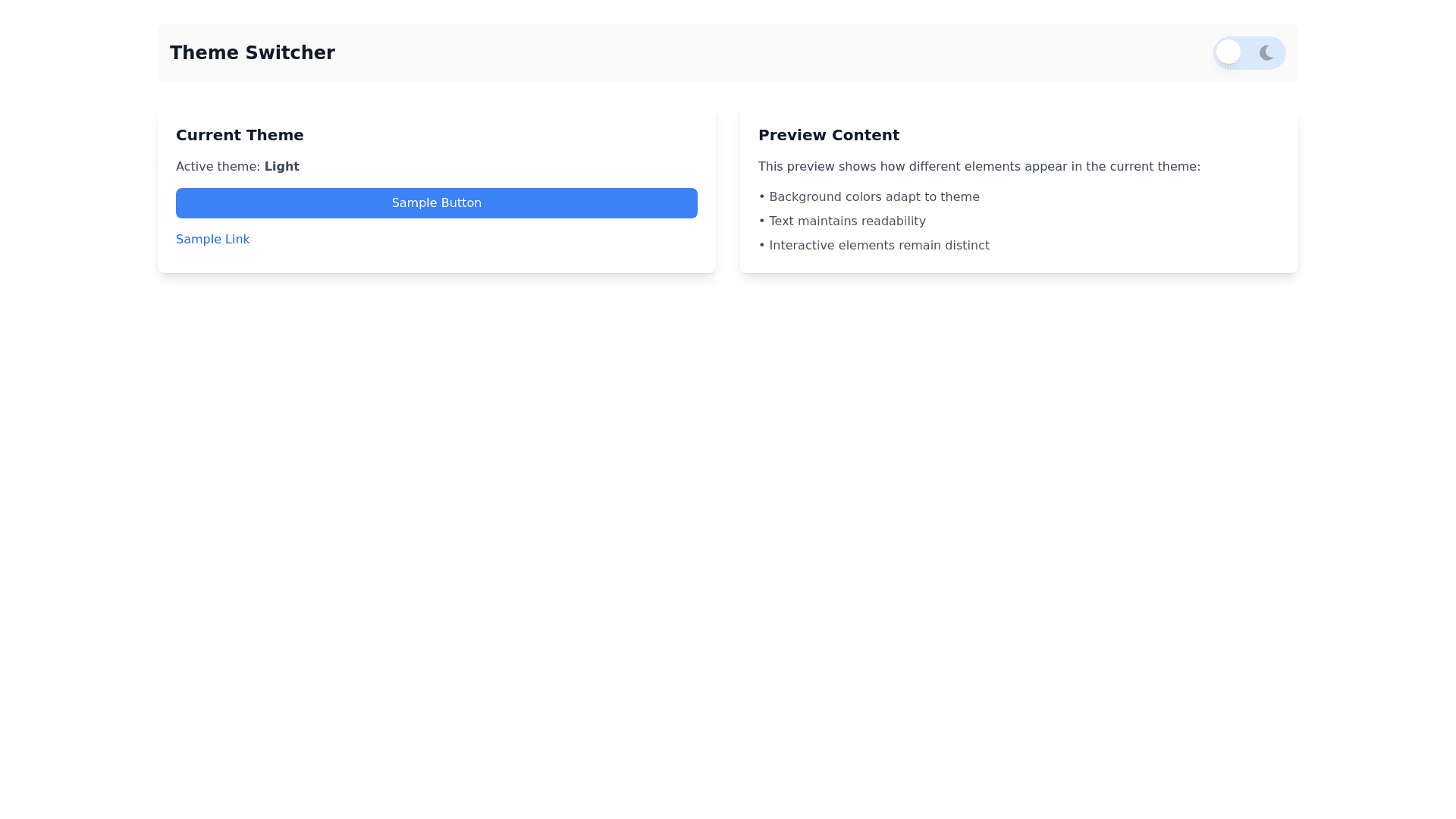
Generate a Tailwind CSS-based implementation of a light mode and dark mode toggle. The dark mode and light mode should adjust the following colors: Background Color: Light mode has a white background, while dark mode has a dark gray or black background. Text Color: In light mode, text should be dark (e.g., text-black), while in dark mode, text should be light (e.g., text-white). Button Colors: Buttons should have different colors in dark and light modes (e.g., a blue button in light mode and a blue button with dark mode styling in dark mode). Link Colors: Links should change color between light and dark modes (e.g., blue links in light mode and lighter blue links in dark mode). The toggle switch itself should be styled with a clear indicator showing the current mode (using icons or color changes). Ensure the color preferences persist across page reloads using localStorage or a similar method. The page should be responsive and work well across both desktop and mobile views. The implementation should focus on the color differences between dark and light mode, with no other complex features.