S T P Ingegneria - Copy this React, Tailwind Component to your project
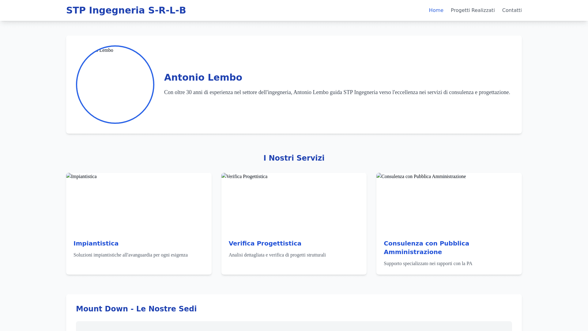
1. Set the Color Scheme: Use a clean, professional color palette that conveys trustworthiness and modernity. Make blue the dominant color, symbolizing professionalism, stability, and technology. Use gray as a complement, providing a sleek contrast. Add green accents to represent sustainability and innovation. Use white to keep the design fresh and clear. Adjust the tones to create a balanced and appealing look. Apply blue to buttons, headings, and borders, while gray and white fill the background, text, and navigation elements. 2. Select Typography: Choose a clear, sans-serif font for headings and buttons (like Roboto or Arial). This will make the text easy to read and give a modern, professional feel. For body text, use a serif font like Times New Roman or Georgia to create contrast and maintain readability. Set the body text at a medium size with proper line spacing to enhance readability. 3. Design the Layout: Ensure the website has a clean, minimal design that is easy to navigate. The top menu should include links to the main sections: "Home," "Progetti Realizzati," "Contatti," etc. Use high-quality images sparingly but effectively. Display images in a grid view for the "Progetti Realizzati" section, with a hover effect to show additional details (e.g., images, descriptions, endoscalie). Make sure the interactive map for Mount Down is integrated seamlessly into the homepage, showing project locations with pop-up windows containing details. 4. Integrate the Interactive Map (Mount Down Location): Include an interactive map of Mount Down on the homepage, showing all project locations. Make it clickable so users can interact with different locations. Design the map with a subtle overlay to match the color scheme (blues and grays) and add visual appeal. Ensure pop-up windows appear when users click on a location, displaying relevant project information such as images, descriptions, and endoscalie. 5. Create the "Progetti Realizzati" Section: Organize the "Progetti Realizzati" section in a grid layout with headings for each of the three main topics: Impiantistica, Verifica Progettistica, and Consulenza con Pubblica Amministrazione. Display images related to each topic, and beneath each image, add descriptive captions (endoscalie) to provide context and further details. Use hover effects to display additional information when the user interacts with each image. Make sure that all images and descriptions are clear, sharp, and professionally styled to maintain a polished appearance. 6. Design the "Contatti" Section: At the bottom of the homepage, create a "Contatti" section with essential contact details, including name, phone number, email, and company address. Add clickable icons for the company's social media accounts (Facebook, LinkedIn, Instagram, Twitter) to allow users to easily follow the company on these platforms. Make sure this section is well-organized, visually appealing, and consistent with the rest of the design. Use social media icons in blue or gray for cohesion, and position them near the contact details for easy access. 7. Apply Overall Aesthetic and Finishing Touches: Ensure the design is modern, sleek, and professional. Maintain a balance between images, text, and interactive elements, avoiding clutter. Ensure mobile optimization so that the website is responsive and displays correctly on all devices. Polish the details: Check all text for clarity, ensure all buttons are clearly visible, and ensure that all images and elements align perfectly.
