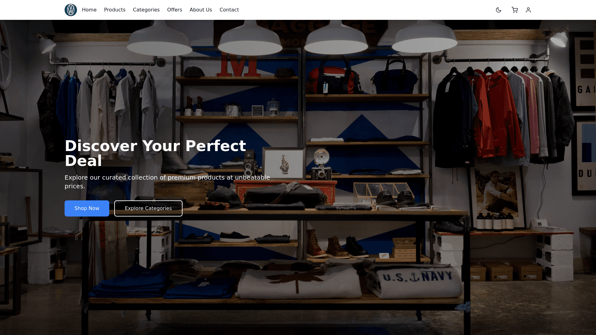
Home Page - Copy this React, Tailwind Component to your project
"Create a modern and visually appealing homepage with advanced features that enhance user experience, including dark and light modes, interactive cart functionality, and account management features. Header Section: Logo: Position the logo on the top left corner for brand identity. Navigation Bar: Place navigation links to essential sections (Home, Products, Categories, Offers, About Us, Contact) on the right side. Account Icon: Next to the cart icon, add a user account icon. This should show either a default avatar for logged out users or the user's profile image once they log in. Light/Dark Mode Toggle: Include a button next to the account icon to switch between light and dark modes. This button should have an icon representing the current mode (a sun icon for light mode and a moon icon for dark mode). Hero Section: Full Screen Background Image: Use a high quality image with a smooth gradient overlay. Main Call to Action: Display a bold headline such as "Discover Your Perfect Deal" and a subheading to engage users. Buttons: Include two main buttons: "Shop Now" and "Explore Categories." Carousel Slider: Add a carousel of trending products or categories with smooth animations. Categories Sidebar (Left): Collapsible Menu: Display a list of product categories like Electronics, Fashion, Home Appliances, etc. Category Icons: Represent each category with visually appealing icons to make browsing easier. Featured Products Section: Product Cards: Showcase 4 6 featured products in a clean grid layout. Each card should include a product image, name, price, and rating stars. Hover Effects: When hovering over a product card, display additional information like a quick view or 'Add to Cart' option. Add to Cart Feature: Add to Cart Button: Once the user clicks "Add to Cart" on a product, display a small animation of the product being added to the cart. Cart Icon: Update the cart icon with the number of items added. For instance, if the user adds two products, the cart icon shows "2." Small Cart Popup: When clicking on the cart icon, open a small popup window with the product's image, name, price, and quantity (with an option to adjust). Also, display the total amount for all products in the cart. Checkout Button: At the bottom of the popup, include a "Proceed to Checkout" button that takes the user to the checkout page. Total Amount: Display the total price of all items in the cart at the bottom of the popup. Footer Section: Quick Links: Add links to FAQs, Policies, Returns, etc. Social Media Icons: Include social media icons for easy access to your profiles. Newsletter Subscription: A form for users to subscribe to your newsletter. Contact Information: Include contact details and location. Design Notes: Use a clean, minimalist design with modern typography for readability. The page should be fully responsive, adapting seamlessly to mobile, tablet, and desktop devices. Ensure smooth transitions and animations for all interactive elements (e.g., cart popup, hover effects). The color scheme should include light backgrounds with accent colors for buttons (e.g., vibrant blues, oranges) and dark mode that inverts the colors (with a darker background and lighter buttons). This design should provide an intuitive user interface while keeping the focus on simplicity and functionality."
