Design System Dashboard - Copy this Html, Tailwind Component to your project
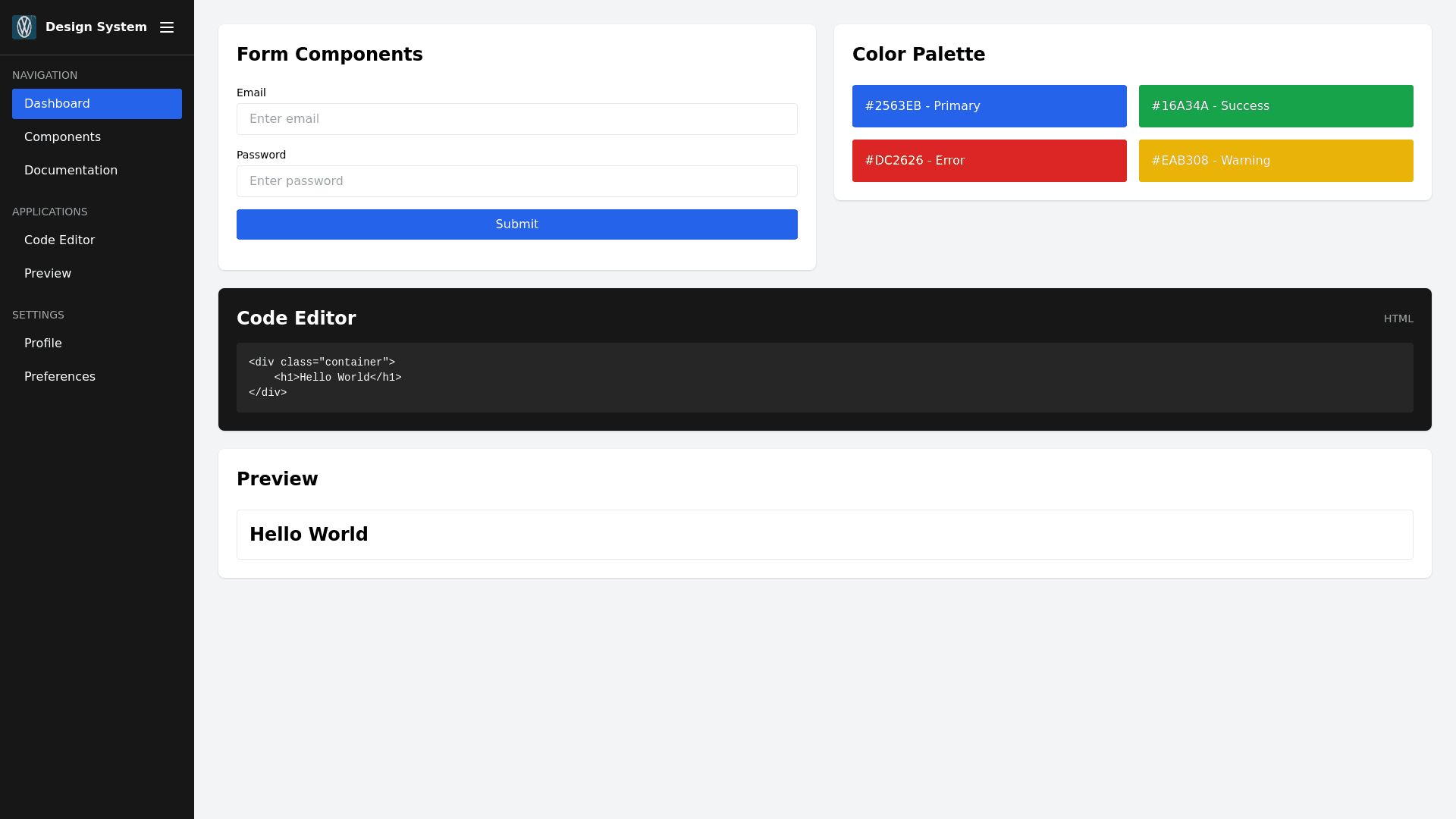
Project Overview Our project is a comprehensive design system that aims to provide a consistent and user friendly interface across various applications. The system includes a sidebar navigation, reusable components, and a responsive layout. The primary goal is to create a modular and scalable design that can be easily integrated into different projects, ensuring a cohesive user experience. Key Components Sidebar Navigation Positioning: The sidebar is fixed on the left side of the screen, taking up 250px of width. It can be collapsed to 60px or completely closed, depending on user preference. Styling: The sidebar has a dark background ( neutral 900) and white text. It includes a header with a logo and a toggle button to control its state (collapsed or closed). Sections: The sidebar is divided into sections with titles (e.g., Navigation, Applications, Settings). Each section contains links with icons and text. Active State: Active links are highlighted with a blue sidebar indicator and a slightly lighter background. Responsive Behavior: On smaller screens (below 480px), the sidebar is hidden by default but can be toggled to a collapsed state (60px) or completely closed. Main Content Area Layout: The main content area is positioned to the right of the sidebar. It adjusts its margin left based on the sidebar's state (250px, 60px, or 0px). Responsive Design: The main content area uses a grid system with 12 columns, which adjusts based on screen size. On smaller screens, the grid collapses to a single column. Components: The main content area includes various sections such as forms, color palettes, cards, and widgets (e.g., code editor, preview widget). Forms and Inputs Styling: Forms are styled with consistent spacing, labels, and input fields. Input fields have a hover effect that changes the border color to a lighter shade of blue. Validation: Forms include basic validation (e.g., required fields, email pattern). On submission, invalid forms prevent the default action and display error messages. Color Palette Display: A section showcasing the primary, success, error, and info colors used throughout the design system. Each color is displayed with its name and hex code. Cards Styling: Cards are simple and elegant, with a subtle shadow and a hover effect that increases the shadow intensity. They contain content such as titles and paragraphs. Widgets Code Editor: A widget that allows users to input and edit code. The editor has a dark background and light text, with a header indicating the language (e.g., HTML). Preview Widget: A widget that displays a live preview of the code entered in the code editor. The preview is embedded in an iframe. Functionality Sidebar Toggle Collapse: Clicking the toggle button collapses the sidebar to 60px, hiding the text of links and section titles while keeping icons visible. Close: Clicking the toggle button again closes the sidebar completely, hiding it from view. Expand: Clicking the toggle button when the sidebar is collapsed or closed expands it back to its full width (250px). Submenus Display: Some sidebar links have submenus that display additional links when clicked. Submenus are hidden by default and can be toggled open or closed. Form Submission Validation: Forms are validated on submission. If a form is invalid, the submission is prevented, and error messages are displayed. Responsive Design Media Queries: The design system uses media queries to adjust the layout and components based on screen size. For example, the grid system changes from 12 columns to a single column on smaller screens. Goals Consistency: Ensure a consistent look and feel across all components and sections. User Friendliness: Provide an intuitive and easy to navigate interface. Scalability: Design the system to be easily scalable and adaptable to different projects. Modularity: Create reusable components that can be easily integrated and customized. Conclusion Our project aims to create a robust and flexible design system that meets the needs of various applications. By focusing on consistency, user friendliness, scalability, and modularity, we ensure that the system provides a seamless and enjoyable user experience. The sidebar navigation, main content area, forms, color palette, cards, and widgets are all designed to work together harmoniously, providing a comprehensive solution for modern web design.