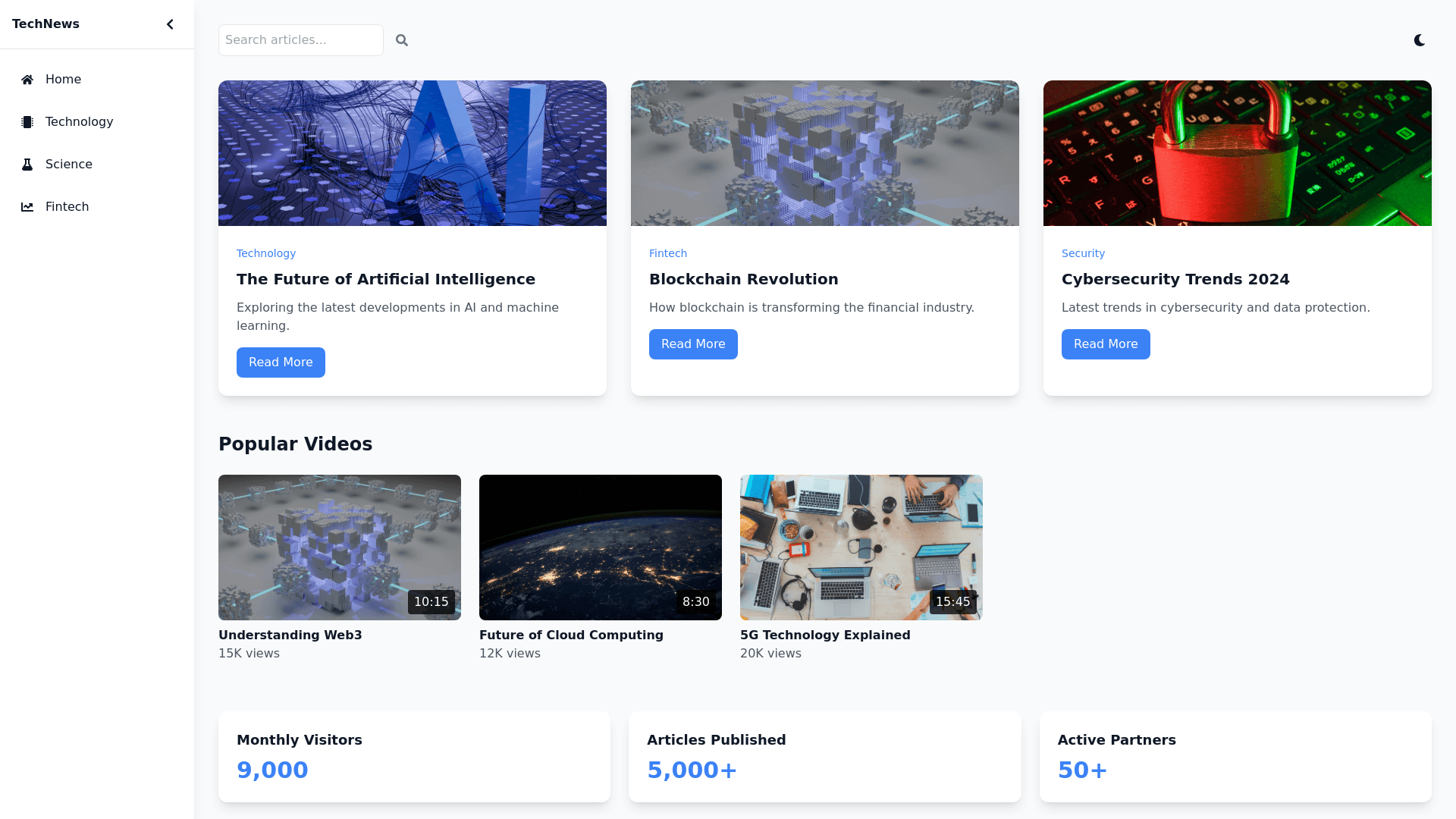
Tech News U I - Copy this React, Tailwind Component to your project
Create a complete, modern, and professional website dedicated to technology news. The design should include advanced, interactive components with a sleek, cohesive, and responsive layout. Below are the detailed specifications: Key Components: Fixed Side Menu: A sidebar menu that remains visible (sticky) even when the user scrolls down the page. Includes intuitive icons with labels (e.g., Home, Technology, Science, Fintech). Hover animation to enlarge or change the color of icons. Submenus that expand smoothly with animation. Collapsible menu (toggle) to save space on smaller screens. Article Section (Dynamic Grid): A flexible and fluid grid layout for displaying articles or posts. Each card should include an image, title, short description, category (e.g., “Technology”), and a "Read More" button. On hover, cards should have a subtle animation (e.g., zoom or shadow effect). Pagination or infinite scroll functionality to load more articles seamlessly. Popular Videos Section: A horizontal carousel gallery to showcase popular videos. Each video card includes a thumbnail, title, duration, and view count. Navigation buttons (previous/next) for scrolling through the carousel. Tags and Filters System: A section with clickable popular tags (e.g., "AI," "Blockchain," "Cybersecurity"). An advanced filtering system that allows users to sort articles by category, date, or popularity. Testimonials and Partners Section: A slider or card based layout for displaying user testimonials. A dedicated area to showcase partner logos, displayed in grayscale with a color effect on hover. Dynamic Statistics Dashboard: An interactive section to display key stats (e.g., total articles published, monthly visitors, partners). Include a progressive counter animation (e.g., numbers increase dynamically as they come into view). Contextual Sidebar: A secondary sidebar (different from the main menu) that appears when users click a button or interact with specific content (e.g., related articles or recommended content). Includes a list of direct links, small thumbnails, and brief summaries. Style and Interactivity: Transition Effects: Components should have subtle animations (e.g., fade, slide) for a smooth user experience. Responsive Design: The site should work flawlessly on desktop, tablet, and mobile devices. Dark/Light Mode Toggle: Add a feature allowing users to switch between dark and light modes with smooth transitions. Micro Interactions: Include light animations for clicks, hover effects, and page transitions
