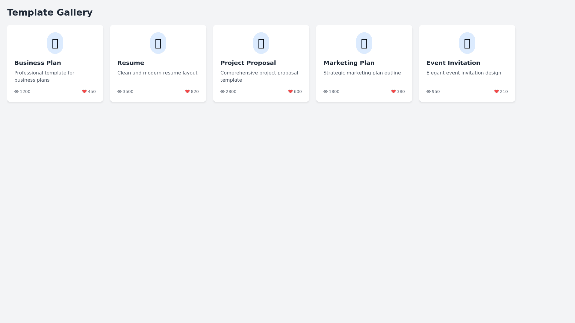
Template Gallery - Copy this React, Tailwind Component to your project
Create a React component named TemplateRow for a scrollable row of templates using Material UI (MUI) Card components. Each card represents a template and, when clicked, opens a modal form to edit the prompt templates. The component should be designed to be responsive, user friendly, and visually appealing. Features and Requirements: Container: Scrollable Row: The main container should be a horizontally scrollable row that allows users to navigate through multiple template cards. Smooth Scrolling: Implement smooth scrolling to enhance the user experience. Styling: The container should have padding and hidden scrollbars to maintain a clean look. Cards: Layout: Each card should display an icon, title, description, and two statistics (views and likes). Size and Spacing: Cards should have a consistent size with enough spacing between them to avoid clutter. Styling: Apply a slight shadow and rounded corners to each card for a modern and clean appearance. Responsive: Ensure the cards adjust appropriately on different screen sizes. Icons: Variety: Use different colored icons for each card to visually distinguish between templates. Positioning: Icons should be placed at the top of the card, centered horizontally. Styling: Icons should be within a circular background that matches the card’s theme. Title: Typography: The title should be bold and prominently displayed at the top of the card. Styling: Ensure the title is easily readable and stands out from the description. Description: Content: A brief description should be displayed below the title, summarizing the template's purpose. Typography: Use a smaller font size and lighter color for the description. Statistics: Views and Likes: Display two statistics at the bottom of each card: the number of views and likes. Icons and Text: Use an eye icon for views and a heart icon for likes, followed by their respective counts. Styling: Position the icons and text side by side, ensuring they are easily distinguishable. Interactions: Clickable Cards: Clicking on a card should open a modal dialog to edit the template. Modal Dialog: Implement a modal using Material UI that contains a form for editing the selected template. Form Component: The form should be a separate component (EditTemplateForm) that is dynamically populated based on the selected template. Responsive Design: Media Queries: Use media queries to ensure the component looks good on various screen sizes, including mobile devices. Adjustable Layout: Ensure the cards and scrollable container adjust their layout based on screen size.
