Swap Container - Copy this React, Mui Component to your project
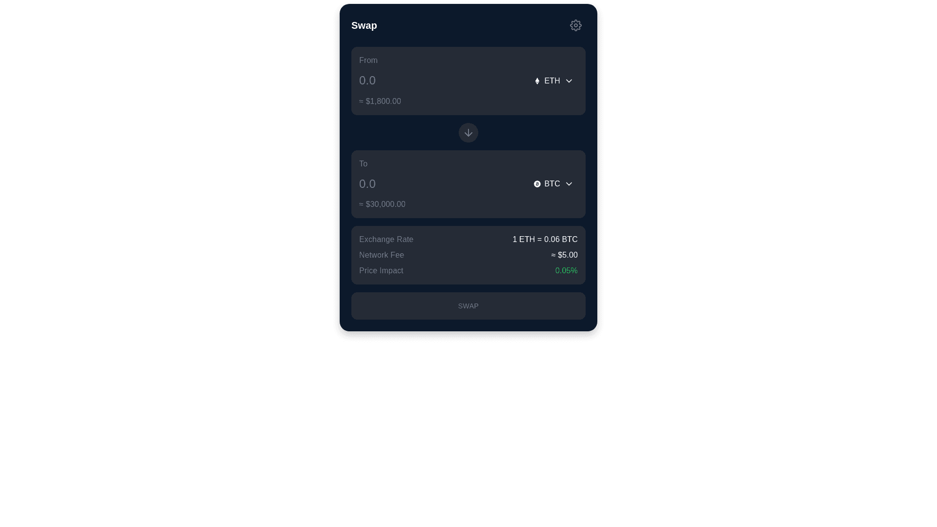
Design and implement a Token Swap interface with the following detailed specifications: LAYOUT & CONTAINER Container width: Max 480px Primary Background: #0C192B Border radius: 20px Padding: 24px all sides Box shadow: 0px 8px 16px rgba(0, 0, 0, 0.2) COLOR SYSTEM Background Colors: Primary Background (Card): #0C192B Secondary Background (Input containers): #252B36 Tertiary Background (Button hover): #343434 Modal/Popup Background: #252B36 Text Colors: Primary Text: #FFFFFF Secondary Text: #717A8C Tertiary Text/Placeholder: #8B8B8B Disabled Text: #A2A8B4 Border & Divider: Border Color: #393939 Divider Lines: rgba(113, 122, 140, 0.3) Status Colors: Warning/Alert: #C4B454 Success: #4CAF50 Error: #FF5252 TYPOGRAPHY Font Family: Inter/SF Pro Display Text Sizes & Weights: Heading "Swap": 24px, Semi bold (600), #FFFFFF Token amounts: 28px, Medium (500), #FFFFFF Token symbols: 16px, Medium (500), #717A8C USD values: 14px, Regular (400), #717A8C Transaction details: 14px, Regular (400), #A2A8B4 Button text: 16px, Semi bold (600), #FFFFFF HEADER SECTION Title "Swap" aligned left, #FFFFFF Settings icon (24x24px) aligned right Icon color: #717A8C TOKEN INPUT SECTIONS (Apply to both "From" and "To" sections) Container: Background: #252B36 Border: 1px solid #393939 Border radius: 16px Padding: 16px Margin between sections: 16px Amount Input: Placeholder: "0.0", color: #8B8B8B Right aligned Support up to 6 decimal places Font: 28px, Medium Active text color: #FFFFFF Token Selector: Token icon (32x32px) Token symbol text: #FFFFFF Chain icon (16x16px) if applicable Dropdown indicator: #717A8C Background: #343434 Border radius: 12px Padding: 8px 12px Hover background: Lighten by 5% USD Value Display: Prefix: "≈" Color: #717A8C Format: "$X,XXX.XX" Swap Direction Button: Centered between input sections Icon size: 24x24px Icon color: #717A8C Background: #252B36 Hover background: #343434 Circular shape TRANSACTION DETAILS SECTION Exchange Rate: Format: "1 [TokenA] = X.XX [TokenB]" Label color: #717A8C Value color: #A2A8B4 Network Fee: Label: "Network Fee:", color: #717A8C Value color: #A2A8B4 Format: "~$X.XX" Gas in GWEI: Secondary text #8B8B8B Price Impact: Format: "Price Impact: X.XX%" Color coding: • < 1%: #717A8C • 1 3%: #C4B454 • > 3%: #FF5252 Minimum Received: Label color: #717A8C Value color: #A2A8B4 Format: "Minimum received: X.XX [Token]" Slippage: Secondary text #8B8B8B SWAP BUTTON Width: 100% Height: 56px Border radius: 12px Active state: • Background: #252B36 • Text: #FFFFFF Disabled state: • Background: #343434 • Text: #8B8B8B Hover: Opacity 0.9 STATES & INTERACTIONS Loading: Skeleton background: #343434 Shimmer effect: linear gradient(90deg, #252B36, #343434, #252B36) Loading text color: #717A8C Error States: Error text: #FF5252 Warning text: #C4B454 Info text: #717A8C Hover Effects: All interactive elements: brightness increase 10% Transition: 0.2s ease in out [Previous sections for RESPONSIVE BEHAVIOR, ACCESSIBILITY, and ANIMATIONS remain unchanged] OPACITY LEVELS Full opacity: 100% Medium opacity: 70% Low opacity: 40% Disabled state: 30%