Dashboard Card - Copy this React, Mui Component to your project
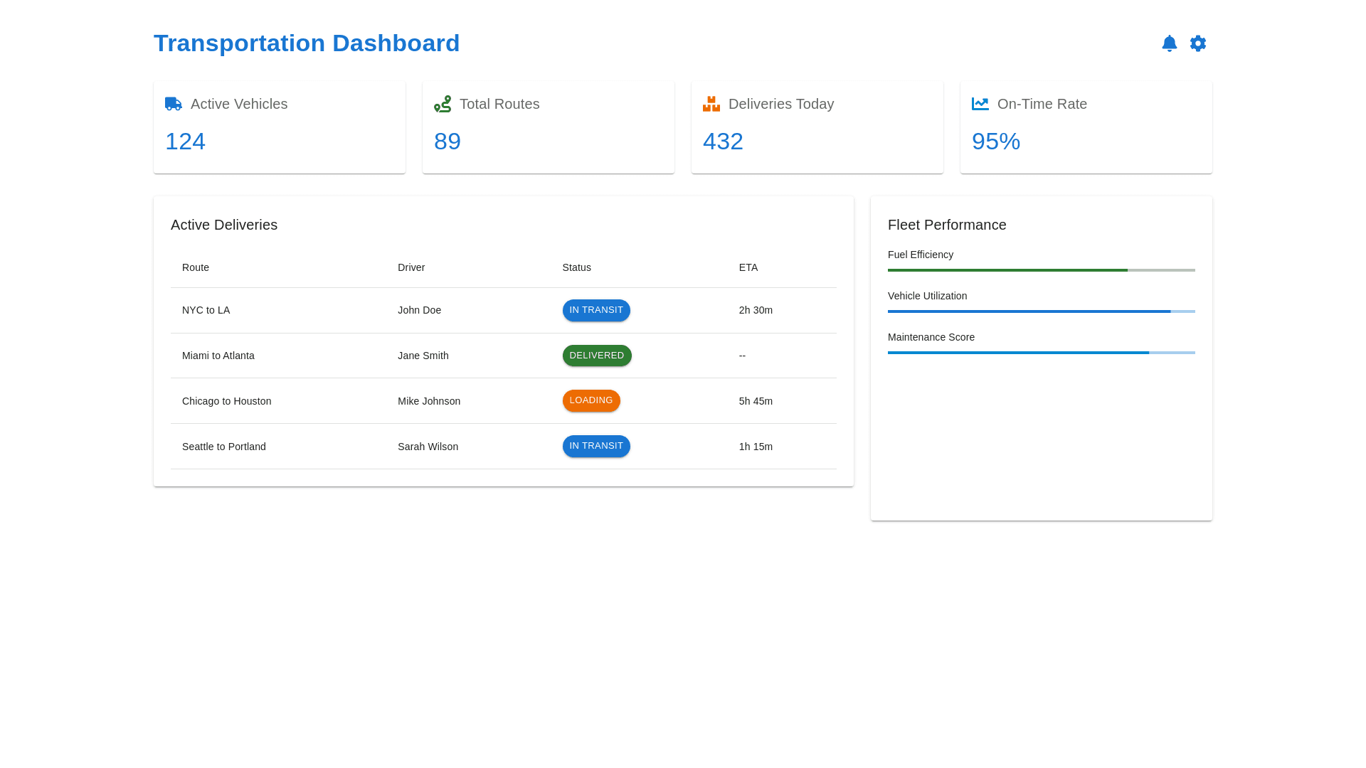
Current layout of your Transportation Management Dashboard, here are some design and color scheme suggestions that could enhance both the aesthetic appeal and the usability of the interface: Design Improvements Modernize the UI Components: Buttons and Inputs: Use flat design with subtle shadows for depth. Consider rounded corners for a softer, modern look. Icons: Update action icons to a more uniform style that aligns with modern design trends, ensuring they are intuitive and easily recognizable. Typography: Font Choices: Choose a clean, sans serif font such as 'Roboto' or 'Segoe UI' for better readability and a contemporary look. Hierarchy: Establish a clear hierarchy using different font sizes and weights. For example, table headers could be semi bold to differentiate from table content. Layout: Spacing and Alignment: Increase white space around elements to reduce visual clutter. Ensure consistent alignment of all text and elements for a tidy appearance. Responsive Design: Ensure the layout is responsive, adapting well to different screen sizes and orientations. Color Scheme Improvements Primary Colors: Choose a primary color that reflects your brand but is also visually appealing. For a transportation dashboard, shades of blue or green can evoke reliability and efficiency. Example Palette: A deep blue for headers and important buttons, complemented by a lighter blue for hover states and highlights. Secondary Colors: Use secondary colors sparingly to draw attention to interactive elements like filters, search bars, and active status indicators. Example Palette: Soft gray for less critical information and light green for status indicators (green for active, red for inactive). Accent Colors: Use accent colors to highlight important actions like 'Add New Carrier' or critical status changes. Accents should be bright but not overpowering. Example Palette: A vibrant orange or yellow for calls to action, ensuring they stand out but remain aesthetically pleasing. Consistency Across Visuals: Ensure that all charts, graphs, and icons use the color palette for a unified look. This helps in maintaining visual consistency across the dashboard. Visual Feedback Hover and Active States: Provide visual feedback for mouse interactions. For example, change button colors on hover and provide a subtle shadow effect on click. Animations: Use mild animations for transitions in modal windows or dropdowns to enhance the user experience without causing distractions. Accessibility Contrast Ratios: Adhere to WCAG (Web Content Accessibility Guidelines) by ensuring sufficient contrast between text and background colors. Color Blindness Considerations: Choose colors that are distinguishable even to users with color vision deficiencies. Tools like Color Oracle can simulate different types of color blindness. Implementing the Changes CSS Frameworks: Utilize frameworks like Bootstrap or Material UI for consistent components and styling. Custom Themes: If using a framework, consider creating a custom theme that matches your new color scheme and design standards. By adopting these design and color suggestions, your Transportation Management Dashboard can achieve a balance between functionality and modern aesthetics, enhancing user experience and engagement. If you need mockups or specific CSS code examples for these suggestions use mui material component