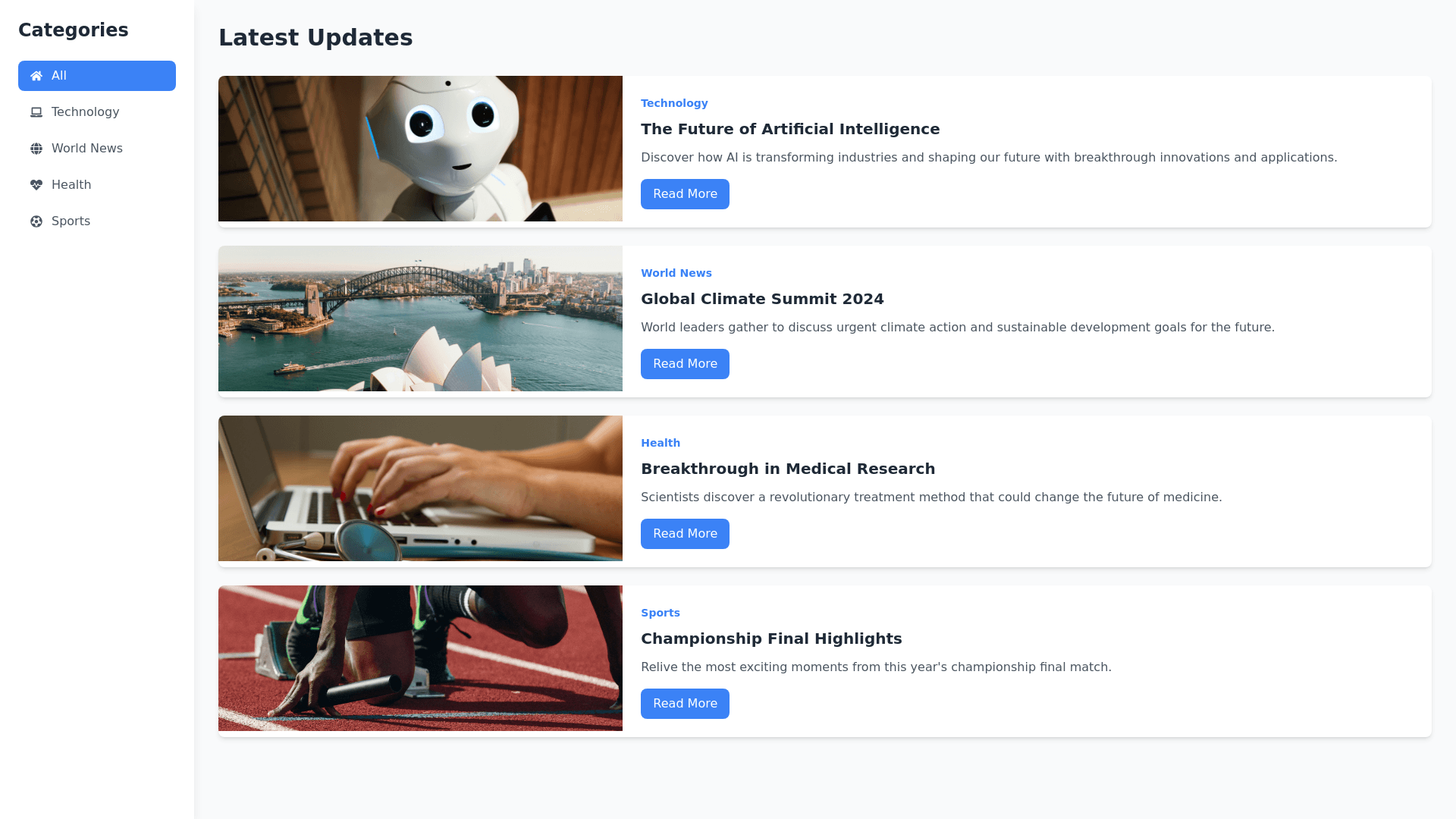
Blog Website - Copy this React, Tailwind Component to your project
Create a simple and responsive blog website focused on 'Updates & News,' similar to Wikipedia in simplicity. The website should have two main sections: a sidebar on the left and a news section in the center. Sidebar (Left): The sidebar should be positioned on the left side of the page. It should contain categories for different types of posts and updates (e.g., Technology, World News, Health, Sports). The sidebar should have a light background color, and category names should be displayed in a darker, readable font. The design should be simple and clean, with clear category labels. Main Content (Center): The center of the page should display a list of the latest news updates. Each news item should contain the following elements: A thumbnail image. A heading for the news post. A short summary or description of the news. A 'Read More' button that links to the full article. The thumbnail image should be on the left side, with the heading and summary next to it. Style the news items with a clean and professional layout that remains easy to read. Additional Styling: The overall design should be minimalistic, with a focus on readability. Ensure the layout is responsive, so it works well on mobile, tablet, and desktop screens. Use light colors for the background (e.g., white or light gray) and darker text (e.g., black or dark gray) for contrast and readability. Style the 'Read More' buttons with a simple design, such as a color change on hover for interaction. This website should prioritize a simple, user friendly design with smooth navigation and quick access to news content." Additional Notes for AI Tool: Ensure the website is easy to update with new news posts and that the sidebar categories are editable. The layout should be intuitive, focusing on clean navigation and easy access to different news categories. Provide a working example with placeholders for the news posts and categories, which can be filled later.
